
Learning Outcome #3
Creative Iterations
You present the successive iterations of your creative process, and the connections between them, of your methodically substantiated, iterative design and development process.
Evidences

(Studio Branding)
(Studio Branding)
(Studio Branding)
(Client Project)
(Client Project)
(Client Project)
(Client Project)
(Passion Project)
(Passion Project)
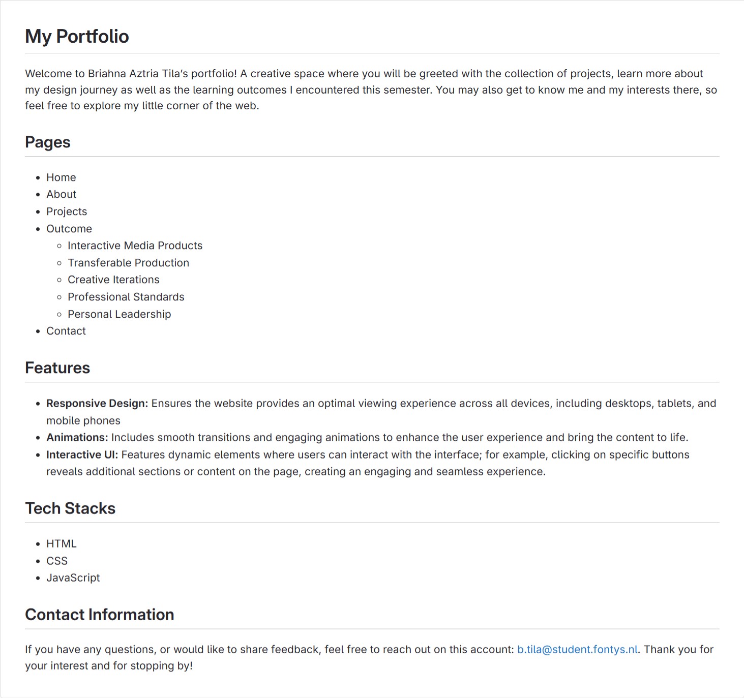
Portfolio
Link: Figma Prototype
Introduction
I created a new version of my Figma portfolio that presents my idea more professionally while
maintaining my personality and branding through my website design.
Inspiration
I conducted benchmark creation and design pattern search using existing websites such as
Pinterest and Behance, which allowed me to see the trends for a cleaner and minimalist
approach to design that gives a professional feel to the users.
Mood Board
From here, I created the mood board for the website. I focused on using sea-related colors,
clean text styles, and short content to integrate my concept of a “Tropical Coast” then a clean
and minimalist approach to the layout.
First Iteration
Then I proceeded to create the Lo-Fi prototype of my website, which was made from the
website I collected and an example provided by the teacher. I found that I want the structure of
my portfolio to be straightforward. So, I aim for elements such as photos of my works, concise
text, and enough negative space to ensure that my audience will experience the brand identity
of the “calmness” of Tropical Coast.
Feedback
Second Iteration
For the second iteration of the Lo-Fi structure, I removed the project information to make it less
wordy and lengthy. Then, the reflection and “what have I done” section is merged.
Third Iteration
The third iteration is the creation of the Hi-Fi prototype. After reviewing all the possible layouts
and structures I have for the portfolio, I started to implement the elements that align with my
theme, “Tropical Coast,” and the existing design of my inspirations. The sea inspires the main
homepage, showcasing a moving GIF of waves near the shore. Additionally, elements of waves,
sands, tropical leaves, and seashells are incorporated as one of my inspirations from Pinterest.
To ensure that the design remains minimalist, the boxes and the roundings of corners are
uniformly applied, and the fonts used are clean and robust in their features to maintain a
professional look.
Feedback
Fourth Iteration
For the fourth iteration, I implemented a new structure to merge the information of the projects
and learning outcomes; therefore, I removed the supposed pop-up page for project information
and merged this with the learning outcomes from my portfolio. I simply implemented a dropdown
area for the evidence and projects in the learning outcomes, which will showcase more details
of that specific evidence when the users click it.
Feedback
After receiving approval for the overall design, I proceeded to code my website. I coded the
website’s layout, texts, and animations. The website must be coded correctly so the needed
actions and interactiveness from Figma can also be seen on the website. Other details and the
process of my coding process may be viewed here.
Studio Logo
Introduction
Initially, we are tasked to create our own company and own brand. This includes choosing a
name, establishing a brand guide and visual elements to represent it in a real-world context.
Studio Name
To choose the most suitable name for our studio, each of us contributed our name suggestions,
which I then gathered into a single document called Studio Names. We later voted on the
options and settled on UXynergy (combine UX and synergy), for the final name of our company.
First Iteration
After our group decided to have UXynergy as our studio name, we came up with brand values
which are fun, eye-catching, colorful, and innovative. I then proceed on my own research by
using Benchmark Creation to browse the internet to find logos and similar designs that have
“UX” in it. I compiled images that will guide my next step, which is logo sketch. I aim for a simple
and neat design, so I focused on the initials “UXY.” After that, I transferred my sketch to digital in
Adobe Illustrator to properly visualize my idea.
Feedback
Second Iteration
The teacher liked the idea of combining the initials, so in my second iteration, I kept the “UXY” in
my sketch and design. They also pointed out that the logo is too corporate and serious for our
brand values, so instead of a simple and neat design, I came up with the idea of incorporating a
puzzle piece that symbolizes synergy and fun, which represents our brand.
Feedback
I showed the final sketch to my groupmates and received positive feedback, however, they
mentioned that others might not see the initials “UXY” right away. So, we collectively decided to
go with my groupmate’s logo for our final design.
Reflection
I enjoy designing logos and brand identities, but challenges are part of the process, like when
we had to design everything from scratch in this project. I learned that when conceptualizing, I
need to consider how the target audience will perceive the brand identity and logo since these
represent the studio to the public.
But despite some design difficulties, I still had a lot of fun because I was able to use my skills
and think outside the box. Tasks that involve creating brand identity are the reason why I
consider branding in my future goal.
Stylescape
Introduction
I made a stylescape to showcase our brand values and logo with our chosen color palette. This
guides our target audience of our visual aesthetic. It carries the feeling of the overall design, so I
want to share the brand values of UXynergy in this visual representation.
First Iteration
The elements I used conveys: synergy (group of people), fun (man smiling), eye-catching (2
models), and UXynergy as design company (desk flatlay). I highlighted our slogan, “we are the
missing piece,” by adding puzzle pieces in different colors, still on our scope of color palette.
Feedback
I received positive feedback because it clearly reflected our brand values. They really liked the
stylescape and appreciated my idea of using dual colors.
Second Iteration
After the first iteration, our group decided to change the colors. The reason for changing the
colors is that we asked some of our peers for feedback, and they mentioned that our previous
color palette doesn’t match the brand values of UXynergy, so I adjusted some shades. To guide
our decision, we asked for our teacher’s advice. They advised that instead of “colorful” and
“innovative,” we should include “dynamic” in our brand values. So I immediately made my
second iteration, incorporated our new color palette, removed “colorful” and “innovative,” and
replaced it with the word “dynamic.”
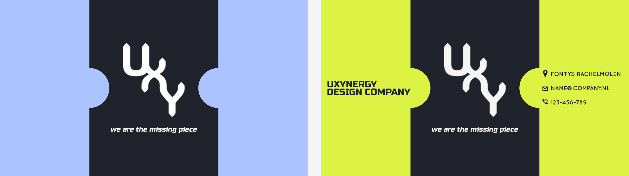
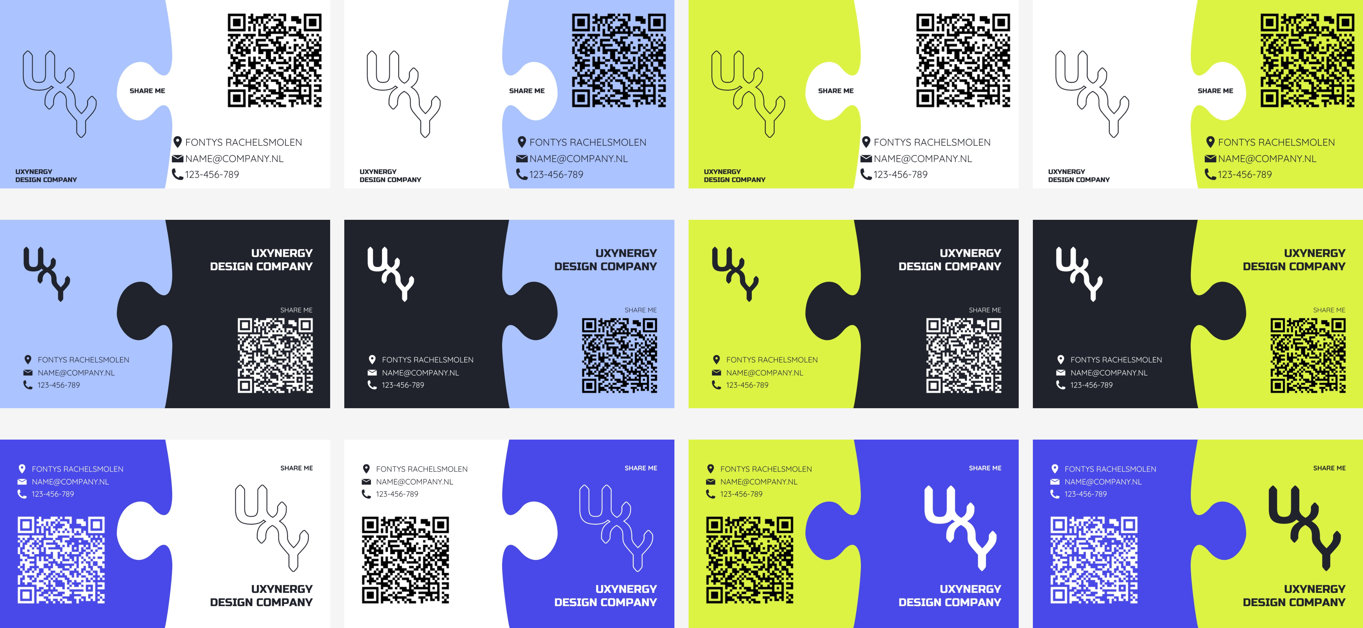
Business Card
First Iteration
Our group wanted to incorporate the puzzle idea that will highlight our slogan, “we are the
missing piece,” and our brand values, so I looked at inspirations online, where I found valuable
references such as a jigsaw puzzle with a missing part/piece. Then my groupmate thought of an
idea, so I combined our concepts—that is, to create a design featuring actual puzzle pieces.
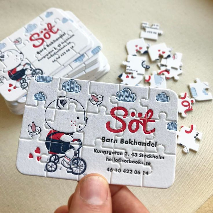
The first idea was that the business card should be made of actual puzzle pieces that can be
separated and fit together, with one piece in white color to convey the “missing piece” in our
slogan.
Feedback
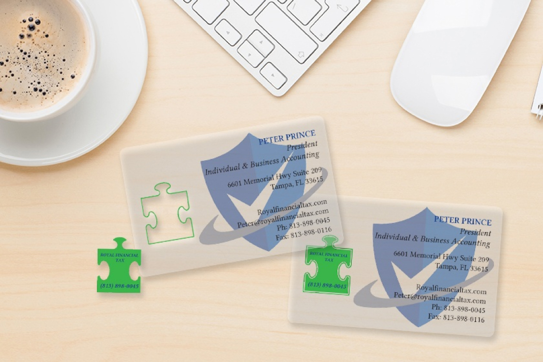
Second Iteration
I lessened the number of puzzle pieces; instead of whole business card as puzzle pieces, I only
created 3 puzzle pieces and centered the logo. I added bright colors for consistency of branding
and made texts readable.
Feedback
The group then asked for another feedback from our teacher, and he said he preferred having 2
pieces instead, which my groupmate created. He also suggested we make multiple versions in
different collections.
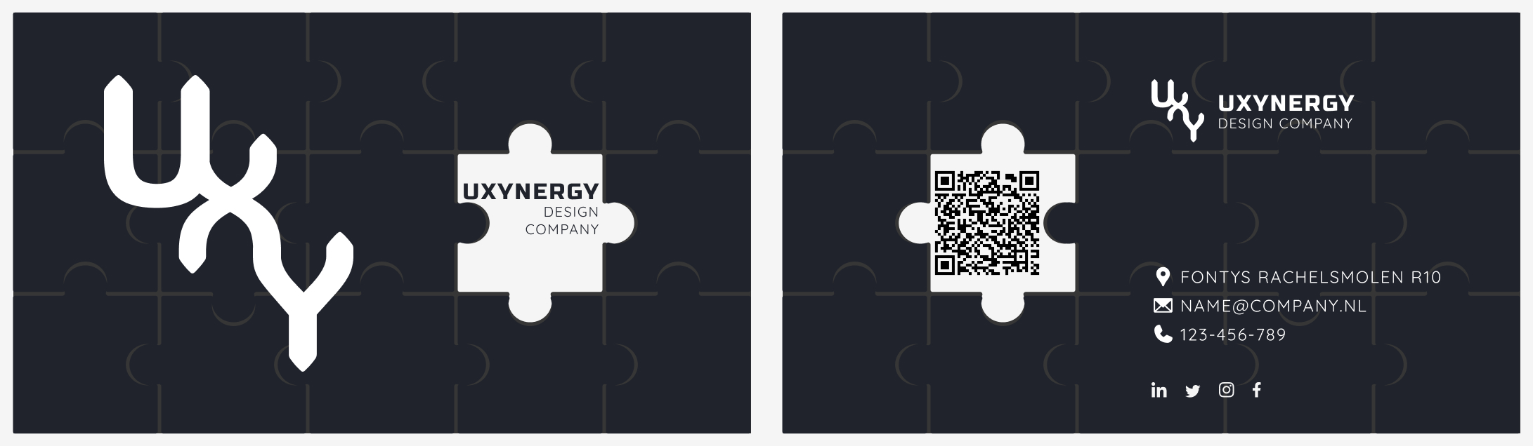
Third Iteration
So for the final iteration, I tweaked the design where I added curve shapes (that resemble one
side of the puzzle piece) so it will look more fun. I created different variations and in different
colors, but still within the scope of our color palette.
Reflection
Upon working on the design for our studio’s business card, I gained several key takeaways that
I’ll surely bring to my future projects:
- Ensure that the design is appealing in the eyes and fun (consistent to our branding) but still has the professional look.
- Avoid cluttering the design with too many elements, so focus on easy-to-read contact information while staying true to our brand.
- I was able to come up with better iterations after seeking feedback. By making multiple versions, I also learned which color combinations are great for the business card.
Interview Questions
Introduction
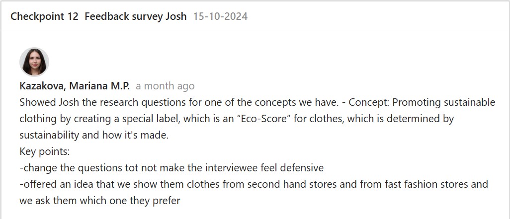
After brainstorming ideas with the group, we came up with three concepts. The group was then
divided into subgroups to begin working on the research. Together with Mariana, I decided to
focus on the concept: Promoting sustainable clothing by creating a special label, an “Eco-Score”
for clothes, which is determined by sustainability and how it’s made.
First Iteration
Mariana and I decided to conduct both primary and secondary research. We came up with the
research questions for the interviews together. We will conduct two research based on those
questions: one with interviews conducted in front of second hand stores and the other with
interviews in front of fast fashion stores. We will then compare the responses we receive from
both research.
Link: First Research Questions
Feedback
Second Iteration
After the feedback, we made sure to find a different approach to the questions and created
neutral types of questions to prevent harsh tones and unfairness.
Link: Final Research Questions
Feedback
After receiving the go signal from our teacher, we went to the city center specifically to fast
fashion and second hand stores to conduct our interview. In total, we were able to gather 4
interviews. The full details of our findings may be viewed here.
Game Storyline
Introduction
The goal is to promote awareness of fast fashion issues since it can negatively affect the
environment. To do that, we decided to create an upcycling game that will especially cater
around our target audience which are young people aged 15-24.
Inspiration
We ended up choosing Papa’s Pizzeria as our guide. I then looked into the flow of the game to
get some inspiration for our own game. In Papa’s Pizzeria, the worker multitasks by taking
orders from customers, ensuring customer satisfaction, earning points, and leveling up. Most of
these games also include a game trailer or introduction that sets up the storyline, so we took
note of that.
Following this, Papa’s Pizzeria is divided into working stations: the Topping Station, where
ingredients are added to the pizza based on the order; the Baking Station, where pizzas are
cooked; and the Cutting Station, where pizzas are sliced and served.
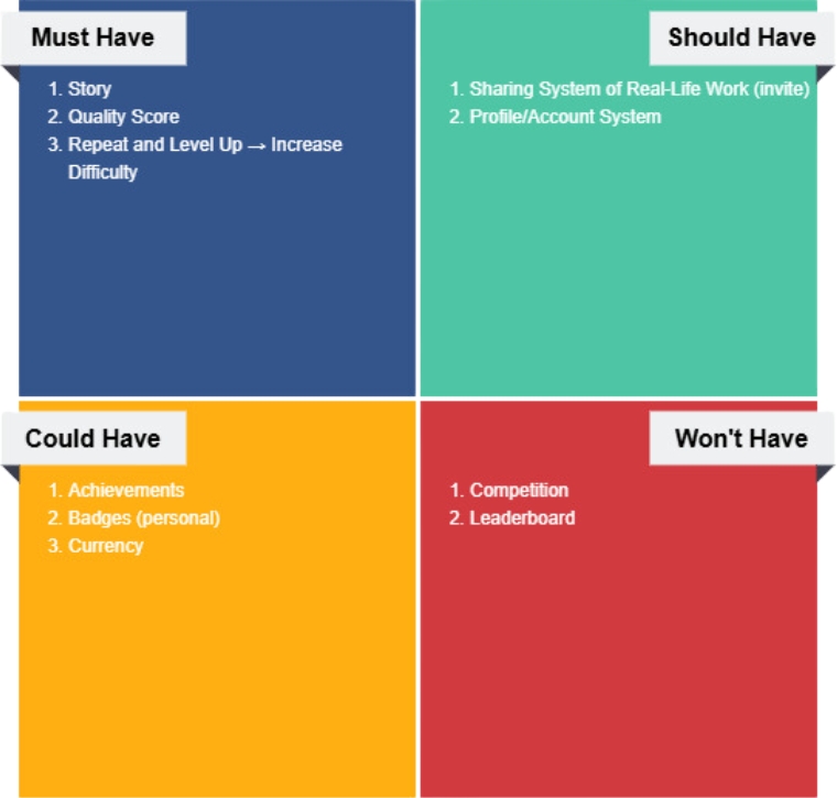
MoSCoW Method
To summarize and prioritize what we need for our game, I recommended using the MoSCoW
method to my group. Aside from that, this will help the team focus on the most important tasks
and manage our resources effectively.
First Iteration
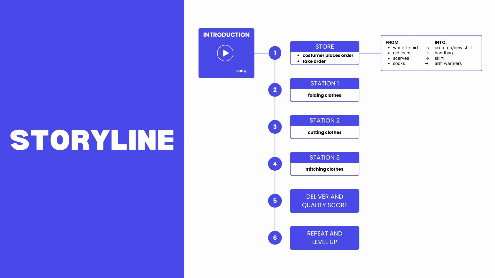
We then proceeded to detail the storyline and objectives of our game. We created 3 stations:
station #1 includes folding clothes, station #2 is where clothes are being cut, and the last station
is where players have to stitch the clothes. This was just the general overview of what we vision
for the game. Once players finish a round with a great score, the level increases, along with the
difficulty, adding more challenges and tasks to complete.
After this, I made the storyline more presentable by organizing it into a flowchart, making it
clearer and easier to understand.
Second Iteration
Once we started discussing which scenes should come after each other, we came to the
conclusion that we won’t be able to accomplish everything written in the MoSCoW chart so we
thought of just prioritizing the game’s functionality and making sure that every scene is
connected.
Since we’re in a time crunch, I suggested that we do the introduction after finishing the
important parts of the game. I also told my team that having our own profile and sharing system
might be unnecessary since the game won’t be used after the one-time presentation at the
Night of the Nerds event.
We then planned the sequence of our game; the customer will enter and ask for the piece of
clothing they’re carrying to be upcycled. The worker goes through the open stations and makes
sure the customer is satisfied with the outcome. The level will increase and more stations will
open.
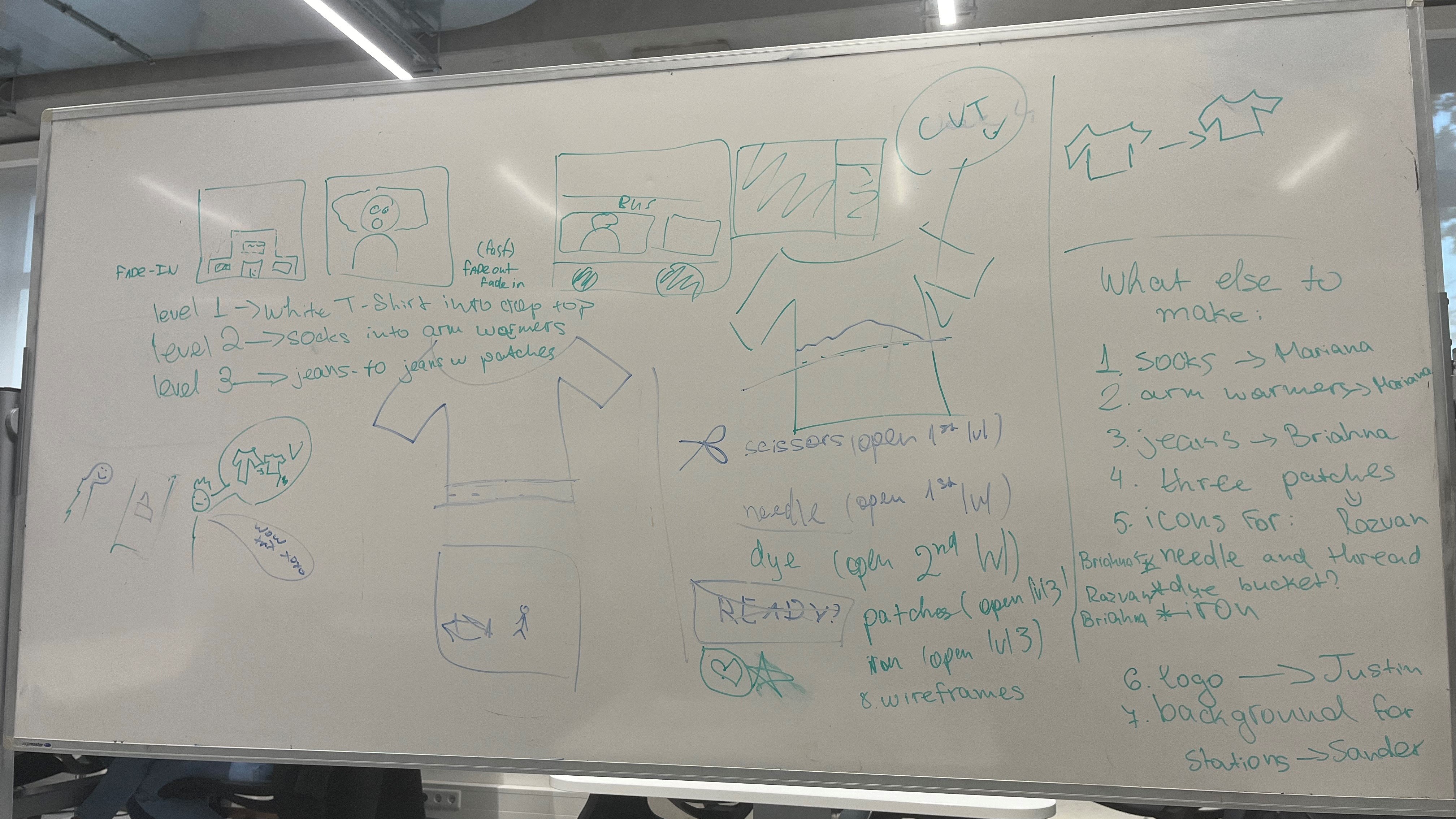
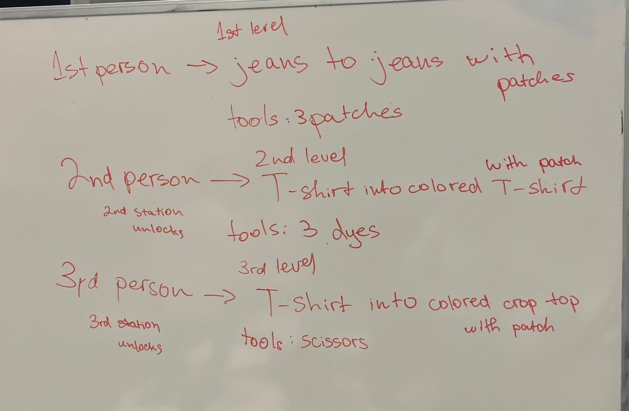
Third Iteration
We finalized the designs of each level, the flow and difficulty. The easiest level of the game
includes dyeing and patching clothes. On the third level (which is the hardest), the player has to
cut the clothes and properly use specific tools to win the round. After this iteration, I quickly
began prototyping and then helped with fully coding the different levels of the game.
Game Assets
Introduction
I created my own style of assets for the game we are about to make. I designed each element
from scratch to ensure they aligned with the concept and atmosphere of the game. I focused on
details like colors, textures, and proportions to make everything look polished and consistent.
These assets match the theme of the game and make it more interesting and fun for our
players.
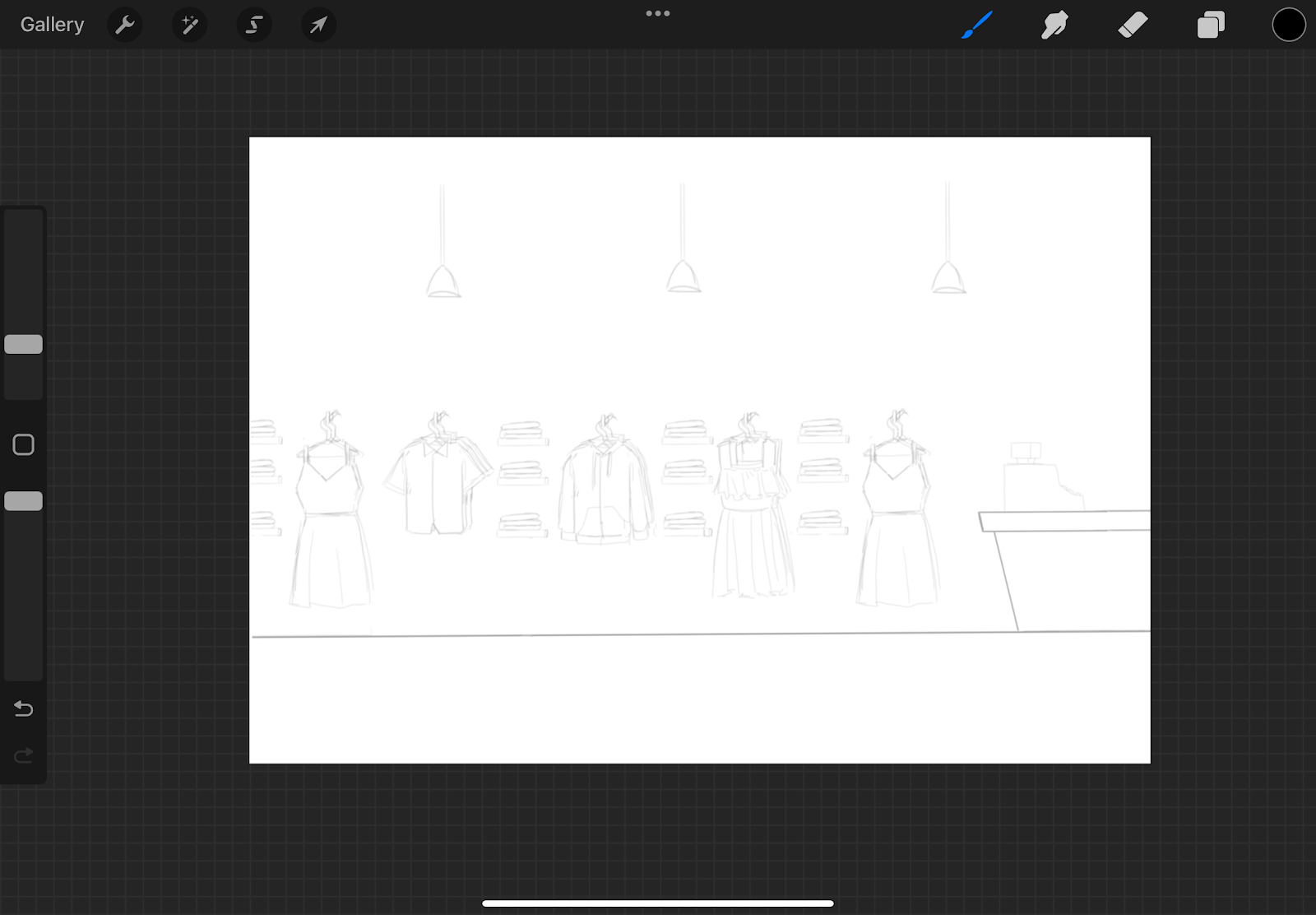
Mood Board
All of the group members gathered inspiration for the style we would like the game to have and
created a mood board to show the visual direction we want. We divided the board into
categories—characters, clothes, tools, backgrounds, gameplay, and colors—to keep everything
organized. We discussed and brainstormed, then decided on the style that felt best.
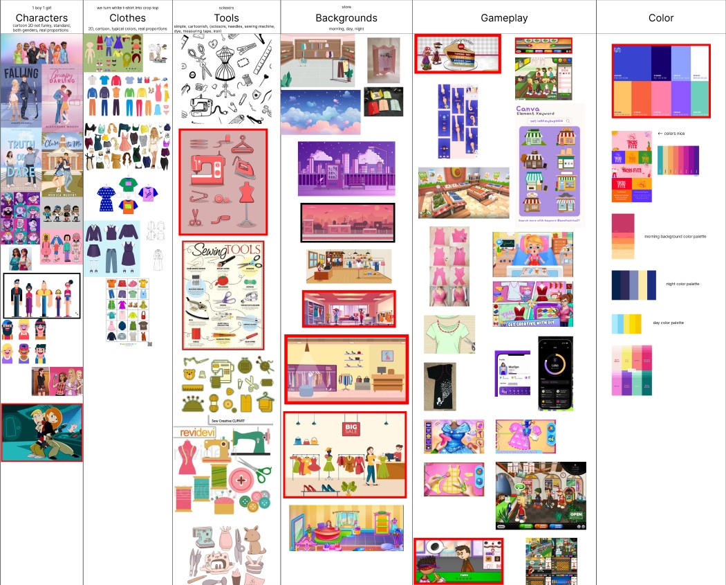
Link: Mood Board
We chose a cartoonish style inspired by the cartoons and games we grew up with. The
backgrounds are 2D, the gameplay is interactive, and the colors are bright and vibrant to
engage players.
First Iteration
Each group member created their own design based on the styles we chose from the mood
board. In my first attempt, I discovered Procreate, a digital tool for sketching, which allowed me
to create assets by hand and convert them into pixel art.
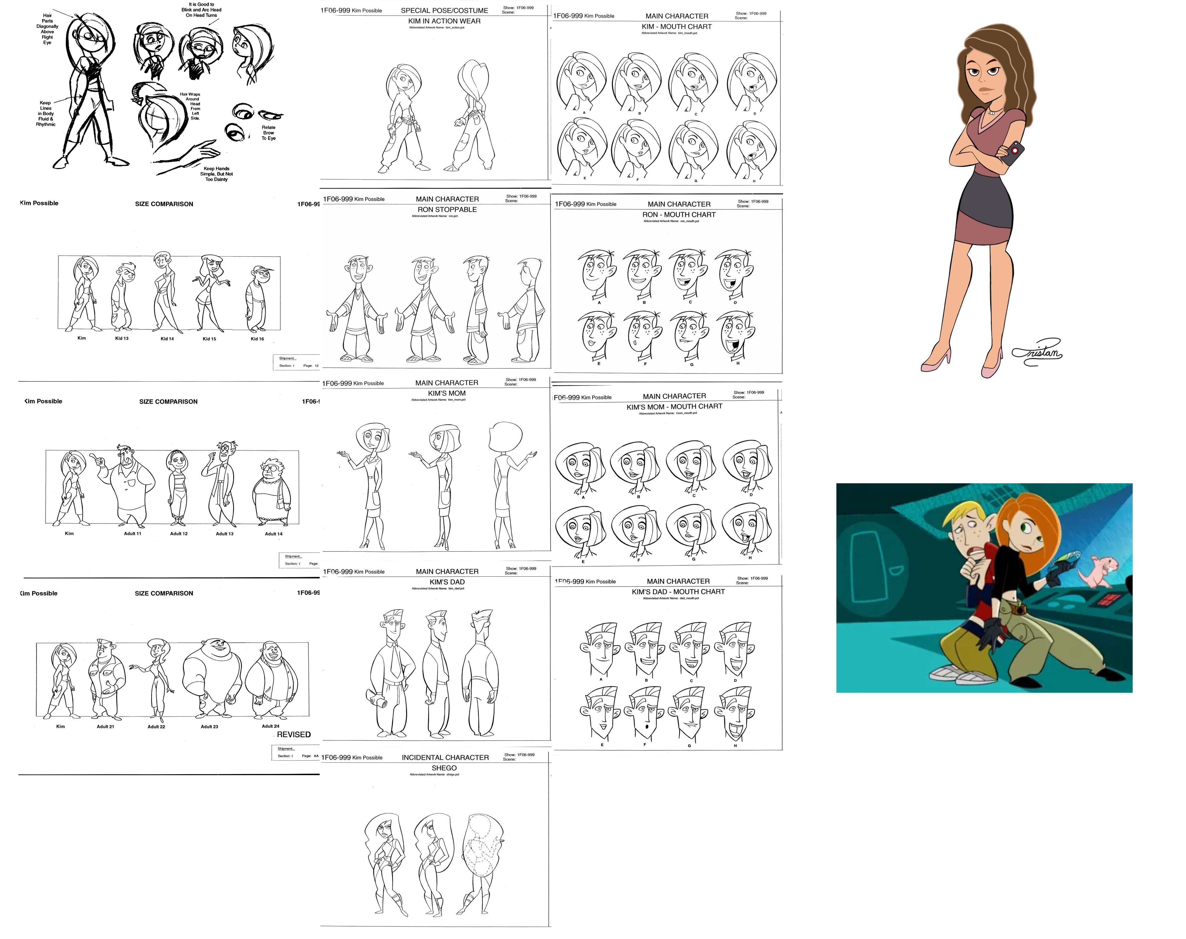
Characters
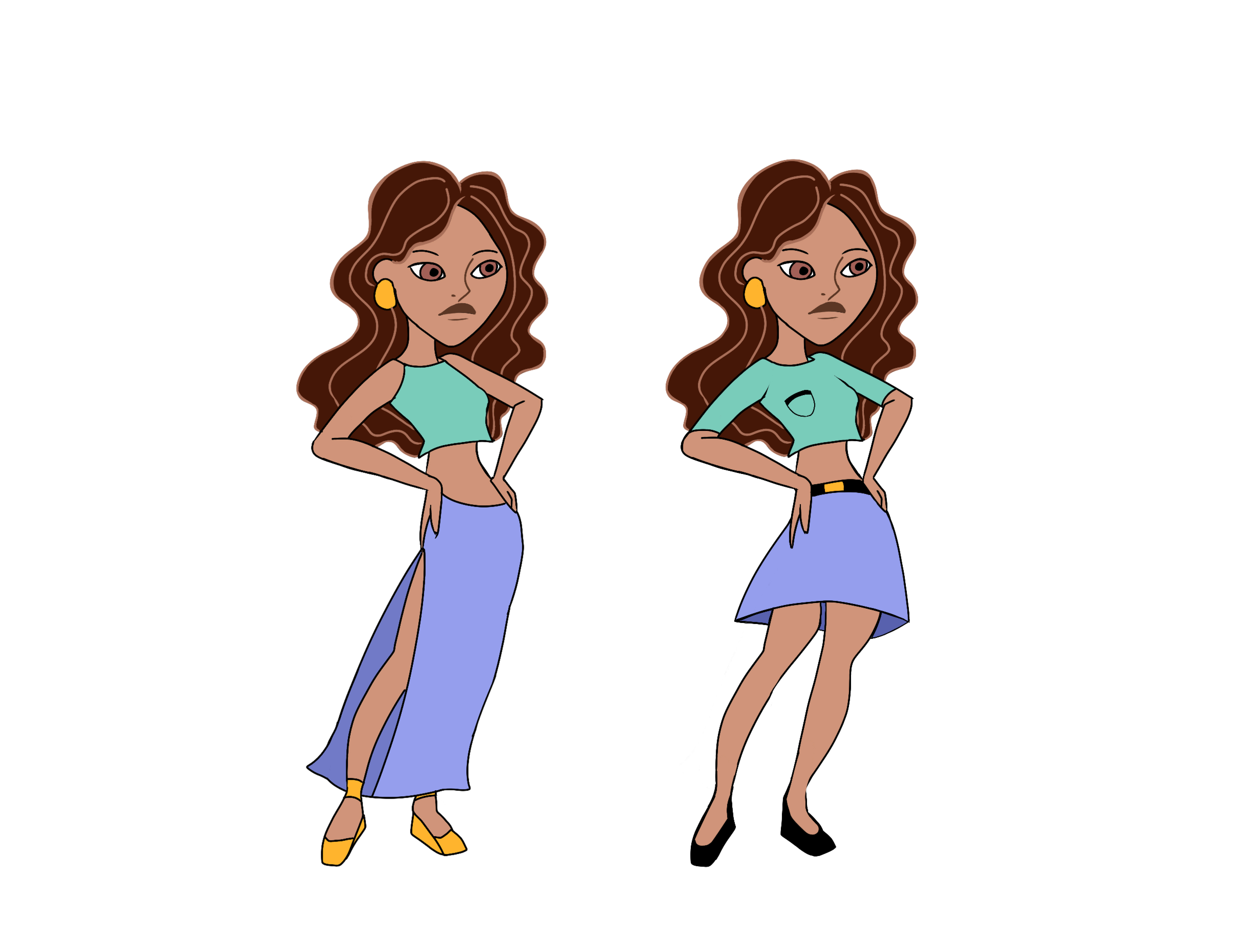
For the female character, I based her pose and look on Kim Possible and adjusted the
proportions for a better figure. I took clothing inspiration from Everskies and matched the line art
to Kim Possible’s style.
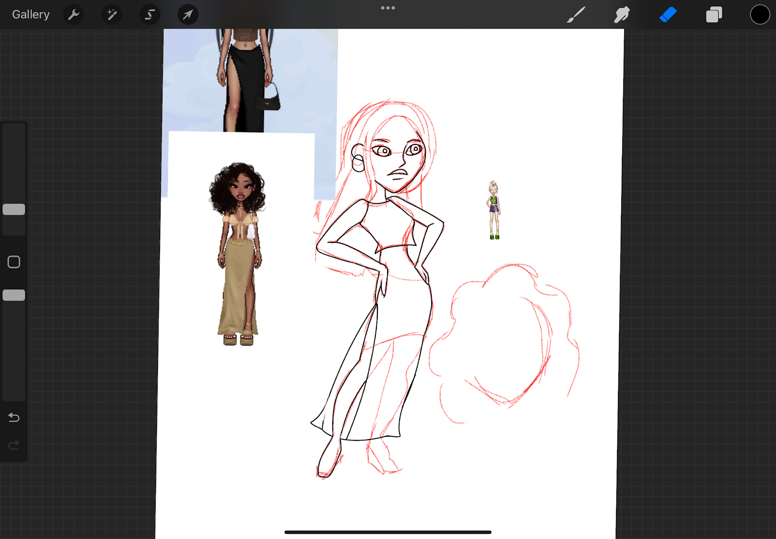
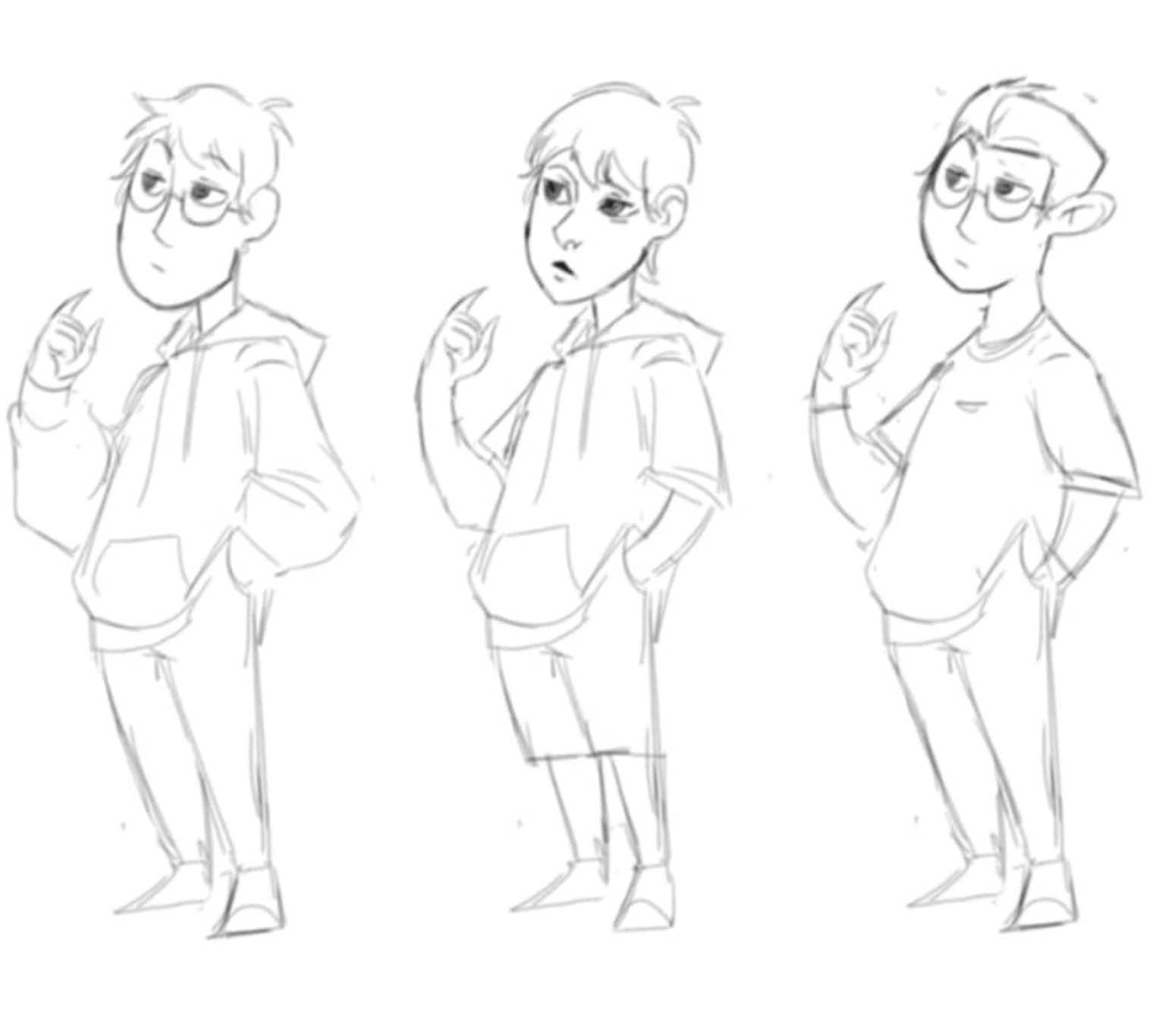
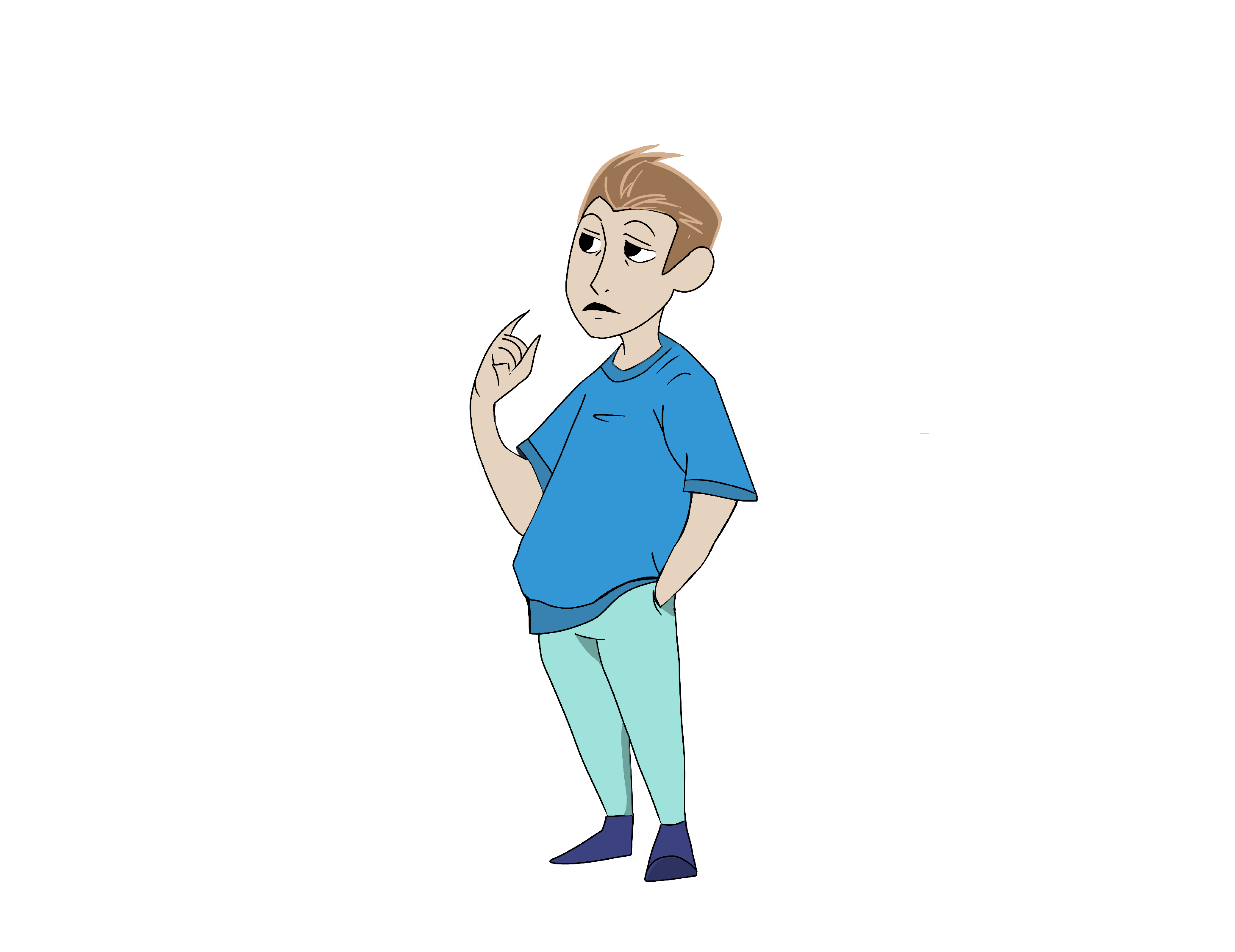
For the male character, I sketched three variations to match the female model. After finalizing
the rough line art, I cleaned up the lines and used vibrant colors that blended well with the
female character’s design.
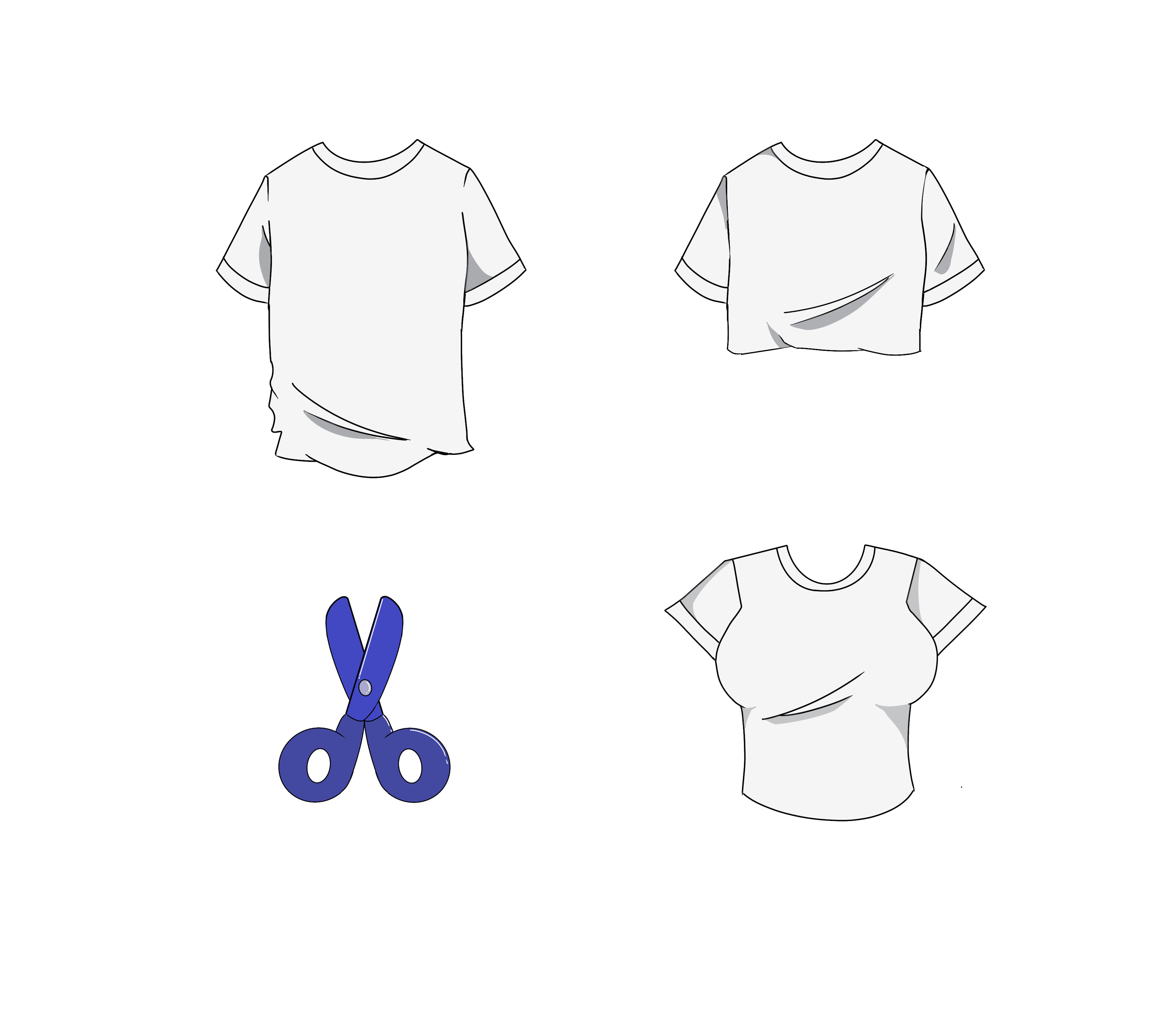
Clothes and Tools
The shirt is a simple, plain T-shirt with clean lines. I chose a greyish tone for the color to make it
versatile for shading and to keep the design minimalist. The crop top design features a soft,
fluffy look with a relaxed fit, giving it a casual, playful vibe. For the scissors, I aimed for a clean,
simple look with a modern touch.
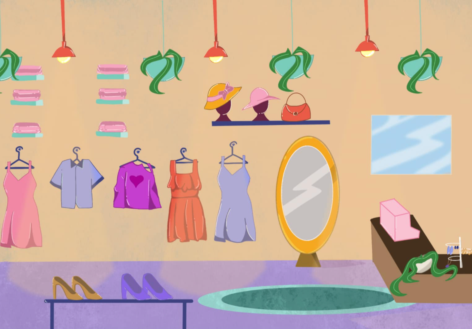
Backgrounds
For the store, I added elements like plain wallpaper, plants, a funky light, and a mirror to create
a boutique feel. I included jewelry, hats, and bags to bring the design to life, focusing on
balancing colors for a simple and engaging look.
Feedback
My group members liked the character designs, clothes, and tools I created. We decided to test
how they would look in the background created by another group member to see if they fit well
together. After doing that, we asked for feedback on how the assets looked together.
Second Iteration
After receiving the feedback, I immediately tested different versions. For the characters, I
created versions without any outline and with a darker outline to see which one worked better. I
did the same for the shirt design. For me, the version with the darker outline looked better and fit
more naturally with the background created by my groupmate.
I was also assigned to work on other clothing pieces and tools, and I focused on making sure
they matched the overall style and vibe we were aiming for in the game.
Reflection
I learned a lot about using Procreate, especially converting designs into pixel art. Experimenting
with different tools improved my skills, and I enjoyed bringing my vision to life by adding
personality to each character. The experience was fun, rewarding, and gave me a deeper
appreciation for the effort behind game designs.
Game Prototype
Link: Figma Prototype
Introduction
I created a working prototype for our game Upcycling with Besties. The prototype highlights the
core gameplay mechanics and gives a clear feel of how the game will look and function. I
focused on ensuring it was interactive and engaging.
Inspiration
The structure and flow of the prototype were inspired by games like Papa’s Pizzeria and other
similar time-management games. I liked how these games are simple yet interactive, guiding
the player smoothly through tasks. I incorporated this style into the prototype I made to make
the gameplay fun, intuitive, and easy to follow.
First Iteration
I designed the game’s stations and levels. I started with a layout that included wooden
backgrounds to look like tables, a transparent working mat, tools, and locked stations to
represent progression. This initial design helped me set the game’s overall look and feel.
Feedback
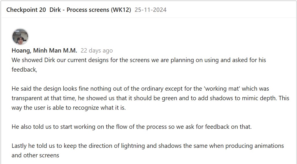
Second Iteration
After getting feedback, I replaced the wooden background with a cleaner design, changed the
working mat to green, and added shadows for depth, making the visuals cleaner and more
vibrant. I also improved the tool presentation by removing unnecessary descriptions since the
drag-and-drop mechanic was already intuitive. After that, I started putting together the flow of
the upcycling process while following the order of tasks and tools.
To make the game more interactive, I added features like a drag-and-drop mechanic and
walking animations. To implement the drag-and-drop feature, I followed a video tutorial. Next, I
wanted to make the game feel more realistic, so I added walking animations for the customers
by following another tutorial, even though the characters appeared slightly floating. Lastly, I
added our crab logo to guide users through the game and tie everything together.
Link: Second Iteration Demo

Feedback
After finishing the prototype iteration, I went to test the game with some teachers and other
students.
Third Iteration
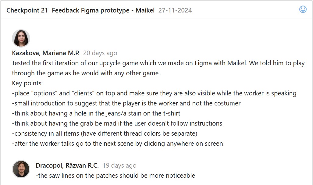
After usability testing, I finalized the prototype with some help from my groupmate. I added more
details to the clothing, like holes in the pants and shirt stains. I included all three patches in the
first station and added a separate space for the thread to improve clarity. I also fixed the
conversations so that clicking anywhere would move to the next scene.
Link: Third Iteration Demo
After finalizing the prototype, we started coding the game. We made sure to address the
feedback we received from usability testing and focused on improving the mechanics to ensure
the game was displayed more clearly and effectively.
Reflection
I enjoyed creating this prototype and learning new skills in Figma, like animations and
interactive drag-and-drop mechanics. The feedback helped me improve my designs at each
step. Seeing the prototype develop with every iteration gave me a better understanding of game
development and how small adjustments can make a big impact.
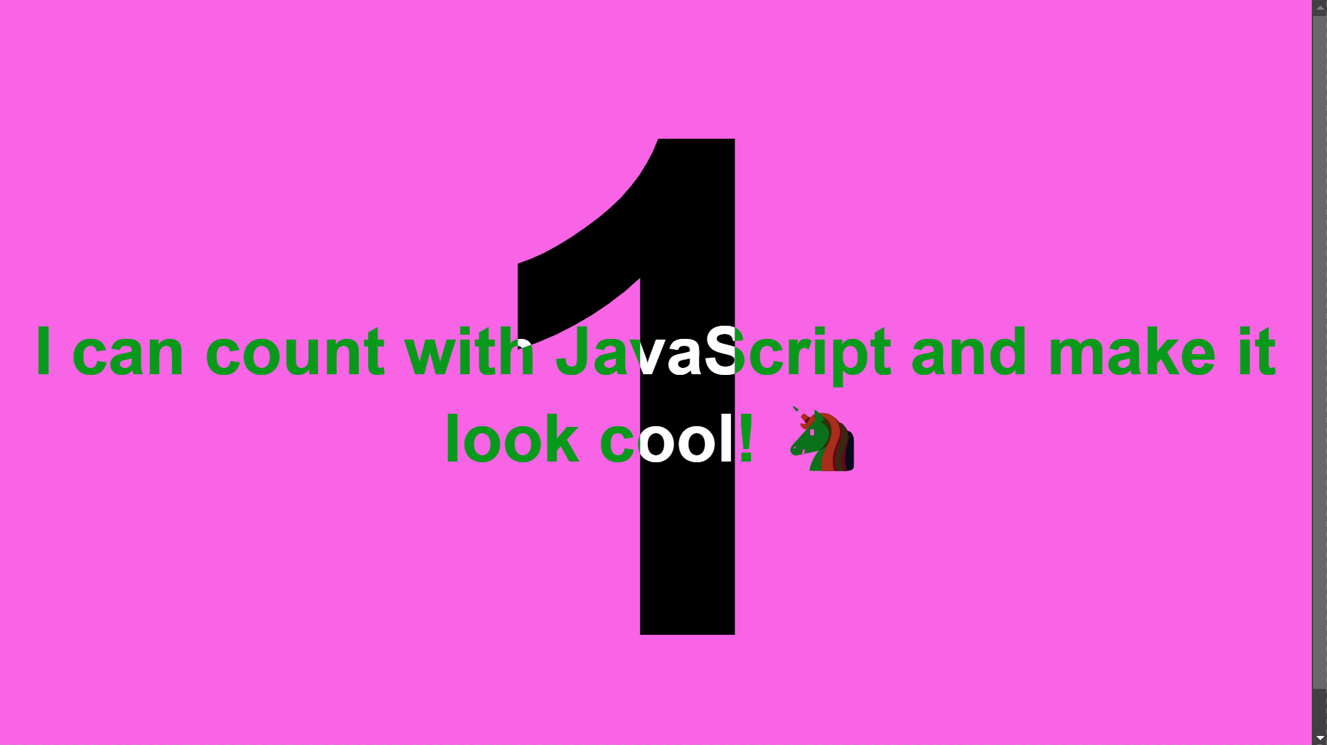
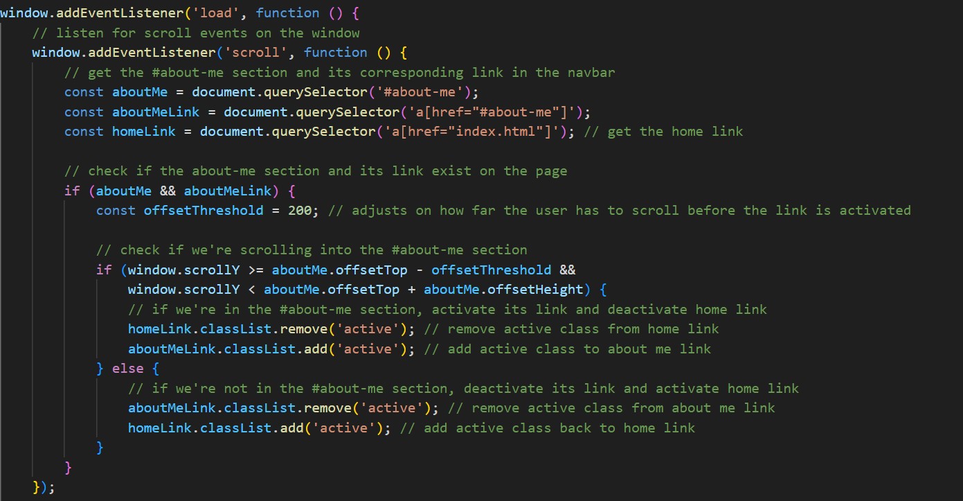
JavaScript Counter
Link: https://i522385.hera.fontysict.net/javascript-counter/
Introduction
I made an interactive JavaScript counter as a personal project during my free time. The
counter increases by 1 every second while changing the background colors and keeping
the text easy to read. I focused on improving the code by making several iterations to
refine both its functionality and design. This project helped me practice optimizing the
code to achieve a smoother, more attractive design.
First Iteration
I wanted to challenge myself during my free time by creating a JavaScript counter. After
reviewing and understanding the challenge instructions, I started coding with HTML, CSS, and
JavaScript. My approach was to try out different CSS styles that I already knew while
experimenting with the design.
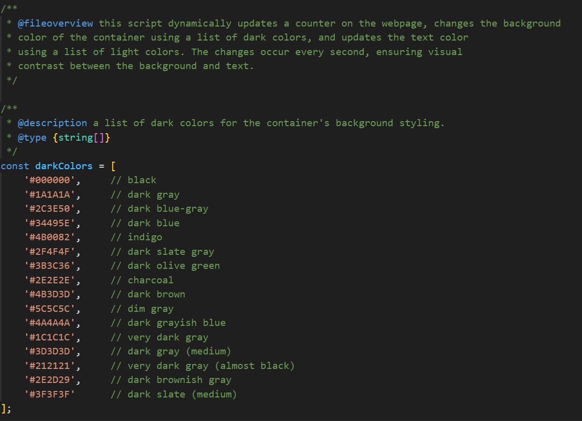
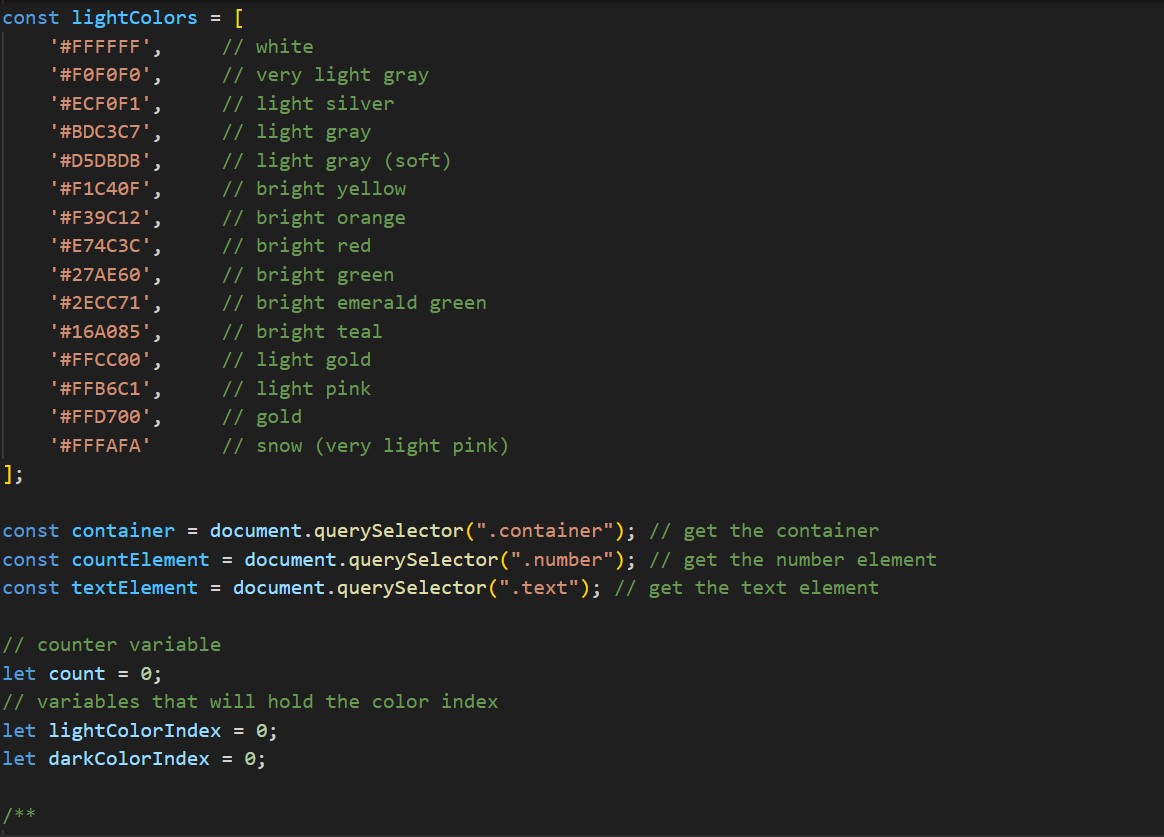
So, what I did was I created a dynamic counter that increments every second while randomly
updating the background and text colors for contrast and readability. Using arrays of light and
dark colors, I ensured no consecutive repeats for a fresh design. I also used ChatGPT to
generate complementary color combinations to ensure the background colors blended well and
kept the text readable. I used JavaScript DOM manipulation and setTimeout to continuously
update the styles, which made the project both functional and visually appealing.
Feedback
After finishing the first version of the JavaScript counter, I struggled to achieve the styling and
functionality I envisioned, especially with getting the colors to look good while keeping the text
readable. I showed my code to a classmate and explained how I was using two arrays for light
and dark colors. They suggested trying a mix-blend-mode to enhance the design and improve
color contrast. Their feedback made the process easier and helped me improve my project.
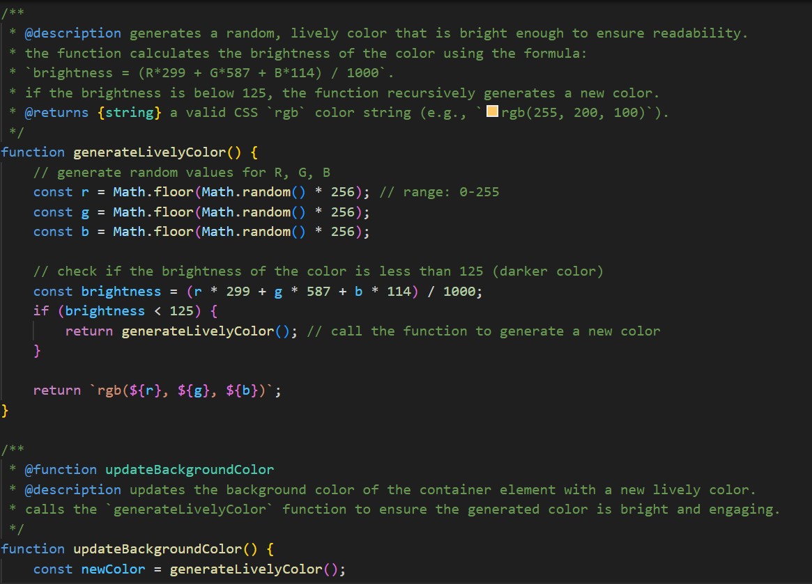
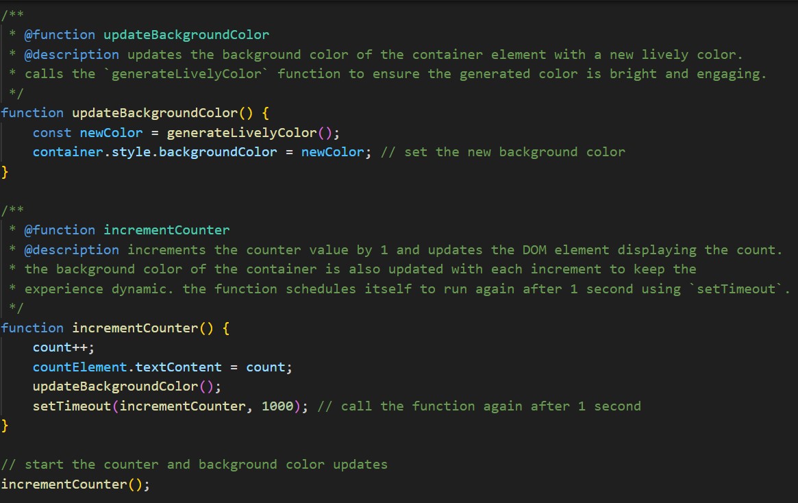
Second Iteration
After receiving feedback to simplify color management, I introduced dynamic color generation
using a custom function, generateLivelyColor, which creates random RGB values. To maintain
vibrant and readable backgrounds, the function checks brightness and regenerates colors if
needed. I also utilized the mix-blend-mode property to improve color contrast and readability.
The updated design features a JavaScript counter that increments every second while updating
the background and text colors dynamically. Using a setTimeout loop, I ensured an interactive
and visually appealing experience with simplified logic.
Reflection
This project allowed me to develop an interactive JavaScript counter, focusing on improving
both its functionality and design. It helped me improve my coding skills and taught me the
importance of optimizing code and being open to feedback. Each change I made helped me get
better at solving problems and creating designs that work well. All in all, it boosted my
confidence in coding and showed me how small adjustments can make a big difference.
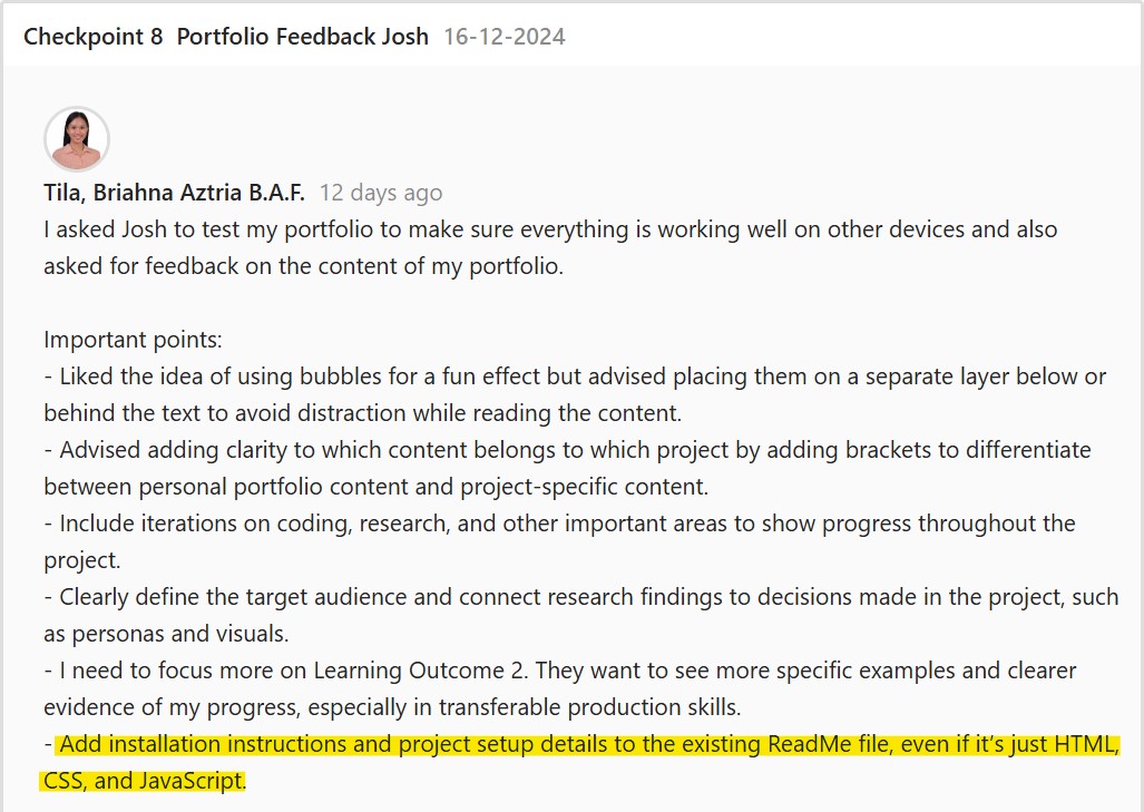
Comments and ReadMe
Introduction
I focused on refining and documenting my code to enhance clarity and usability. The goal was to
ensure that the HTML, CSS, and JavaScript code is well-organized and easily understood,
especially for other users who may review or utilize it. I added code comments to explain the
functionality and created a ReadMe file detailing the project’s purpose, usage, and setup.
First Iteration
In the first iteration, I focused on adding comments to the code for better clarity, creating a
detailed ReadMe file to outline the project’s objectives and features, and implementing the basic
structure using HTML and CSS.
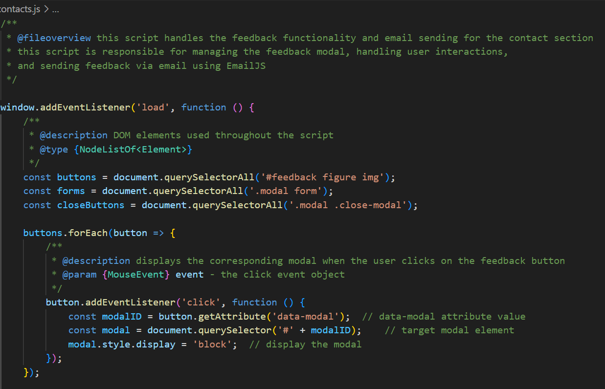
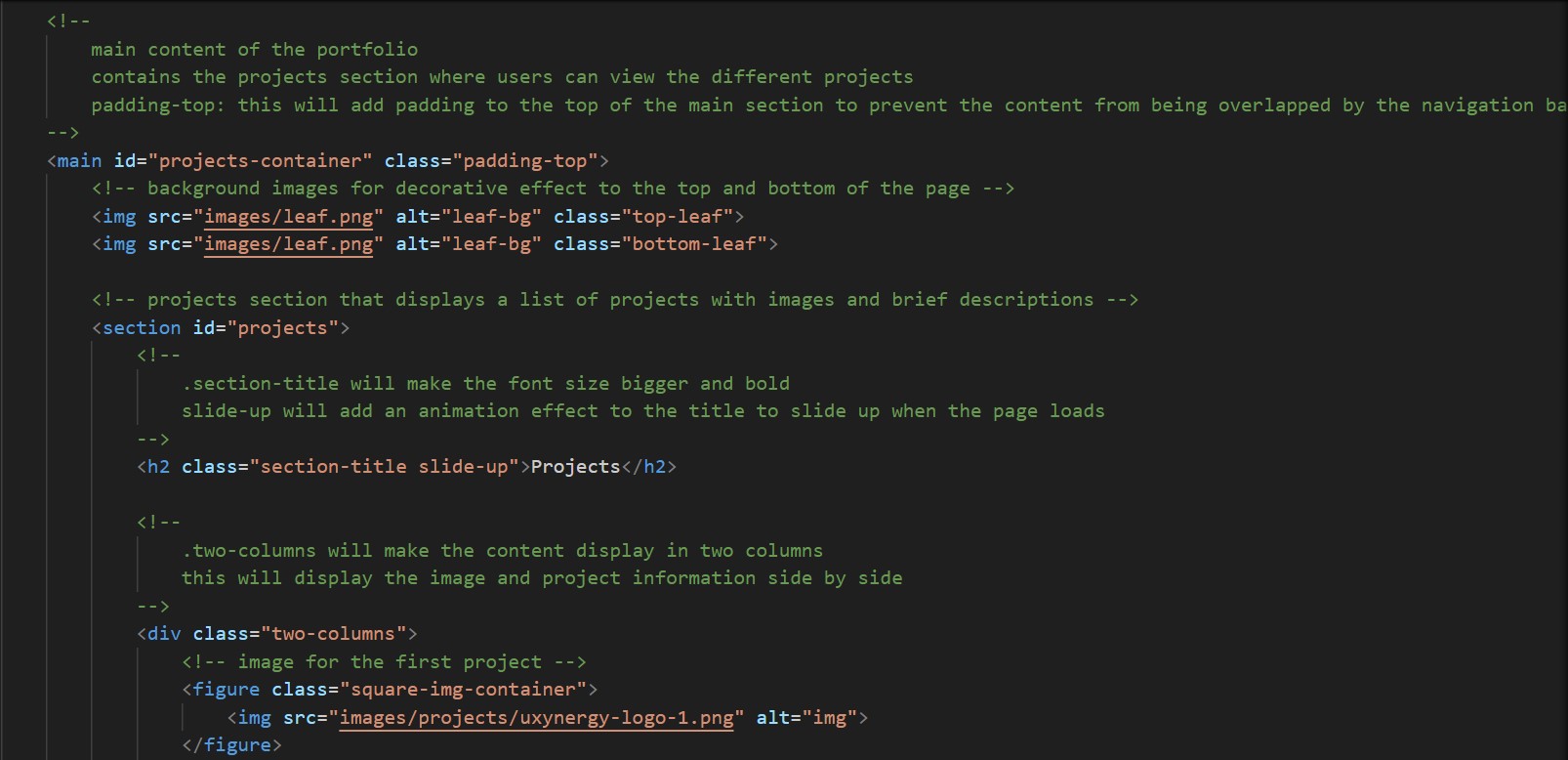
Comments
In the HTML file, I provided comments describing the structure of each page section. This
makes it easier to identify the organization of the code without analyzing it line by line.
In the JavaScript file, I added comments to nearly every line and section of the code to make it
easier for others to understand. These comments explain the purpose of variables, conditions,
and functions, helping users or developers who interact with the code later. This approach
ensures clarity, especially for those less familiar with the project.
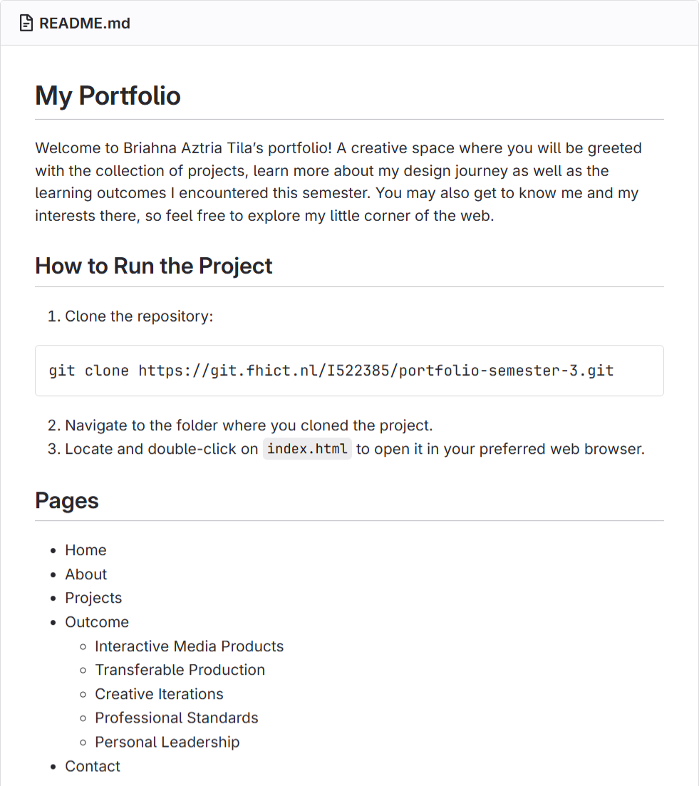
ReadMe File
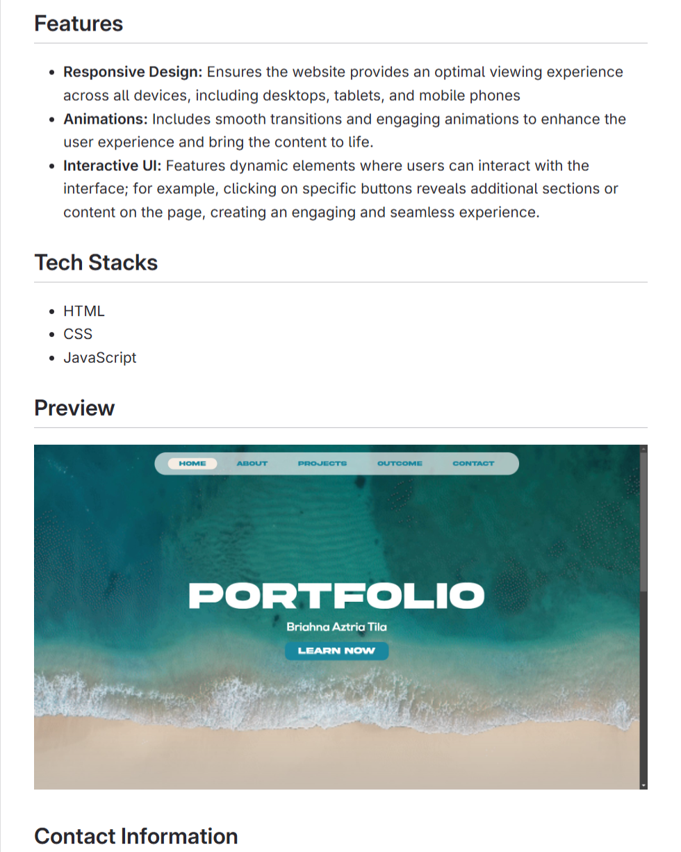
For my first ReadMe, I provided an overview of the project, highlighting its purpose, key features
that enhance the user experience. I also listed the tech stack used—HTML, CSS, and
JavaScript—and included contact information for feedback. This document serves as a concise
guide for anyone exploring or using the project.
Feedback
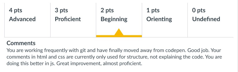
During the second formative assessment of my portfolio, Stan and Dirk reviewed my code and
provided feedback on the JavaScript comments. They noted that including comments on nearly
every line made them redundant, as many parts of the code were already self-explanatory. They
suggested refining the comments to focus only on key sections that required clarification.
Separately, I asked Josh to test my portfolio and review my ReadMe file. He provided additional
feedback, which helped me identify areas for improvement and ensure the documentation was
clear:
Second Iteration
After receiving feedback regarding the redundancy of my JavaScript comments, I decided to
implement a more structured approach using JSDoc. This method allowed me to provide
concise, yet detailed, documentation for functions and key sections of the code rather than
commenting on every line. By adopting JSDoc, the code became easier to understand and
navigate for other users.
In the HTML comments, I made minor adjustments to provide clearer explanations for specific
sections. The new comments focus more on the purpose of each block, making the structure
slightly more organized than before.
For the ReadMe file, I added a new section explaining how to run the project, including
instructions for cloning the repository and opening the main HTML file. Also, I included a
preview of the project to give users a better idea of what to expect before diving into it. These
updates significantly enhanced the documentation by making it more user-friendly and
accessible, ensuring that first-time users can easily set up and explore the project.
Feedback
Third Iteration
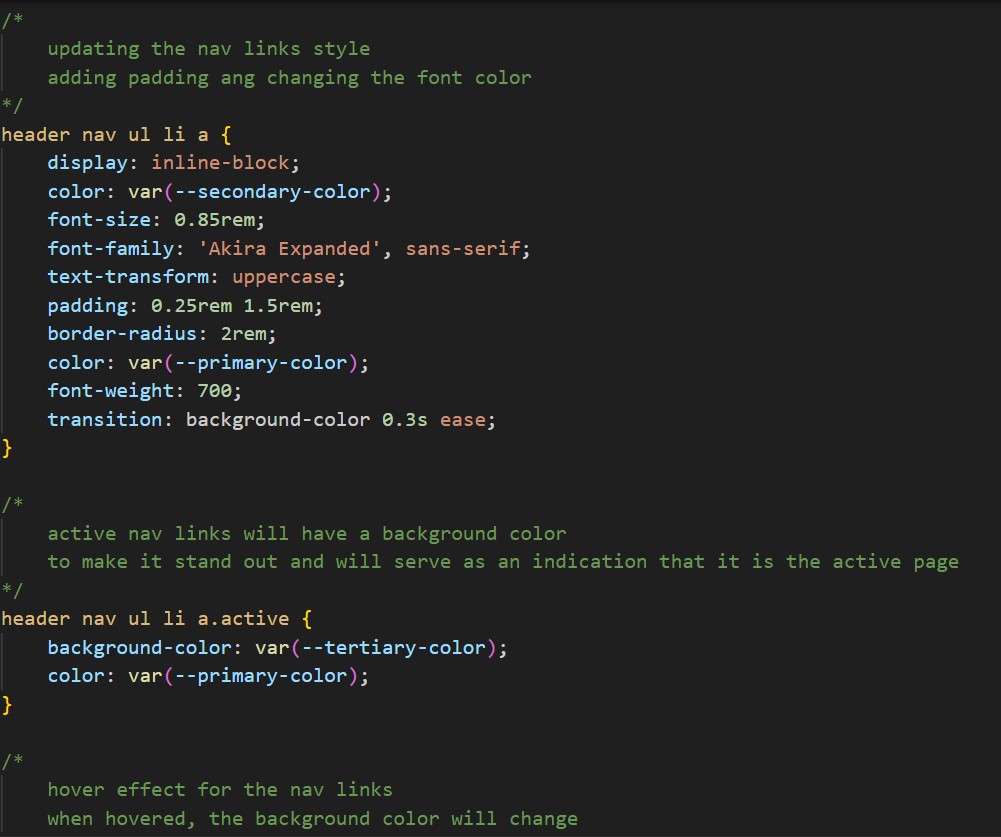
After receiving more feedback, I made further improvements to the comments in my HTML and
CSS. I worked on making the HTML comments more explanatory to help readers understand
the structure without needing to look at the CSS.
For the CSS, I focused on adding comments to clarify the purpose of each class. These updates
aimed to provide a clearer context for each section of the code, making it easier for anyone
reviewing the code to understand its purpose and functionality.
Feedback
Reflection
Through this process, I learned how important it is to be clear and precise when commenting on
code and documenting projects. It made me realize that well-written comments not only help
others understand my work but also improve my own understanding and efficiency. Creating a
detailed ReadMe file also taught me how essential it is to guide users and make projects easier
to navigate.
This experience has also helped me improve my approach to other projects. Moving forward, I’ll
make sure to apply these practices of clear documentation and detailed code comments in all
my future work.
Website Prototype
Link: Figma Prototype
Introduction
I created a website prototype for Patrick Manalad, the stakeholder of Filipino Drivers Europe, a
business that offers van services and tours for Filipino tourists, helping them explore various
cities. The main purpose of the website was to effectively showcase the business and its tour
services. Before I started developing and coding the website, I focused on ensuring that it would
highlight the business’s services, list the cities covered by the tours, share client feedback, and
provide an easy, updated way to book a service.
My goal was to create an output that would allow users to quickly find details about the tours
and book services without hassle, all while keeping the design simple yet easy to navigate.
First Iteration
I started conceptualizing by interviewing the stakeholder about their vision for the website and
researching their competitors. I asked him questions to fully understand the business and the
features he wants to see. This has helped me understand their goals, target audience, and
important details, while giving me ideas on which pages and features to include. With
benchmark creation and design pattern searches, this has helped me determine user-friendly
designs that I can establish on the website.
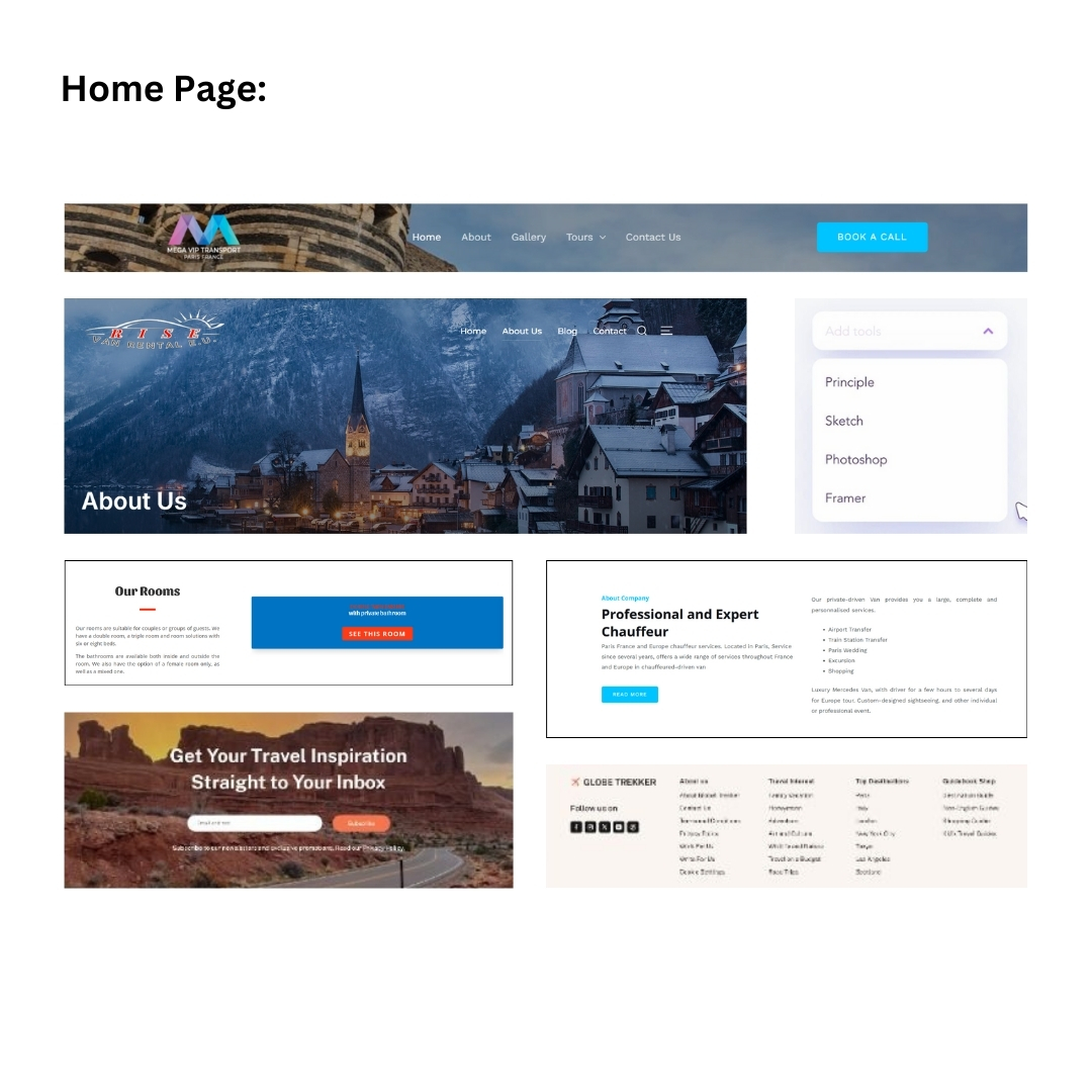
Mood Board
I looked for design layouts through existing websites such as Pinterest, which helped me find
inspirations for each page. I looked for tour website designs that are simple and professional but
are bright and eye-catching, as well as those that have user-friendly layouts.
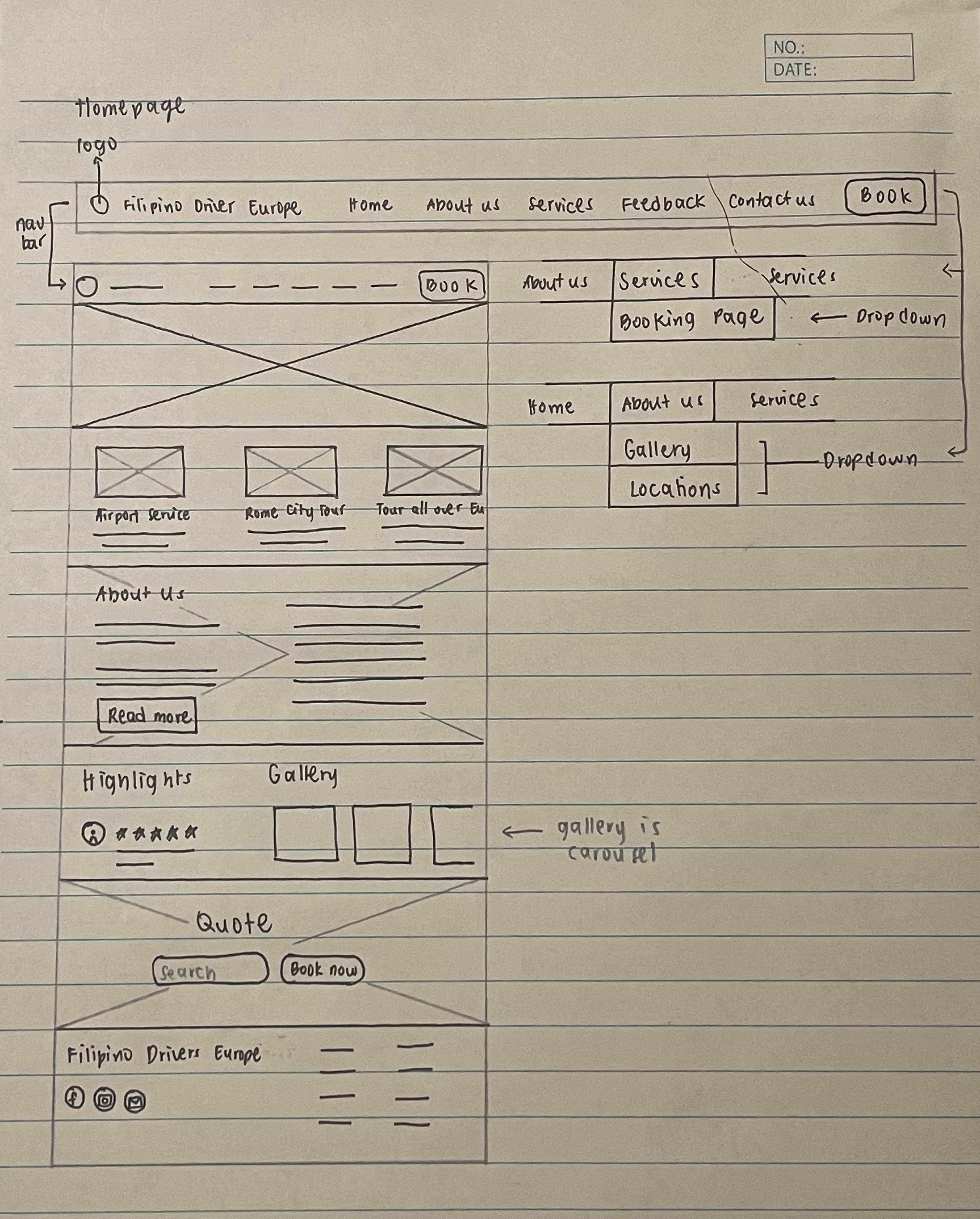
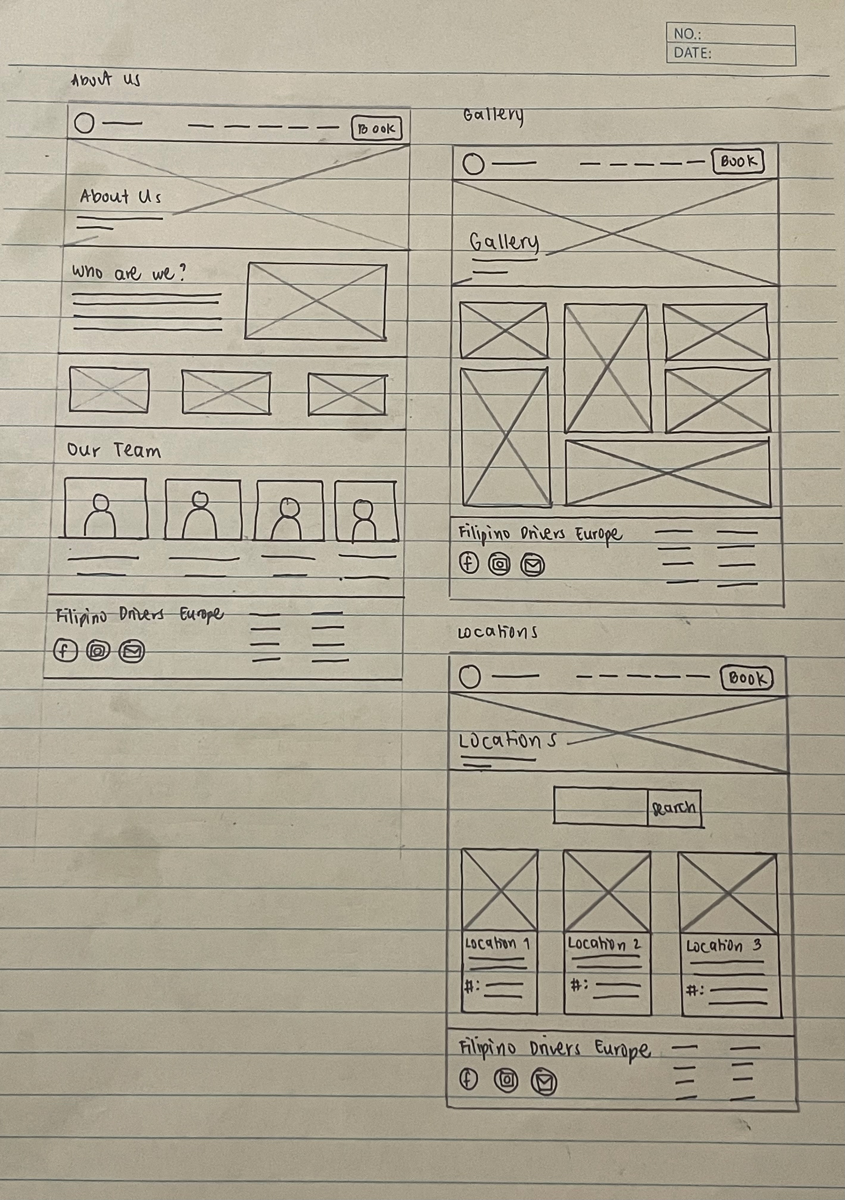
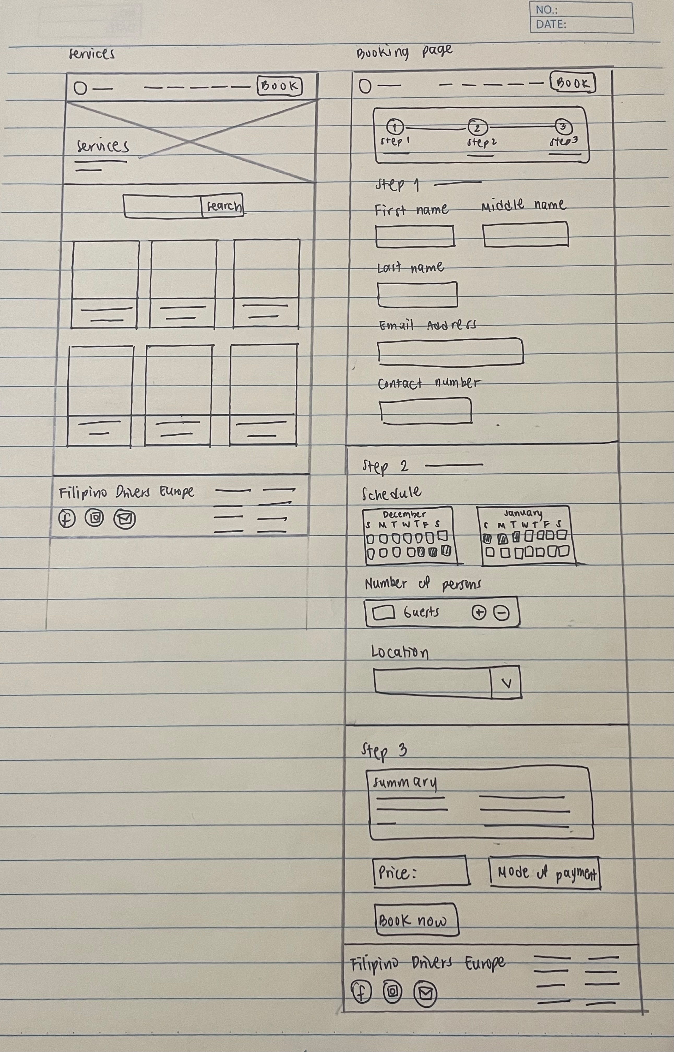
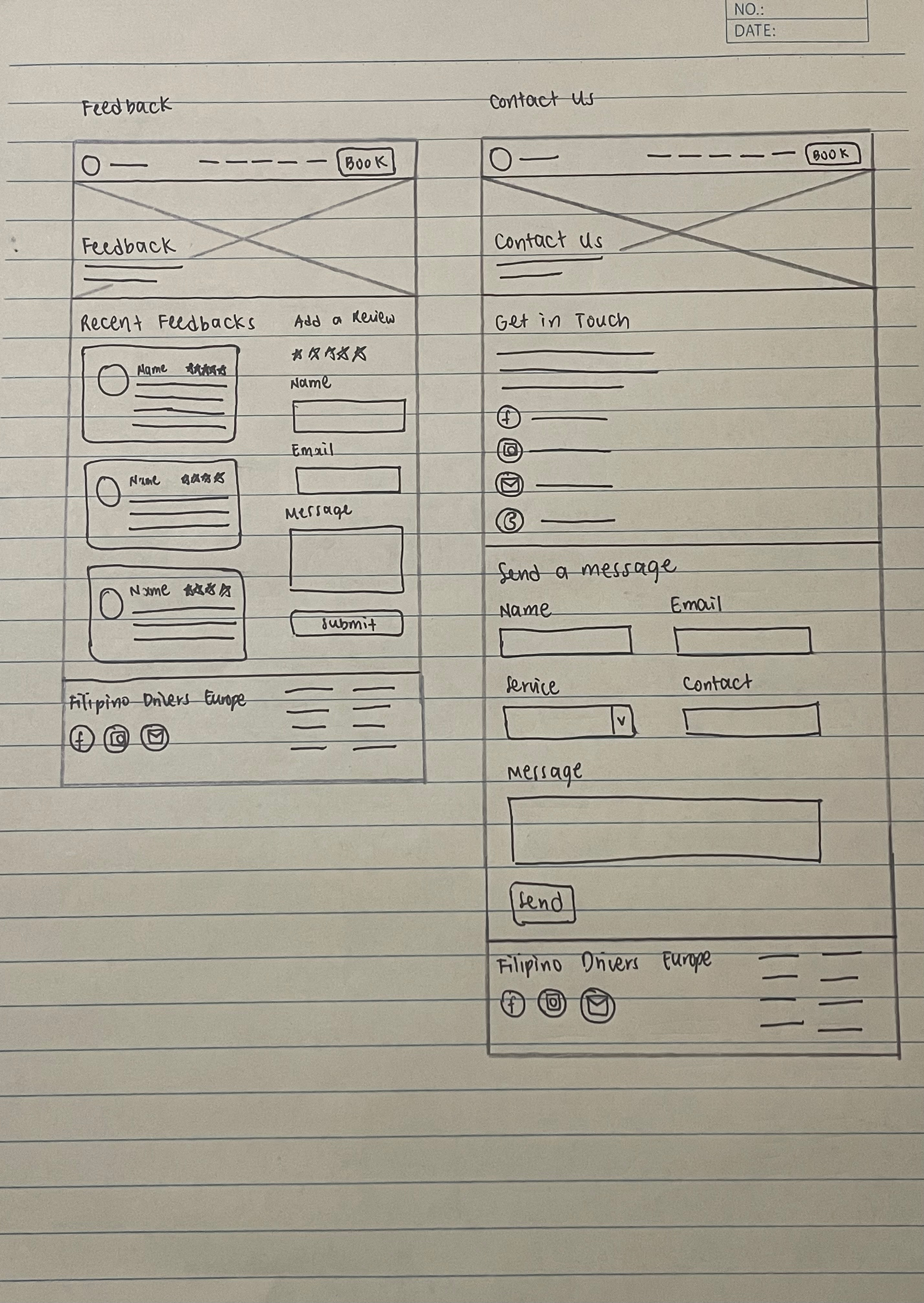
Sketches
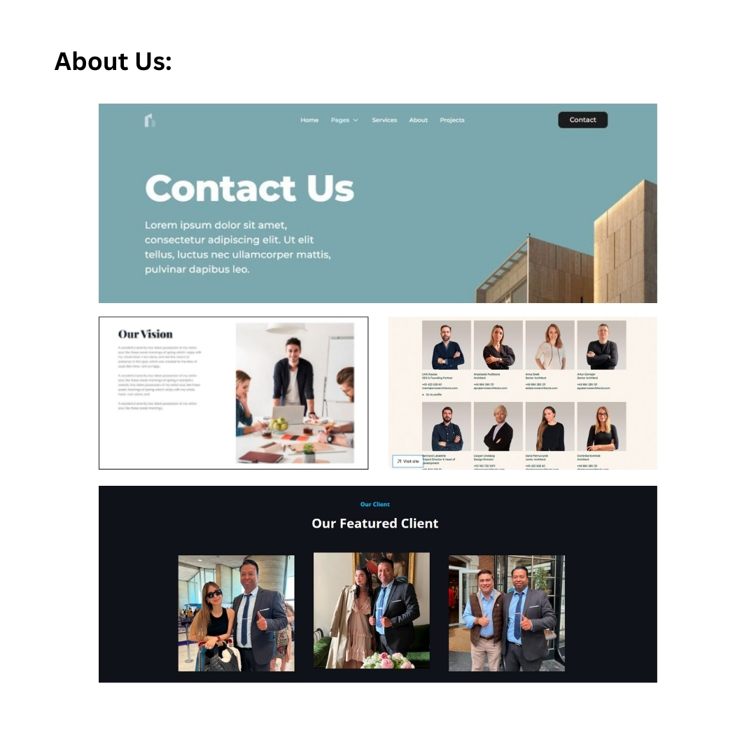
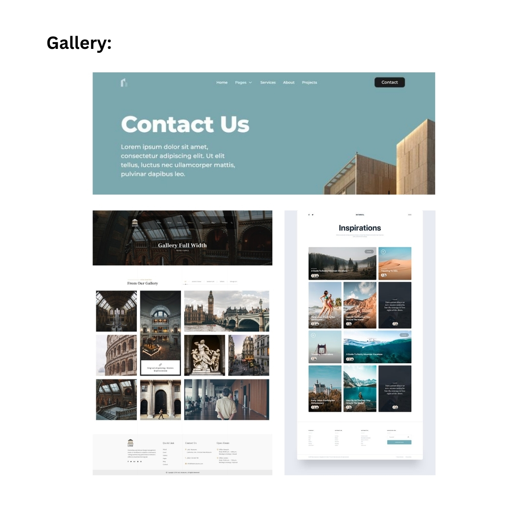
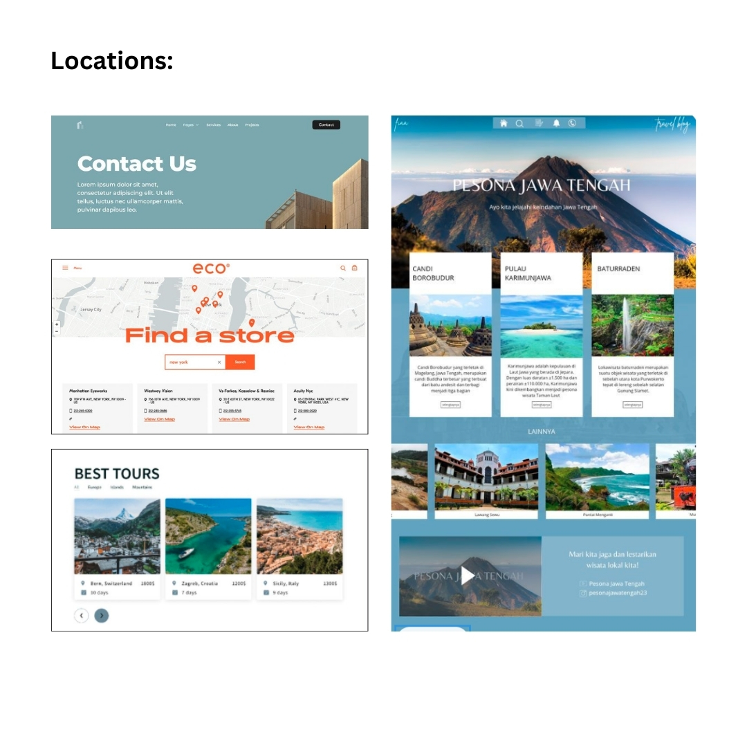
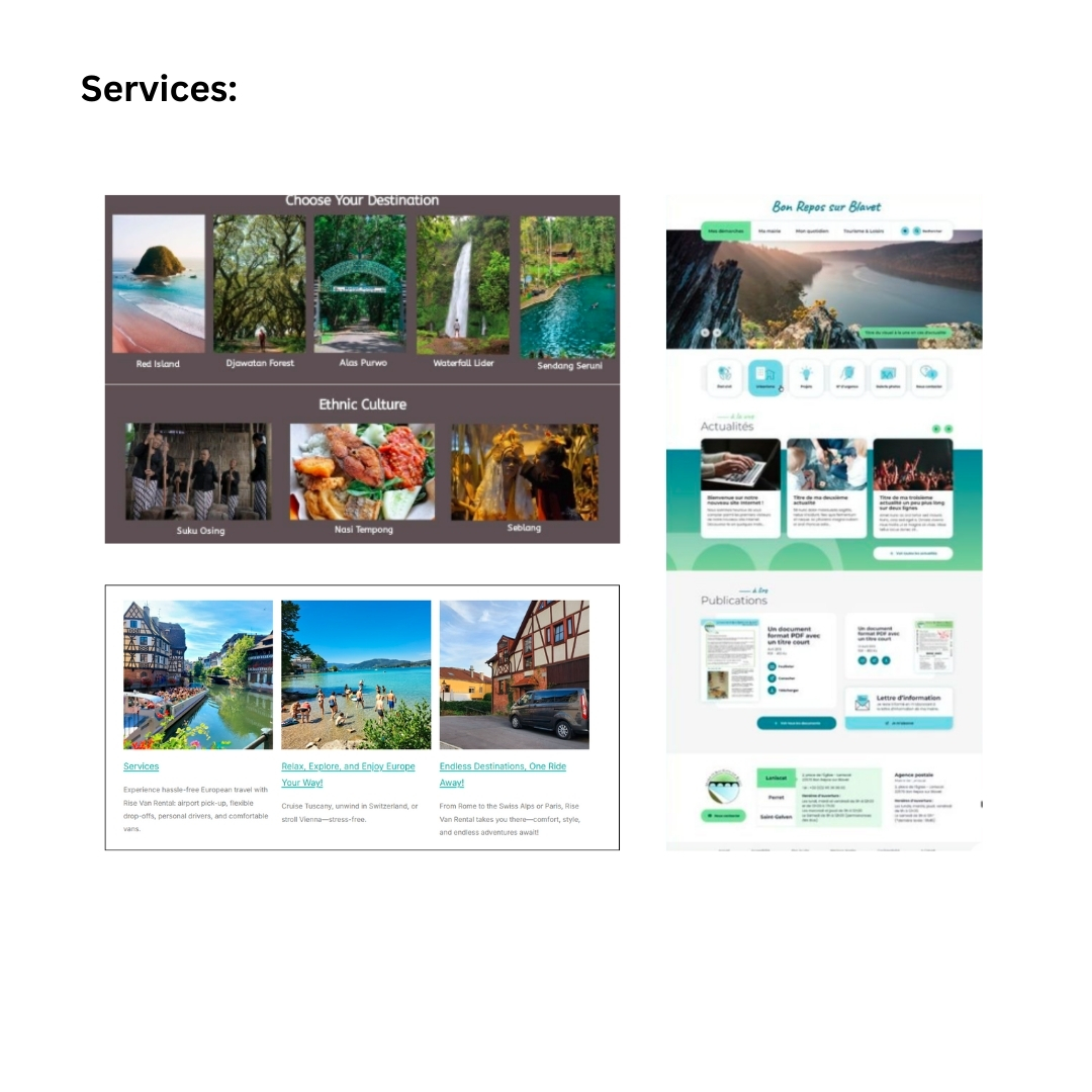
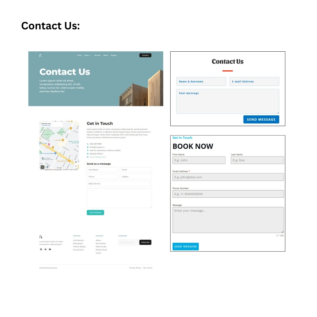
I initially sketched the layout for each page — Home, About Us, Gallery, Locations, Feedback,
Contact Us, Services, and Booking Page. I had the idea of creating additional pages, such as
About Us, Locations, Contact Us, and Services, because competitors have the same pages on
their websites, and other web layouts I have found on Pinterest feature them too. Then, I
proceeded to make it as simple and straightforward as possible to ensure easy navigation for
the stakeholder and audience.
Feedback
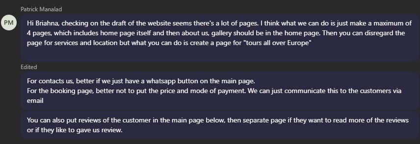
Second Iteration
For the second iteration, I proceeded to create the wireframe, but this time, I applied the
feedback and suggestions from the stakeholder. I compiled all the pages that were removed,
such as the About Us, Contact Us, Services, Gallery, and Location pages, into the Home page
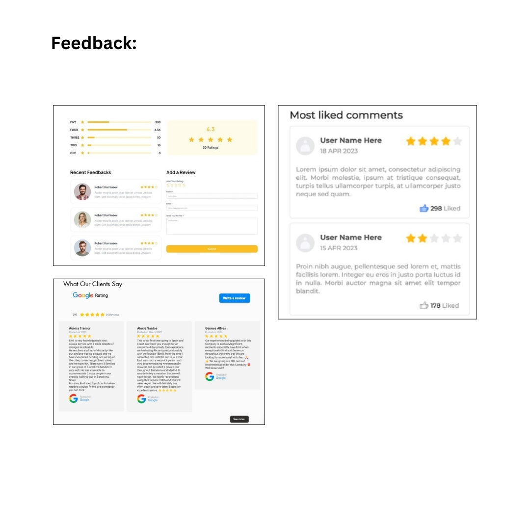
and created sections for each. I then created a ‘Tour All Over Europe’ page to showcase the
cities where the tour takes place and renamed the ‘Feedback’ page to ‘Reviews.’ I also removed
the ‘Price’ and ‘Mode of Payment’ sections. Lastly, I included a WhatsApp button on each page
that opens a chatbox for inquiries.
Feedback
Third Iteration
For the third iteration, I took note of the stakeholder’s feedback in the wireframe and applied
these changes to the Hi-Fi prototype. Before I began, I started compiling the necessary
elements, such as the logo, gallery pictures, and links for the website.
Mood Board
I began the design process by looking for inspirations on Pinterest, and other competitor’s
websites. I also browsed for simple travel and business-related platforms that are a bit bright
and pleasing to the eyes, then I compiled these into a mood board. I took note of how they
established a user-friendly design and layout.
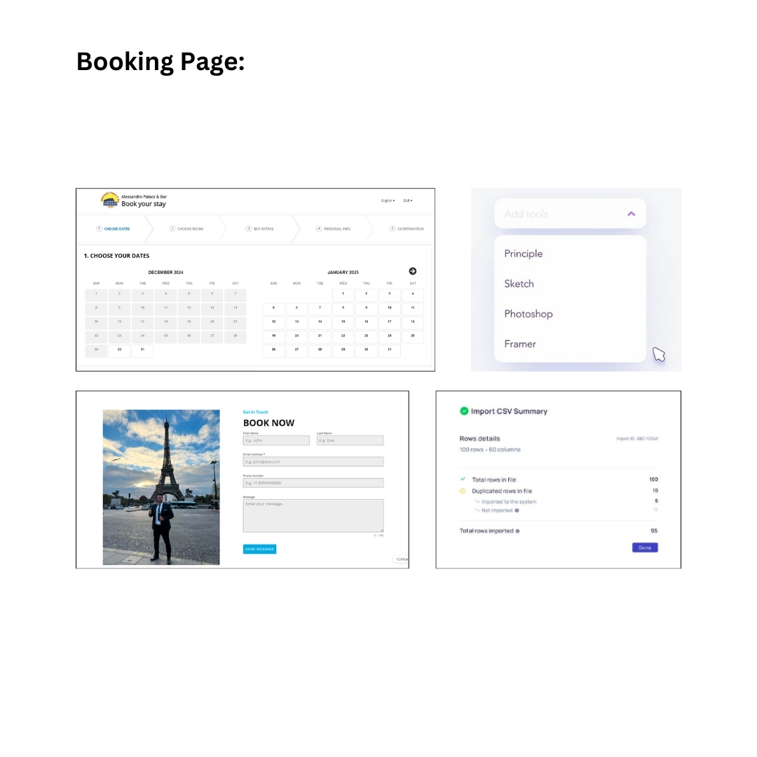
Hi-Fi Prototype
I merged the About Us and Gallery sections into one and added a carousel for the pictures.
Then, I fixed the arrangement of the services and cities on the ‘Tour All Over Europe’ page and
added short descriptions for each. I also removed the carousel on the ‘Reviews’ page for easy
viewing, divided the entire ‘Booking’ page into three separate pages, each for a different step,
instead of creating a single long page, and added a message box in case clients want to type
additional comments about the service they are booking.
I created the design similar to their competitors, featuring a welcoming hero page with a view of
a city, bright colors such as yellow, rounded buttons that complement the overall layout, and
picture overlays in some sections. This design gives a positive vibe when users enter the site.
Feedback
Fourth Iteration
After receiving the feedback, I applied the changes by adjusting the labels of the call-to-action
buttons on the homepage and the navigation bar, rearranging the ‘Booking’ pages according to
the stakeholder’s preferences, and adding a pop up with a confirmation message whenever the
user clicks on the yellow ‘Book Now’ button in the Summary section. I also improved the footer
by removing the social media icons and links, and included a pop up for the Terms and
Conditions, making the footer design more simple.
Feedback
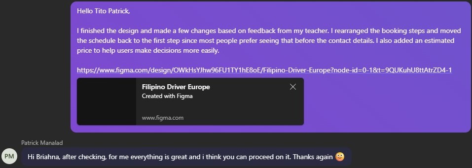
Fifth Iteration
For the fifth iteration, I applied the feedback from my teacher and improved the titles on the
‘Home’ page and ‘Tour All Over Europe’ page to clarify that the cities are not clickable. I also
rearranged the ‘Booking’ pages based on feedback that most people prefer seeing the schedule
before the contact details and added an estimated price in the Summary section so that users
have an idea of how much the service costs. Also, I changed the chatbot icon to provide a more
approachable way for users to make inquiries.
Feedback
Reflection
I enjoy working on my passion project because it will help a lot of Filipinos whenever they want
to tour all over Europe. Also, I wanted to practice my design and coding skills with this project to
make sure that I keep on improving. I had fun conceptualizing the designs, layouts, and finding
inspiration, then coding them. I have a passion for UI/UX design and am eager to pursue this
field in the future. The feedback I received from the stakeholder and my teacher was very
helpful, as it guided me in creating a prototype that they were satisfied with.
Website Development
Link: https://i522385.hera.fontysict.net/
Introduction
I created a website for Filipino Driver Europe, a small business owned by a Filipino based in
Rome that offers van services and tours across Europe. The website was designed to showcase
the company’s services, making it easy for customers—primarily Filipino tourists—to explore,
book services, and learn more about the business. The goal was to build a user-friendly
platform that would attract a broader audience and expand the business’s reach.
Throughout the development process, I made several iterations to improve the website’s
functionality. With each change, I worked on refining features to enhance the user experience
and ensure everything worked smoothly. These updates helped me address challenges and
improve the overall performance of the site, resulting in a more polished final product.
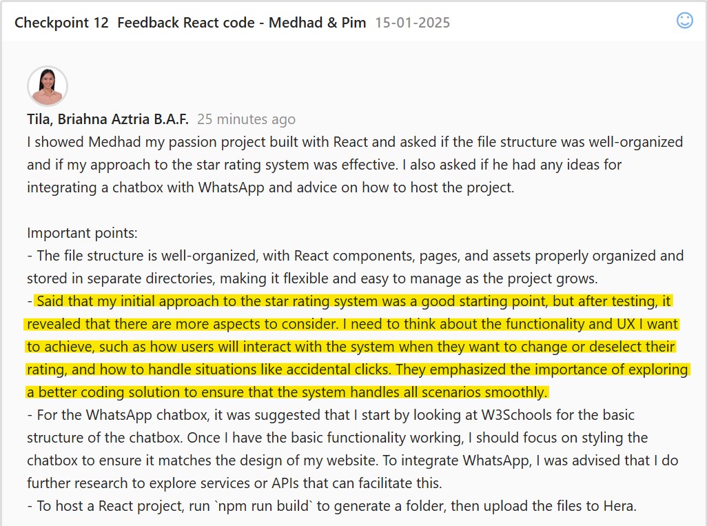
First Iteration
I have a Reviews page on my website where users can see reviews from previous clients. On
this page, users can rate and leave feedback, and they also have the option to add comments
about their experience. Currently, I’m focusing on improving the star rating system to ensure it
works smoothly, is user-friendly, and accurately reflects the client’s chosen rating.
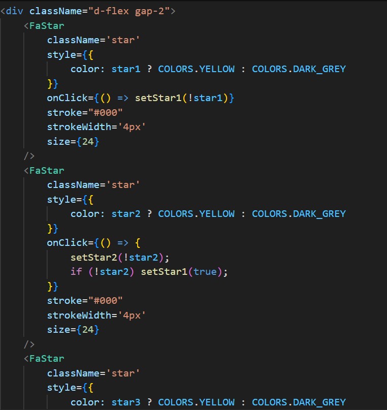
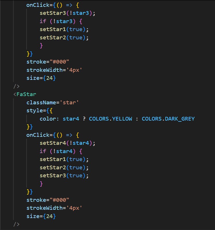
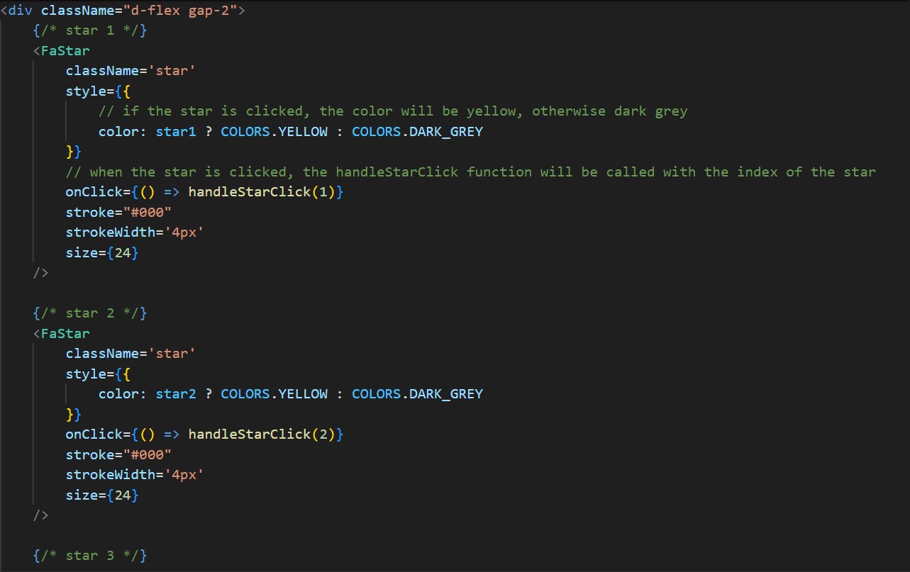
Initially, I created separate onClick functions for each star to update its state and highlight the
current star along with all previous ones. I used useState to manage individual star states,
setting them to true for active stars and false for inactive ones. In each onClick handler, I added
conditional logic to ensure all previous stars are also set to true when a star is activated. The
visual styling is controlled based on the state, toggling between yellow for active stars and grey
for inactive ones.
Feedback
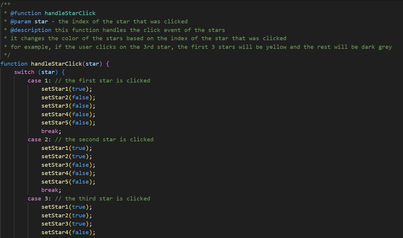
Second Iteration
After receiving feedback, I immediately applied the suggested changes to the star rating system.
I rethought the functionality and improved the code by creating a single function to handle the
logic for all five stars. The function takes a parameter (1 to 5) based on the clicked star and
updates the color of that star and all previous ones to yellow. I used a switch statement to
manage different scenarios, which helped make the process smoother and more consistent.
Now, if a user accidentally clicks a different star, the rating updates correctly without breaking
the flow. I also fixed the previous issue where clicking a colored star would reset it incorrectly.
This update made the code more efficient and the system more reliable.
Reflection
Working on the Filipino Driver Europe website was a valuable learning experience. I gained
insights into the significance of feedback and the iterative process in coding. I realized that it’s
really important to focus on UX because small changes can have a big impact on functionality
and user satisfaction. This experience also boosted my confidence in tackling coding challenges
effectively.