
Learning Outcome #1
Conceptualize, Design, and Develop Interactive Media Products
You create engaging concepts and translate them into interactive validated media products by applying user-centered design principles, visual design techniques and by exploring emerging trends and developments in media, design and technologies.
Evidences

(Studio Branding)
(Client Project)
(Client Project)
(Client Project)
(Client Project)
(Passion Project)
Portfolio
Link: Figma Prototype
Introduction
I created a new version of my Figma portfolio that presents my idea more professionally while
maintaining my personality and branding through my website design.
Inspiration
I conducted benchmark creation and design pattern search using existing websites such as
Pinterest and Behance, which allowed me to see the trends for a cleaner and minimalist
approach to design that gives a professional feel to the users.
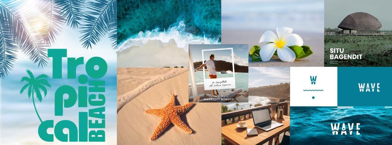
Mood Board
From here, I created the mood board for the website. I focused on using sea-related colors,
clean text styles, and short content to integrate my concept of a “Tropical Coast” then a clean
and minimalist approach to the layout.
First Iteration
Then I proceeded to create the Lo-Fi prototype of my website, which was made from the
website I collected and an example provided by the teacher. I found that I want the structure of
my portfolio to be straightforward. So, I aim for elements such as photos of my works, concise
text, and enough negative space to ensure that my audience will experience the brand identity
of the “calmness” of Tropical Coast.
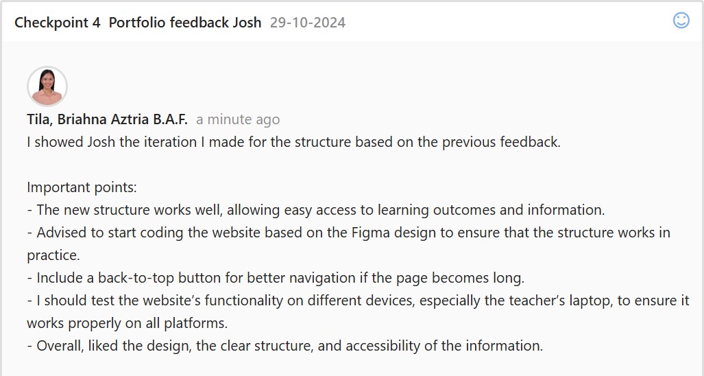
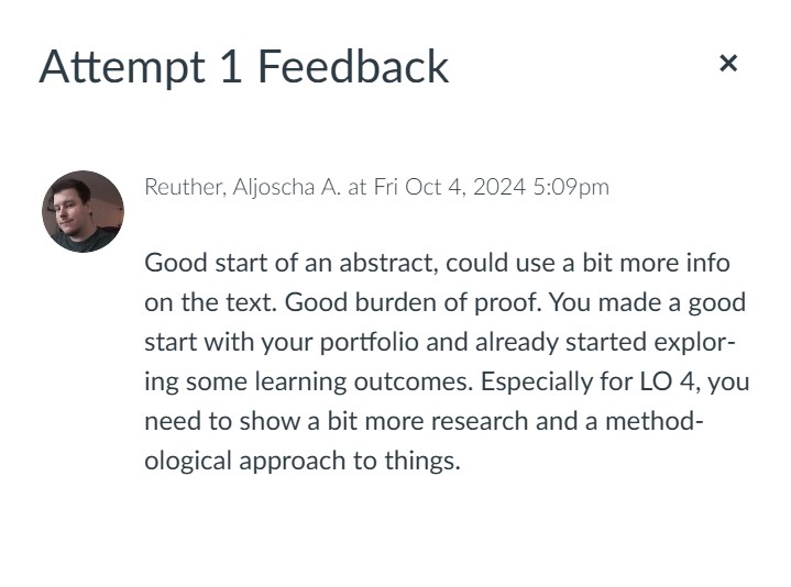
Feedback
Second Iteration
For the second iteration of the Lo-Fi structure, I removed the project information to make it less
wordy and lengthy. Then, the reflection and “what have I done” section is merged.
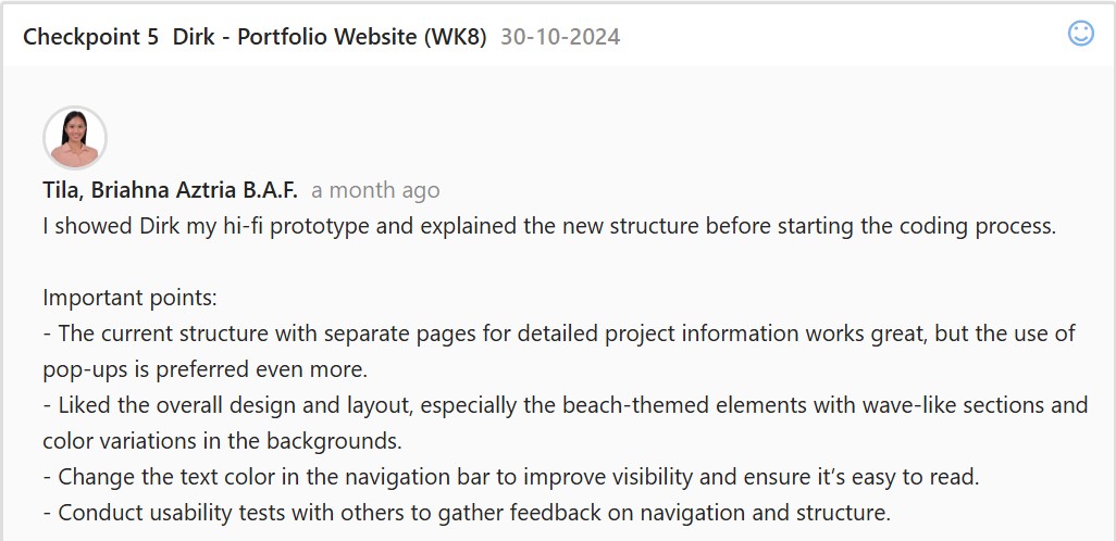
Third Iteration
The third iteration is the creation of the Hi-Fi prototype. After reviewing all the possible layouts
and structures I have for the portfolio, I started to implement the elements that align with my
theme, “Tropical Coast,” and the existing design of my inspirations. The sea inspires the main
homepage, showcasing a moving GIF of waves near the shore. Additionally, elements of waves,
sands, tropical leaves, and seashells are incorporated as one of my inspirations from Pinterest.
To ensure that the design remains minimalist, the boxes and the roundings of corners are
uniformly applied, and the fonts used are clean and robust in their features to maintain a
professional look.
Feedback
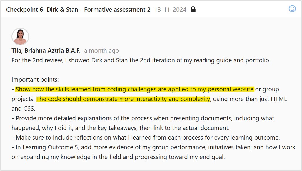
Fourth Iteration
For the fourth iteration, I implemented a new structure to merge the information of the projects
and learning outcomes; therefore, I removed the supposed pop-up page for project information
and merged this with the learning outcomes from my portfolio. I simply implemented a dropdown
area for the evidence and projects in the learning outcomes, which will showcase more details
of that specific evidence when the users click it.
Feedback
After receiving approval for the overall design, I proceeded to code my website. I coded the
website’s layout, texts, and animations. The website must be coded correctly so the needed
actions and interactiveness from Figma can also be seen on the website. Other details and the
process of my coding process may be viewed here.
Portfolio Website
Link: https://i522385.hera.fontysict.net/portfolio-semester-3/
Introduction
I made a website for my portfolio to show the skills I’ve developed, the projects I’ve completed,
and the progress I’ve made throughout the semester. It’s organized to give a clear overview of
my main projects in the “Projects” section and the learning outcomes I’ve achieved in the
“Outcome” section.
First Iteration
After finalizing the design and structure of my portfolio, I started building the website using
HTML, CSS, and JavaScript. To ensure it met coding standards, I validated the code using the
W3C Markup Validation Service. For some functionalities, I reused parts of the code from my
previous portfolio. For the wave designs on the website, I used CSS and made the process
more efficient with a generator from wavier.art.
Problems Encountered
At first, I wasn’t sure how to automatically open the dropdown area on the outcome page when
navigating from the projects page. To solve this, I used URL parameters and the
URLSearchParams() method to detect if the outcome page was accessed via a link and to
check for a parameter named “open.”
Reference: https://www.sitepoint.com/get-url-parameters-with-javascript/
Feedback
Second Iteration
To take this version further, I added animations and effects not included in my prototype. I
initially planned to include a cursor effect that matched my portfolio’s theme, so I researched
possible inspirations online. One of the websites I visited was Awwwards, specifically their
collection of hover and cursor interactions. While browsing through examples, I came across the
About Plantica website, which inspired my design.
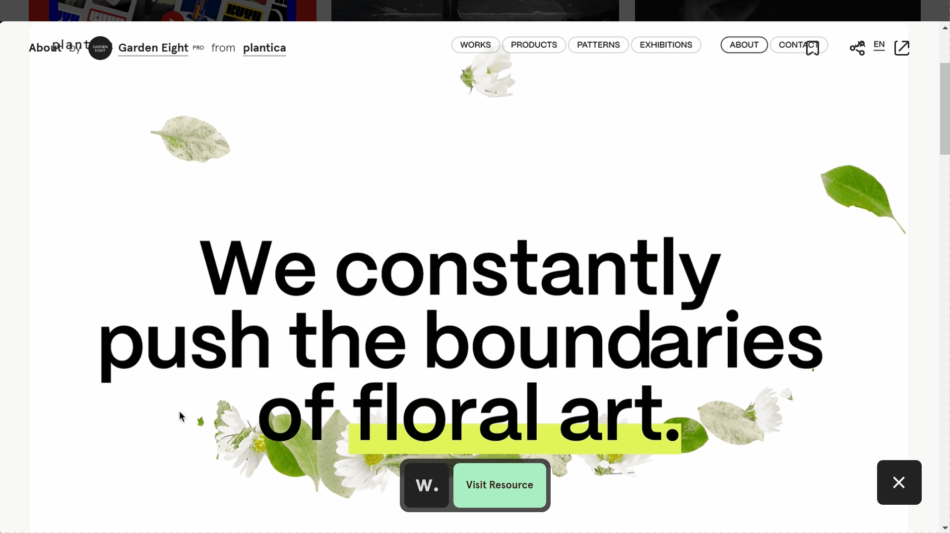
Instead of using a plant-themed effect, I decided to go with a bubble effect to better align with
my portfolio. To create the bubble cursor effect, I looked into resources and found a website
showing different cursor effects. This site provided a bubble effect that became the reference for
implementing my own version in the project.

For titles, I added animations using GSAP, a tool we learned in class. It is a powerful and
user-friendly library for creating smooth and engaging animations. I wanted to make the website
feel more dynamic and interactive, so I used GSAP to add subtle animations to certain titles.

Reflection
I had a lot of fun developing my portfolio as it truly reflects who I am. Experimenting with
animations like GSAP for titles and the bubble cursor effect was exciting since I used these tools
for the first time
This project helped me gain new skills in animations and interactivity. I plan to improve the
website further to make it a strong representation of my work, especially as I prepare for my
internship and showcase my skills to potential employers.
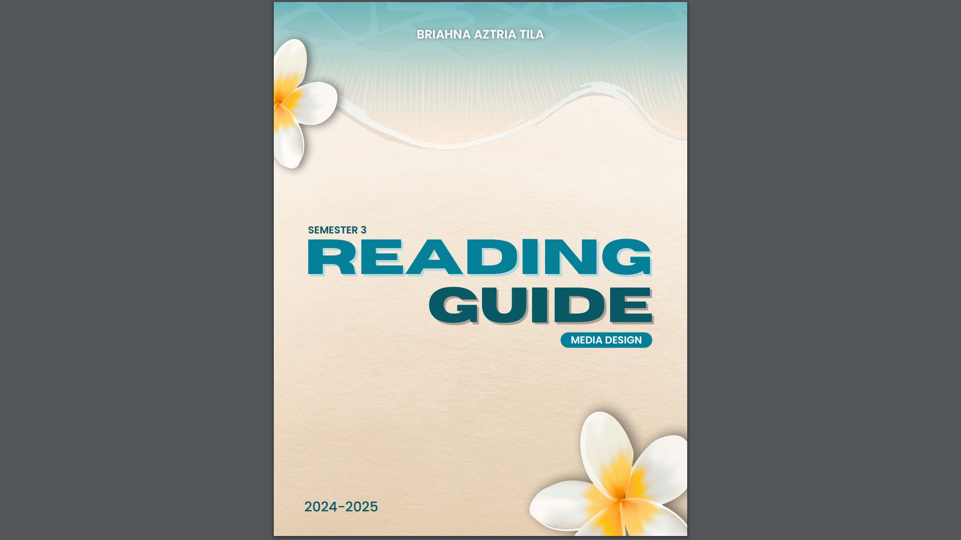
Reading Guide
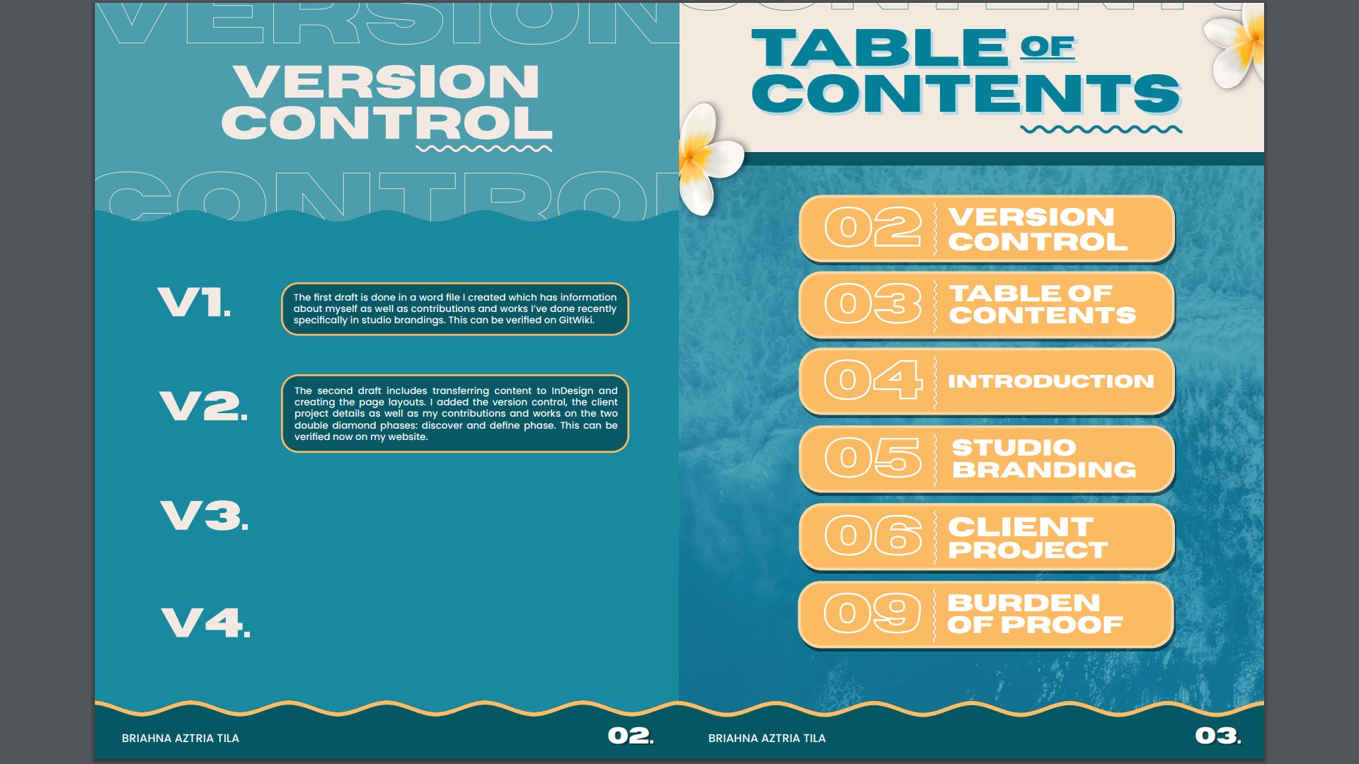
First Iteration
I first made the reading guide in word format, which is composed of information about myself,
what I want to achieve in the future, and projects I worked on previously that I want to
showcase. I added clean, professional designs to avoid a word-heavy document before moving
it into the InDesign layout.
Link: Reading Guide v1
Feedback
Inspiration
I browsed Pinterest to explore ideas specifically for the layout of my reading guide. My goal was
to find inspiration for arranging content in a way that reflects a tropical theme and beach vibes
while maintaining a professional structure. To organize these ideas, I created a Pinterest board,
which provided me with a clear visual overview of layout styles and arrangements.
Link: Pinterest Board
I then browsed design elements that would improve the overall aesthetic of my reading guide. I
gathered inspirations not just from creating a Pinterest board, but also organizing a mood board
filled with typography, oceanic and tropical photos, and the elements I plan to use, such as
starfish and tropical flowers.
Second Iteration
For the redesign, I focused on keeping it similar to my portfolio theme while maintaining a
professional look. My color palette includes blue and yellow (not in high contrast) because I
want to incorporate lively colors instead of low-saturated ones.
I made sure to add page numbering to important content sections, such as Introduction, Studio
Branding, Client Project, and Burden of Proof, so the reader will know the sequence of each
page.
Link: Reading Guide v2
Feedback
Third Iteration
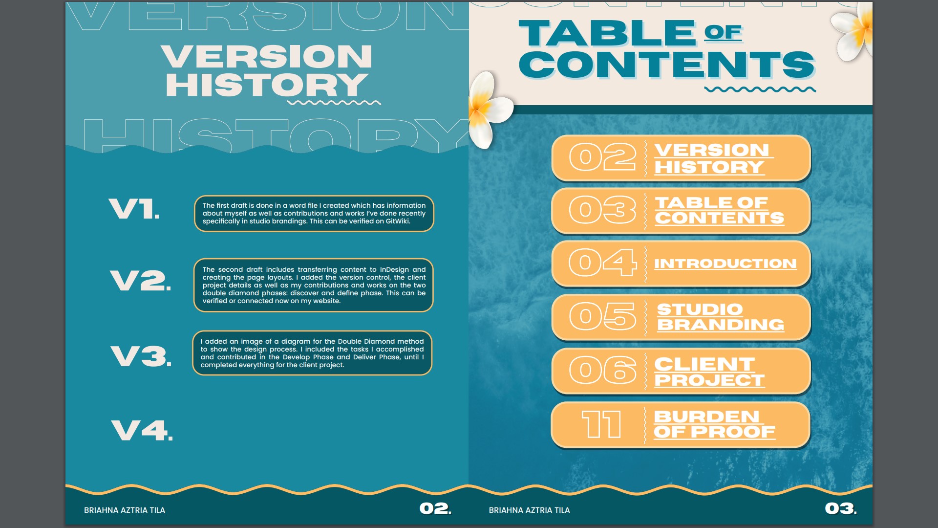
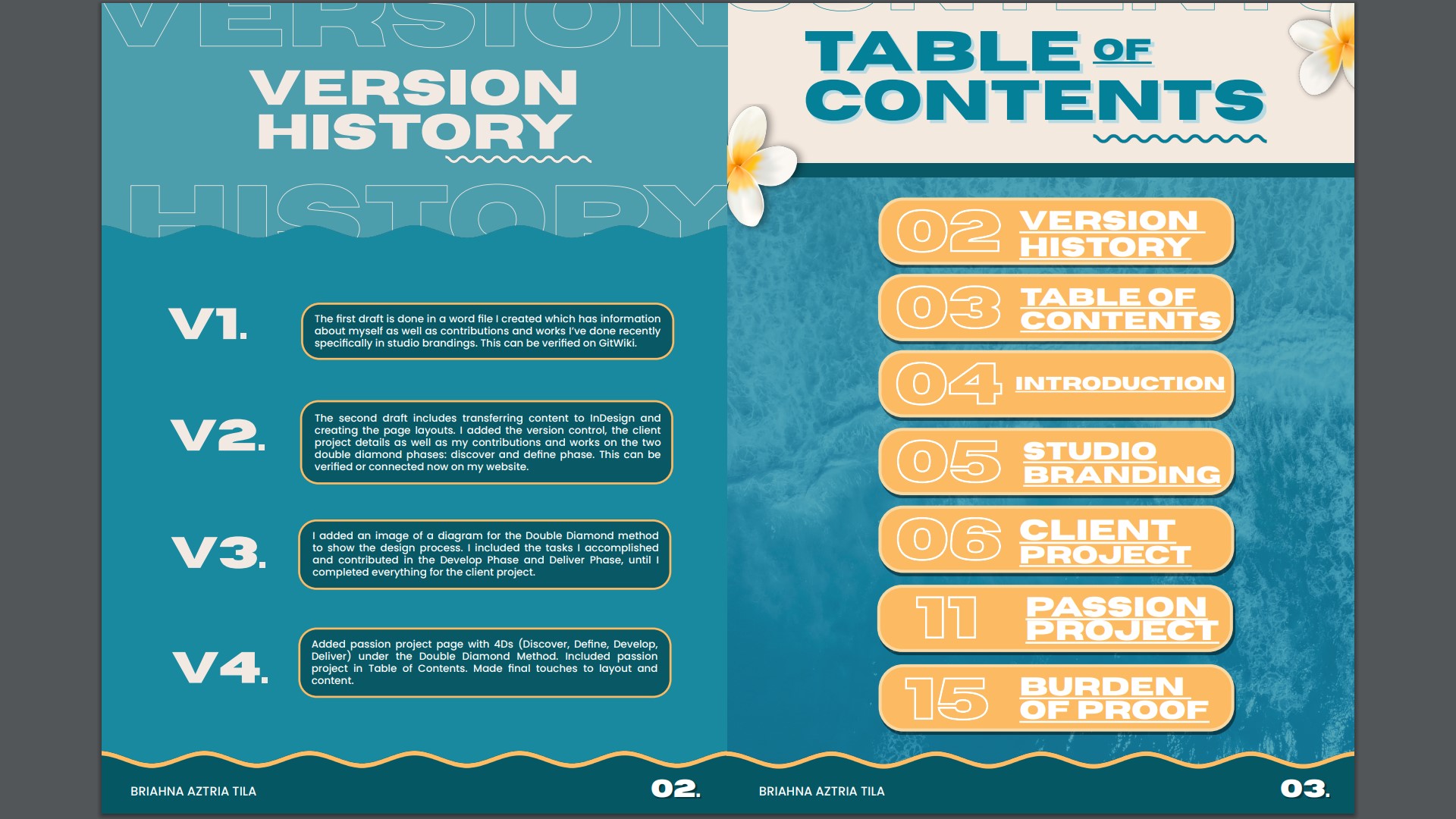
For this iteration, I proceed on changing first the “Version Control” to “Version History” as it fits
more with the concept of documenting the sequence of changes over time. Next, I added an
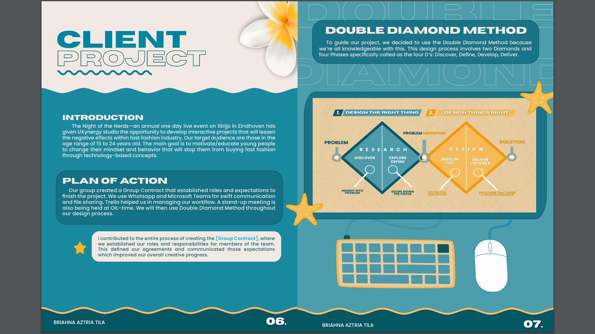
image of a diagram for the Double Diamond method to show the design process.
After this, I detailed the tasks I completed and the contributions I made throughout the Develop
and Deliver Phases, right up until the finalization of the client project.
Link: Reading Guide v3
Feedback
Fourth Iteration
For the final version, I focused on finalizing and polishing the reading guide. I added the Passion
Project page with the 4Ds (Discover, Define, Develop, Deliver) under the Double Diamond
Method. I also updated the Table of Contents to include the Passion Project page. Additionally, I
made final adjustments to the layout, aligning all elements for a seamless and professional
presentation, ready for submission.
Link: Reading Guide v4
3D Visual Representation
Introduction
I created a 3D visual representation of the idea that our group had been able to brainstorm
together. To make this piece, I collaborated with my 2 groupmates, and together we
brainstormed the topic we wanted to create in 3D. From here, we decided to focus on the idea
of synergy and fun.
Process
So I started by using a research method called Benchmark Creation, where I browsed online for
inspiration related to the concept of synergy and fun, and I was able to see pictures of mascot
hands and puzzle pieces. Then I also looked at the website that our teacher suggested and
found things like Puzzle Pencil Holder and Modular Puzzle Containers, which strengthened our
idea of using the puzzle pieces as part of the design we wanted to create.
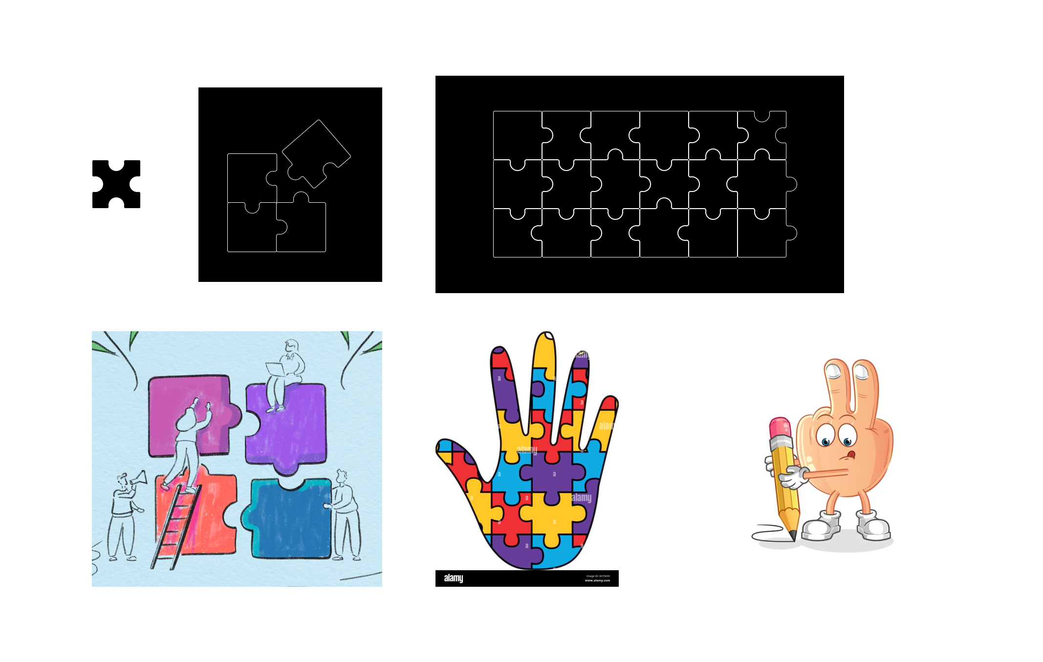
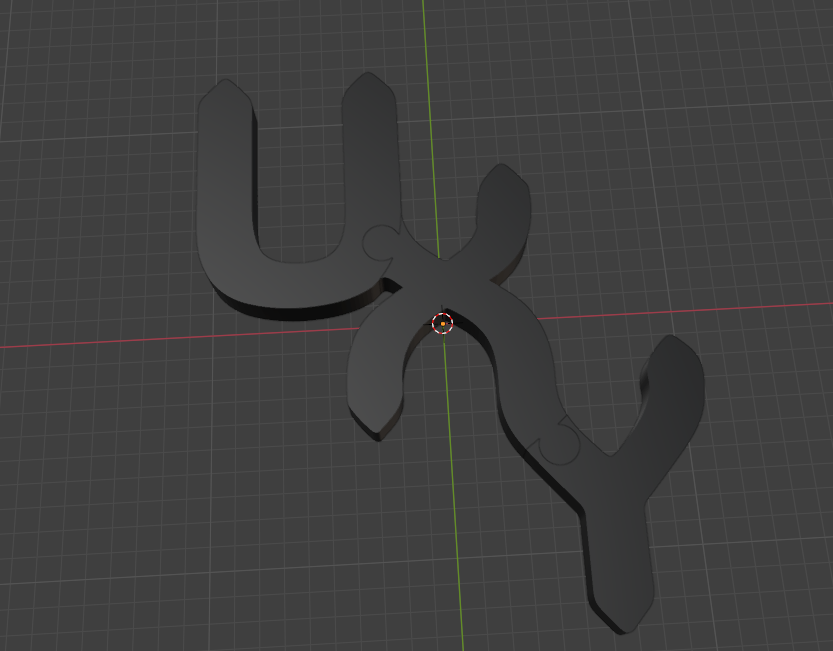
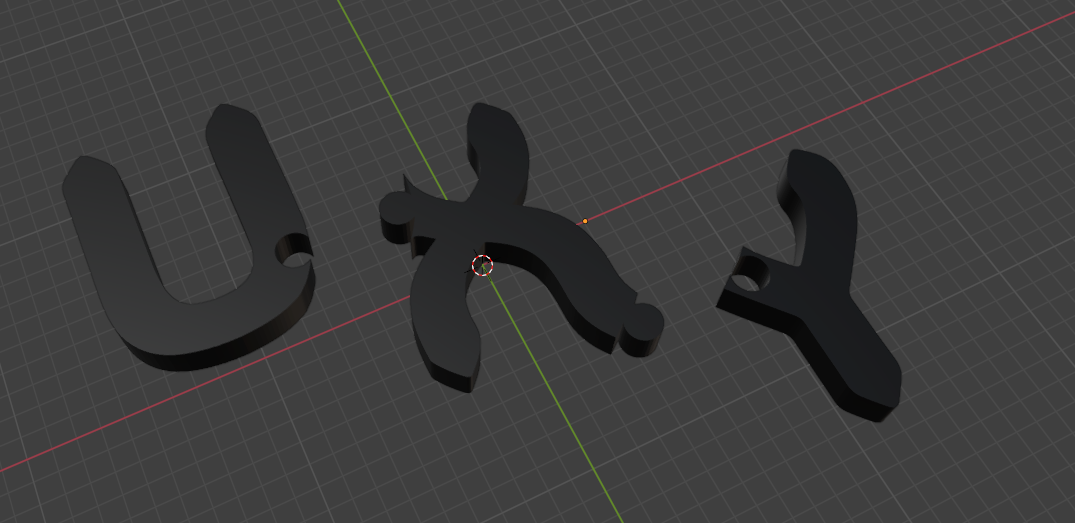
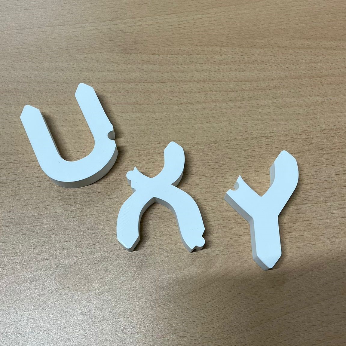
We showed our ideas to the teacher, and from there, the group wanted the logo to be interactive
and resemble puzzle pieces. I then created our sketch, designing the edges to look like
interlocking puzzle pieces. That’s where I proposed that the X serves as the missing piece.
To validate our work, we showed the teacher our final idea; he said he liked the concept for 3D
visuals.
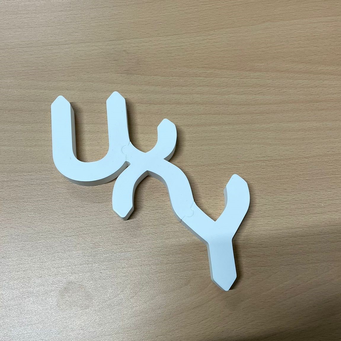
For the finalization, I used Blender to make the 3D model. After finishing the design, I showed it
to my groupmates, and they liked it.

I then printed it using a 3D printer, and here is the printed version of the logo I created. The
details turned out exactly as planned, and seeing it come to life in physical form was really
satisfying. This will be used as a representation of our team’s brand.
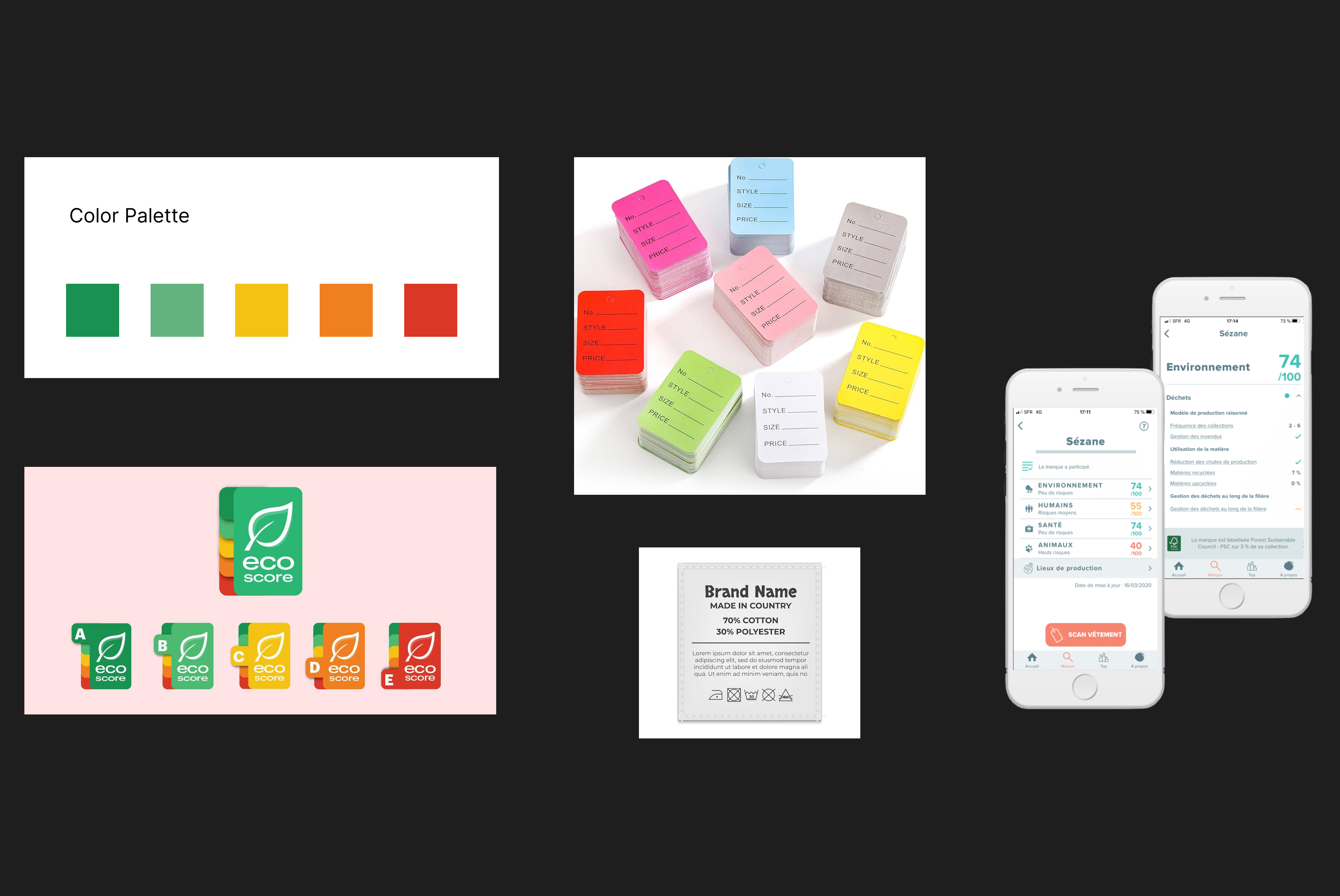
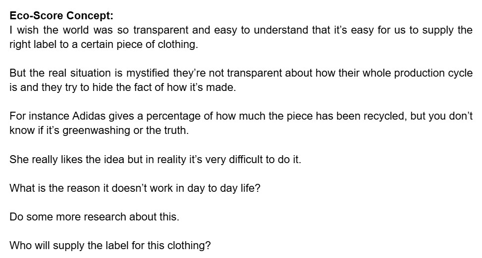
Eco-Score Label
Introduction
Encouraging eco-friendly choices is one way to reduce environmental impacts. This page will
focus on making visuals to help the client understand the concept of Eco-score label – a tool
that uses color coding and A-E ratings to assist in identifying sustainability of clothing brands. I
created the visuals after conducting research about it on the initial target audience which is
15-17 years old as provided by the client because this age group tends to consume more fast
fashion clothes.
Concept
From the brainstorming, we came up with 3 concepts. Then, we created subgroups and
conducted research on the topics we selected. Since Mariana and I were in the same subgroup,
we worked on the concept of “Promoting sustainable clothing by creating a special label, which
is an ‘Eco-score’ for clothes”.
The ‘Eco-score’ would be based on factors such as the environmental impact of the materials
used and the ethical standards followed during the clothing brand’s production process. This
label aims to help young consumers make more informed choices when purchasing clothing,
promoting sustainability in fashion.
Inspiration
Together, Mariana and I gathered inspiration online for our Eco-score labels. I searched for
existing sustainability labels to understand their visuals and how they communicate information
to consumers. From this, I took inspiration from real-life Eco-score labels to create something
that feels familiar, accurate, and, of course, credible.
Process
After conducting research, I created a price tag and wash tag as a creative representation of the
Eco-score concept that Mariana and I developed. The target audience for this labeling is 15-17
years old, as they tend to purchase and consume more clothes. The main goal of this label is to
provide consumers with an easy way to assess the sustainability of clothing.
Link: Figma Prototype
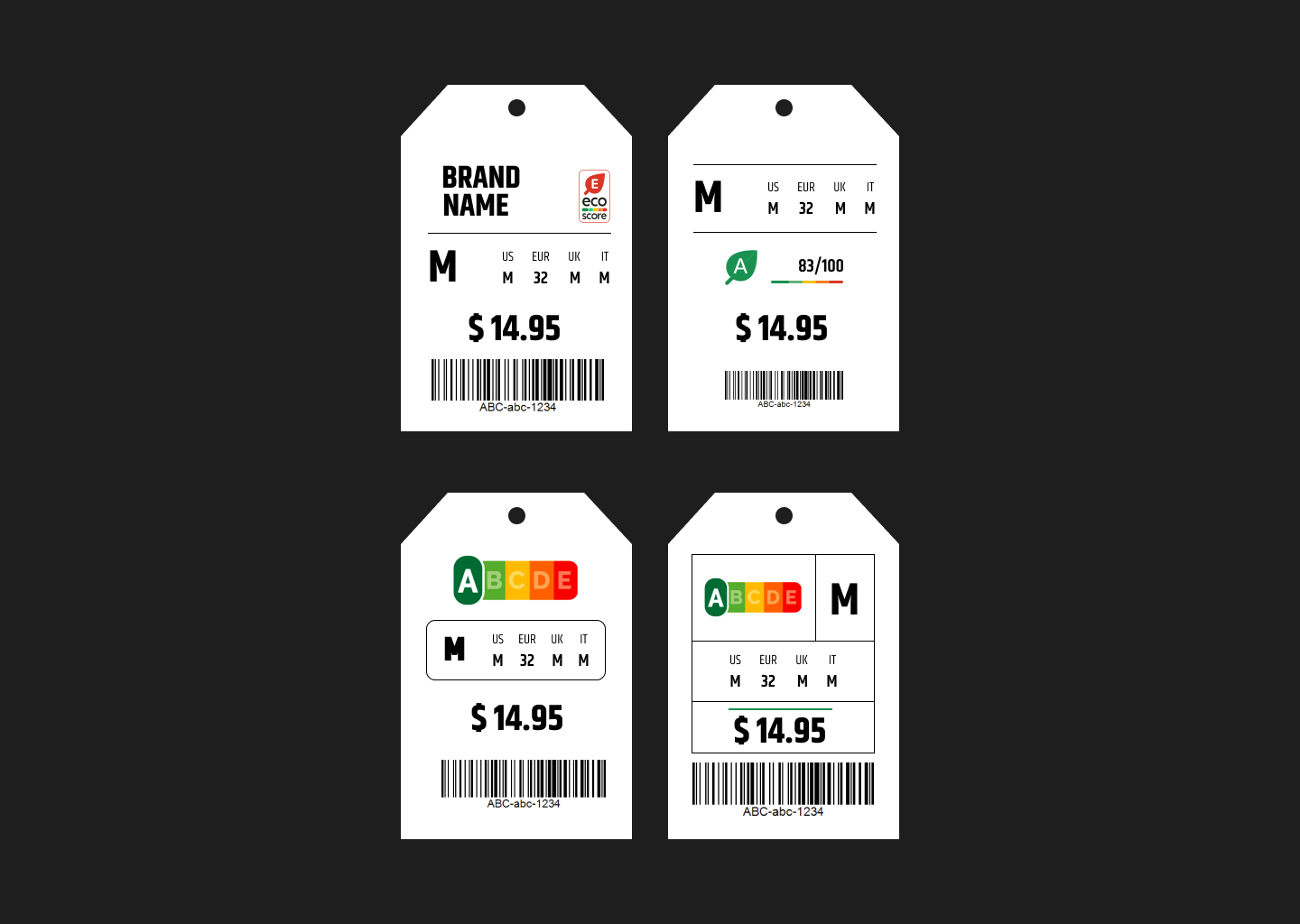
1st Design
The first design I created is a color coded price tag with ratings. I was inspired by the app called
“Clear Fashion” where they have numerical rates according to 4 themes: human, health,
environment, animals. So I applied that to our Eco-score focusing on sustainability.
My design has a simple tag on the front. The back is color coded that incorporates green as the
highest level of sustainability and red for the lowest. Aside from that, there is an A to F rating
system that offers straightforward assessment of brand’s ethical practices.
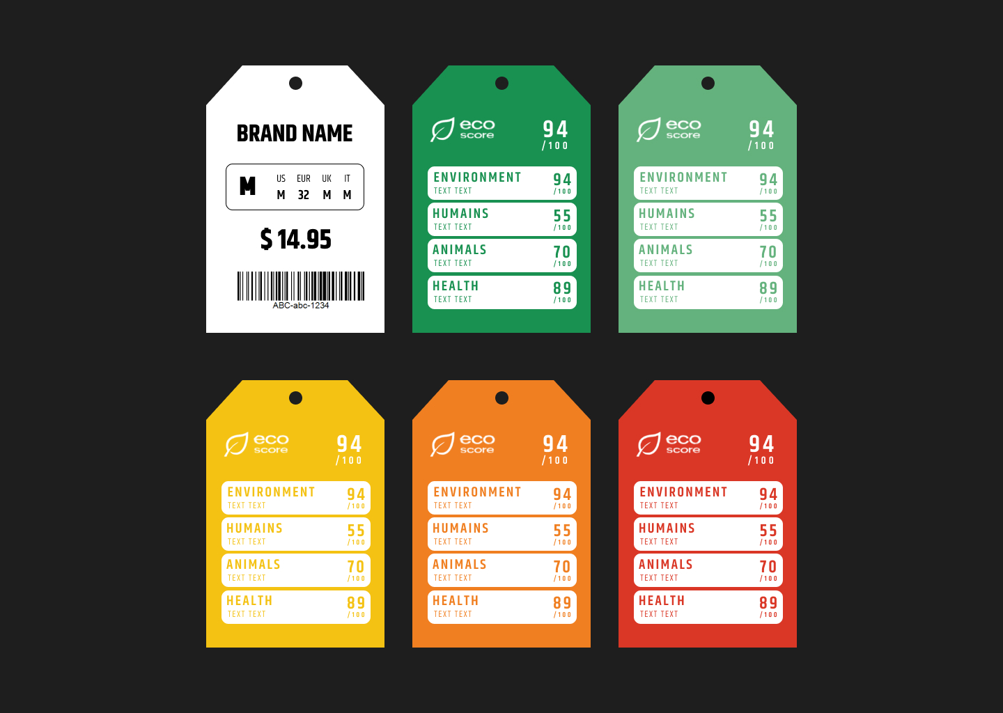
2nd Design
I created a price tag where the Eco-score points are located in the front, along with other details
of the clothing brand. The purpose of adding the Eco-score in the front is so that consumers can
easily access the sustainability information while considering their purchase.
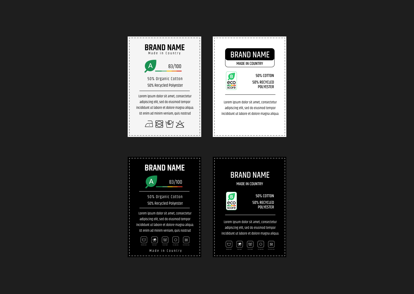
3rd Design
I created an Eco-score label in wash tags placed just below the brand name and fabric details.
The main purpose of this positioning for Eco-score is to help consumers make decisions not
only at the point of buying but also during the garment’s use and case, highlighting the
importance of assessing sustainability in everyday actions.
Feedback
We pitched our concept to the client, presenting the goals and vision behind it. After the pitch,
we received valuable feedback from them, which has helped improve our project further.
Concept Document
Introduction
Aligning our core ideas, goals, and direction is essential. For this client project, we created a
concept document that’s all about preventing fast fashion purchases of the target audience —
individuals aged 15 to 24. Initially, our focus was on the 15-17 age group, but we expanded to
include those aged 18-24, as they also play a significant role in the popularity and consumption
of fast fashion, based on the survey we conducted. This document ensures we stay on track
with our main purpose.
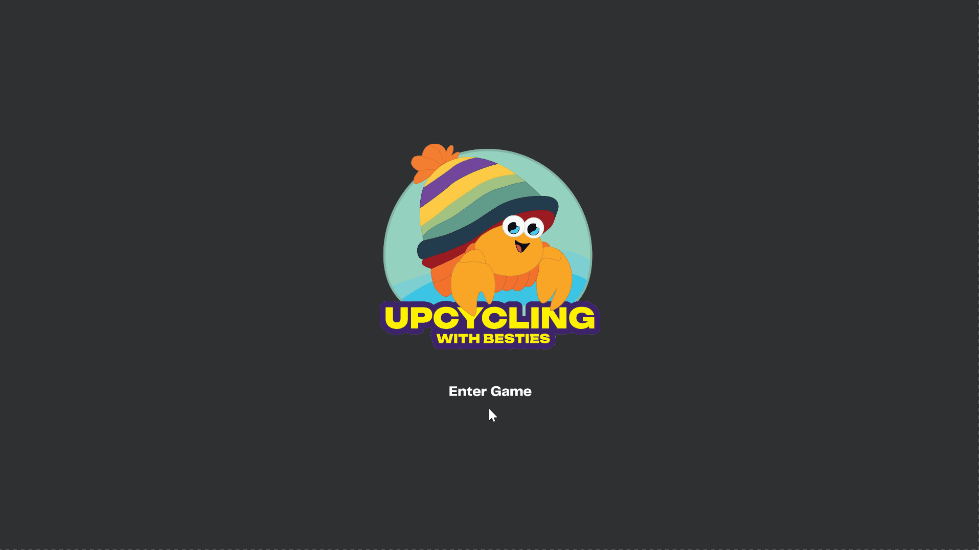
To engage with our target audience effectively, we designed a store management game titled
‘Upcycling with Besties.’ The game aims to teach players how to upcycle old clothes in a fun
and interactive way, encouraging creativity and promoting sustainable practices.
First Iteration
After finalizing our concept, we began preparing our concept document; I first organized the
structure of the document and content outline based on the guide given to us. After that, our
leader assigned the different points to each team member to write down.
I was assigned in the documentation of POV where I elaborated the perspective of teenagers
for buying cheap and trendy clothes. I also created multiple How Might We statements on how
we can create a concept that encourages the teens to go for sustainable fashion. After doing
this, I documented the solutions we developed based on those HMW questions. Lastly, I
contributed to write our conclusion where we provided our expectations as we go further with
this project and what positive movement this overall event could do.
Link: First Concept Document
Feedback
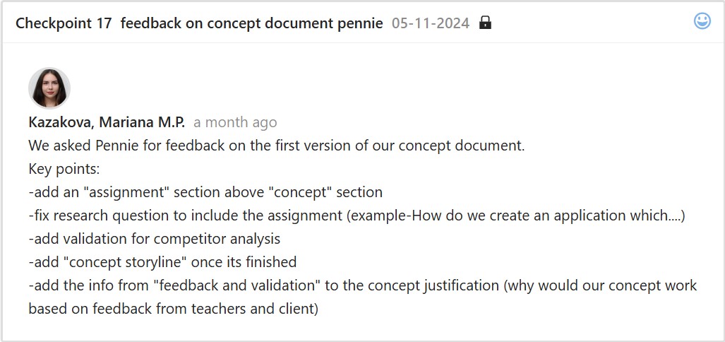
Second Iteration
We created and applied changes to the final version of the concept document after receiving
feedback from our teacher. I was responsible for adding both the Concept Storyline and the
MoSCoW method to the document. To improve and make our document more detailed, I added
relevant visuals and properly organized them. I made sure that the visuals were aligned with the
content to make the document more engaging and visually appealing.
Link: Final Concept Document
Reflection
I recognized the benefits of preparing a concept document because it helps me understand the
overall idea and structure of our project. I often check this document to stay on track with our
goal and review the research findings.
Overall, it saves not only me but also our group from unnecessary revisions or rework, since we
have a concept document that summarizes everything. It also ensures stakeholders are clear on
the project’s direction, making it easier to communicate progress and align expectations.
Game Prototype
Link: Figma Prototype
Introduction
Testing and refining the game mechanics helps before full development, so after completing the
research and survey that led us to know our final target audience, which is 15-24 years old, I
created a working prototype of our game ‘Upcycling with Besties’ (a store management game
about upcycling old clothes) that serves as a platform for ideas, improving user experience, and
visual elements, making sure it was interactive and engaging to the young consumers.
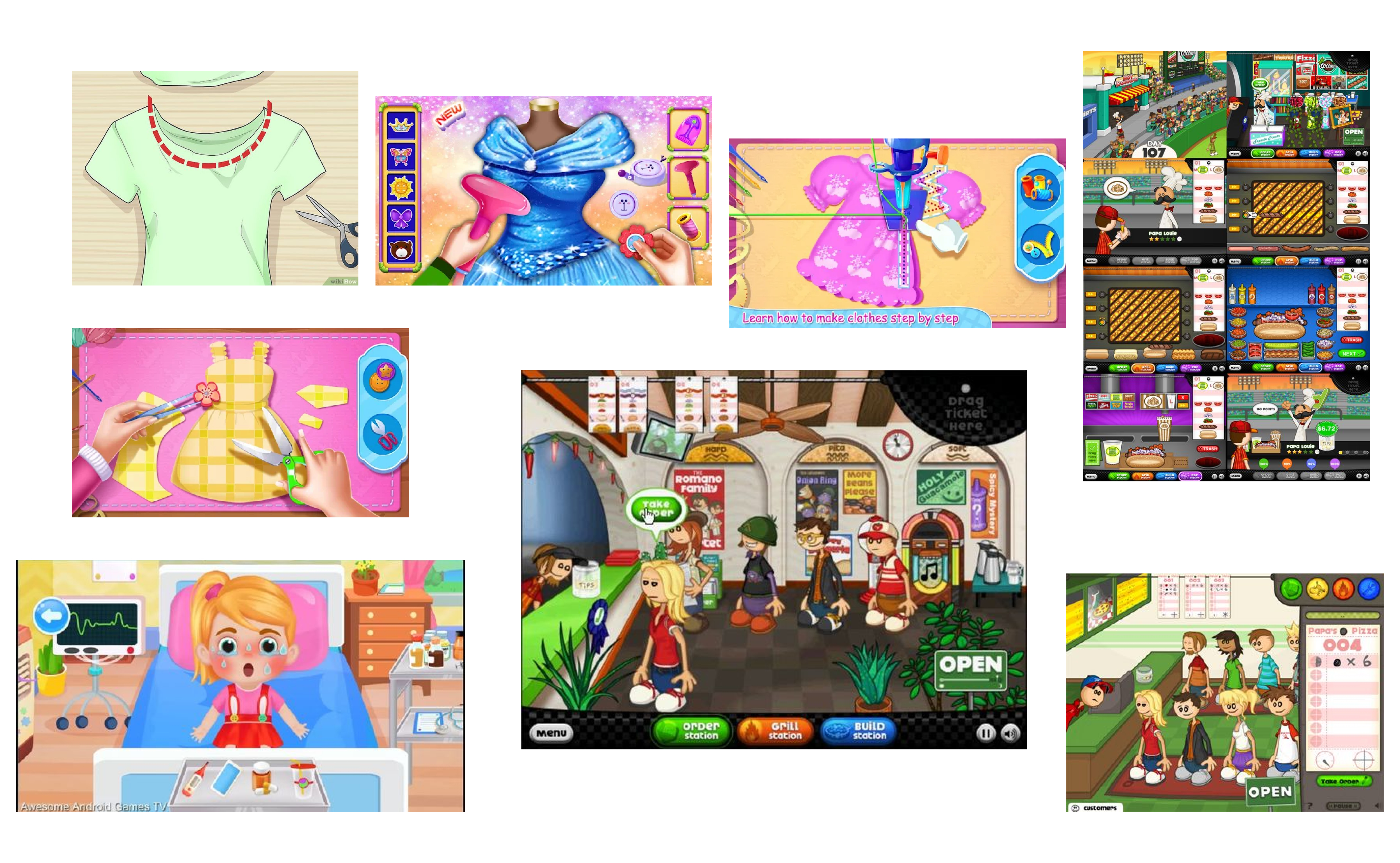
Inspiration
The structure and flow of the prototype were inspired by games like Papa’s Pizzeria and other
similar time-management games. I liked how these games are simple yet interactive, guiding
the player smoothly through tasks. I incorporated this style into the prototype I made to make
the gameplay fun, intuitive, and easy to follow.
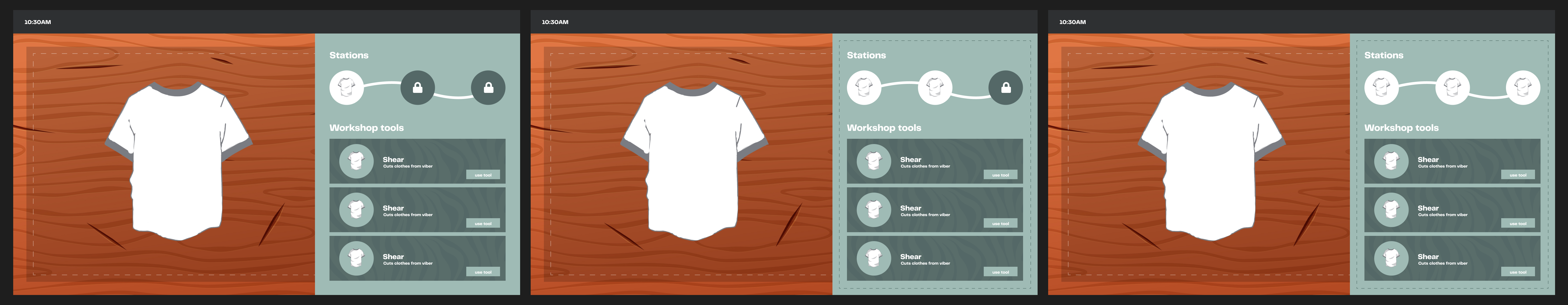
First Iteration
I designed the game’s stations and levels. I started with a layout that included wooden
backgrounds to look like tables, a transparent working mat, tools, and locked stations to
represent progression. This initial design helped me set the game’s overall look and feel.
Feedback
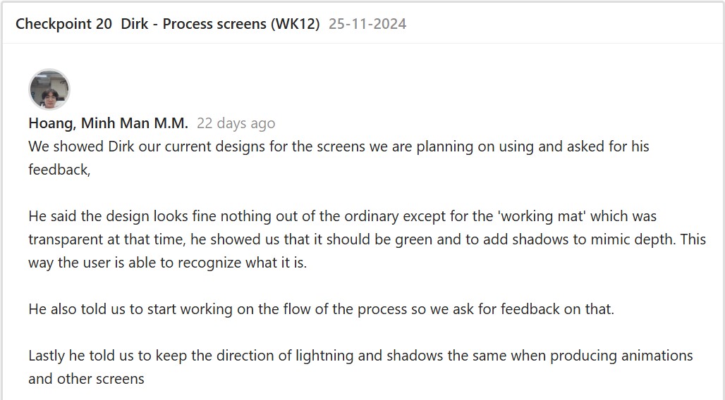
Second Iteration
After getting feedback, I replaced the wooden background with a cleaner design, changed the
working mat to green, and added shadows for depth, making the visuals cleaner and more
vibrant. I also improved the tool presentation by removing unnecessary descriptions since the
drag-and-drop mechanic was already intuitive. After that, I started putting together the flow of
the upcycling process while following the order of tasks and tools.
To make the game more interactive, I added features like a drag-and-drop mechanic and
walking animations. To implement the drag-and-drop feature, I followed a video tutorial. Next, I
wanted to make the game feel more realistic, so I added walking animations for the customers
by following another tutorial, even though the characters appeared slightly floating. Lastly, I
added our crab logo to guide users through the game and tie everything together.
Link: Second Iteration Demo

Feedback
After finishing the prototype iteration, I went to test the game with some teachers and other
students.
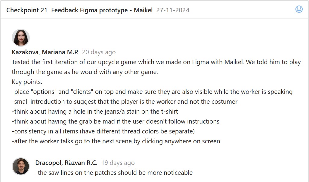
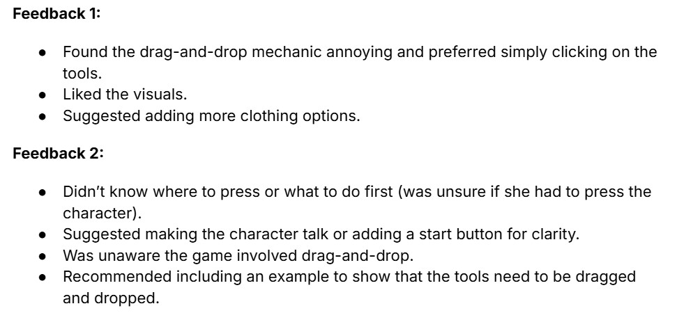
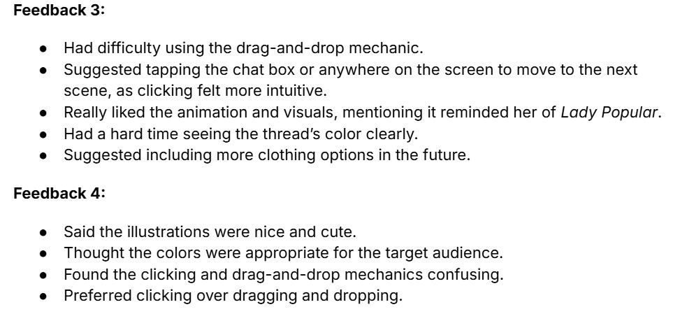
Third Iteration
After usability testing, I finalized the prototype with some help from my groupmate. I added more
details to the clothing, like holes in the pants and shirt stains. I included all three patches in the
first station and added a separate space for the thread to improve clarity. I also fixed the
conversations so that clicking anywhere would move to the next scene.
Link: Third Iteration Demo
After finalizing the prototype, we started coding the game. We made sure to address the
feedback we received from usability testing and focused on improving the mechanics to ensure
the game was displayed more clearly and effectively.
Reflection
I enjoyed creating this prototype and learning new skills in Figma, like animations and
interactive drag-and-drop mechanics. The feedback helped me improve my designs at each
step. Seeing the prototype develop with every iteration gave me a better understanding of game
development and how small adjustments can make a big impact.
Short Trailer
Introduction
I put together a brief trailer for the deliverables, presented the final version and storyline of our
upcycling-themed game named ‘Upcycling with Besties’. The game encourages players to
complete creative tasks focused on sustainability and fashion innovation, inspiring them to
repurpose old materials and promote eco-friendly practices.
Inspiration
First, I looked for game trailer inspirations to help structure our own trailer. Since our reference
is mainly based on Papa’s Pizzeria, I reviewed their trailer and drew inspiration to effectively
highlight our game’s storyline, characters, and give a glimpse of the creative tasks it offers.
First Iteration
After finding inspiration, I edited the trailer using Canva, together with my groupmate Justin
using Canva so we can work together simultaneously. I mostly worked on the structure and
organization of the trailer and received help from my groupmate, Justin, who added the
background music for the game.
For the introduction, I added a dialogue where the girl asks players to help upcycle clothes. I
also saved pictures from the prototype for this part. I chose transitions that fit the game trailer. I
screen recorded the walking animations and added important sound effects for footsteps,
dropped items, and when using different tools.
Feedback
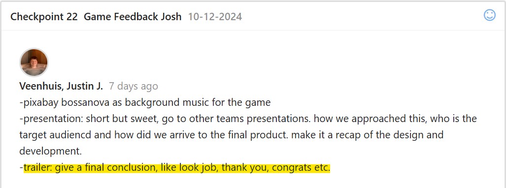
Second Iteration
Since we have nothing to change on the introduction, we just added the conclusion part then
presented the deliverables and final game trailer to the client.
Reflection
From this experience, here are several key takeaways I learned:
- It was a great experience for my creativity and problem-solving: whether showcasing the game’s features or making sure the trailer properly communicated the gameplay.
- The attention to detail such as sound effects and transitions shows how small details can greatly enhance the player experience and storytelling.
- I’m open to exploring different editing softwares so I can discover new tools and improve my editing workflow.
Overall, this process enhanced the importance of creativity and my attention to detail when
creating a well-engaging and impactful game trailer. I will take these learnings for future video
editing tasks.
Website Prototype
Link: Figma Prototype
Introduction
I created a website prototype for Patrick Manalad, the stakeholder of Filipino Drivers Europe, a
business that offers van services and tours for Filipino tourists, helping them explore various
cities. The main purpose of the website was to effectively showcase the business and its tour
services. Before I started developing and coding the website, I focused on ensuring that it would
highlight the business’s services, list the cities covered by the tours, share client feedback, and
provide an easy, updated way to book a service.
My goal was to create an output that would allow users to quickly find details about the tours
and book services without hassle, all while keeping the design simple yet easy to navigate.
First Iteration
I started conceptualizing by interviewing the stakeholder about their vision for the website and
researching their competitors. I asked him questions to fully understand the business and the
features he wants to see. This has helped me understand their goals, target audience, and
important details, while giving me ideas on which pages and features to include. With
benchmark creation and design pattern searches, this has helped me determine user-friendly
designs that I can establish on the website.
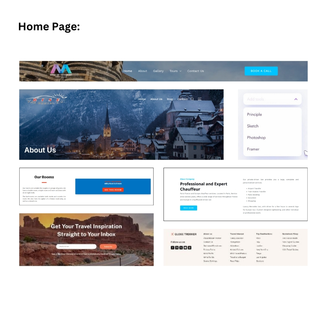
Mood Board
I looked for design layouts through existing websites such as Pinterest, which helped me find
inspirations for each page. I looked for tour website designs that are simple and professional but
are bright and eye-catching, as well as those that have user-friendly layouts.
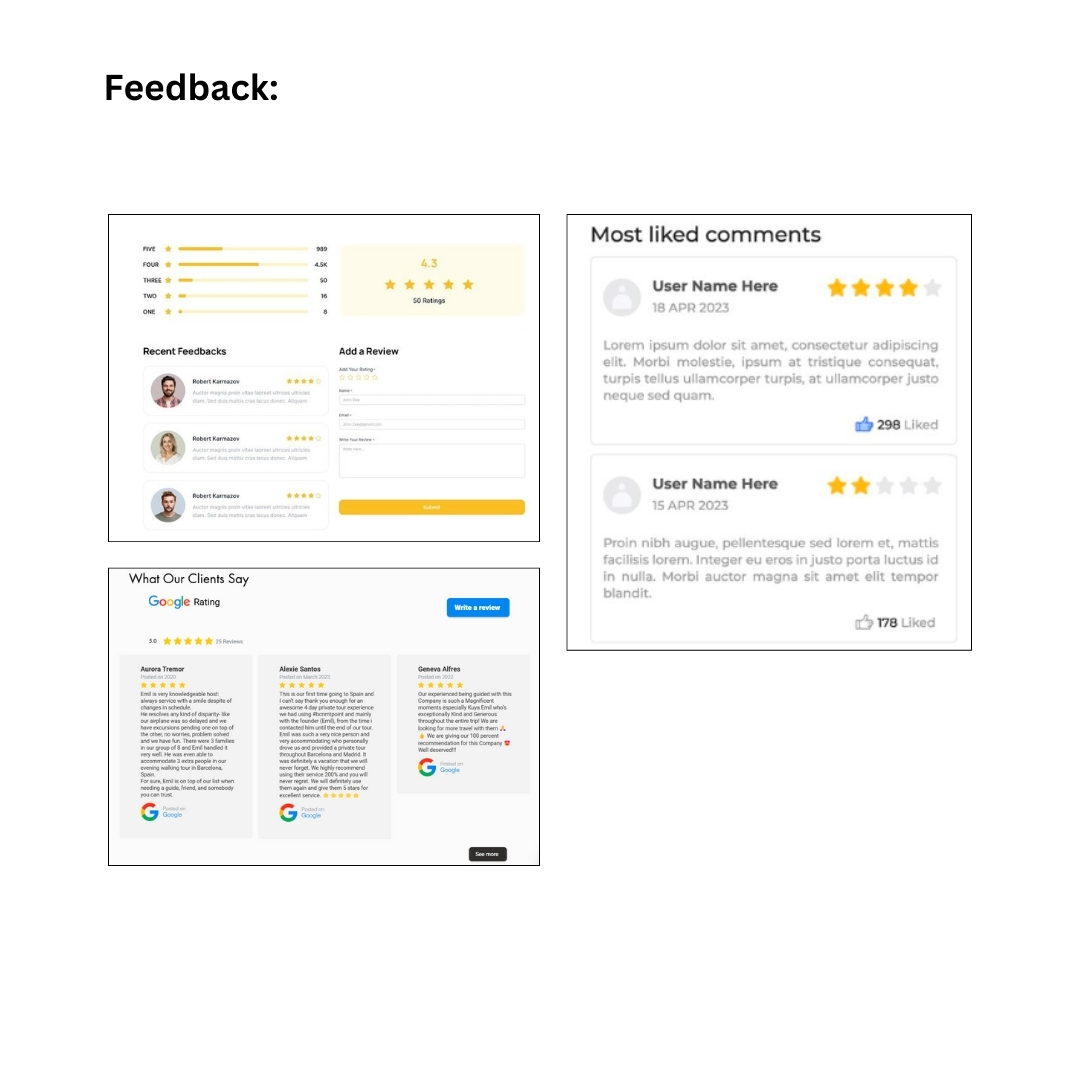
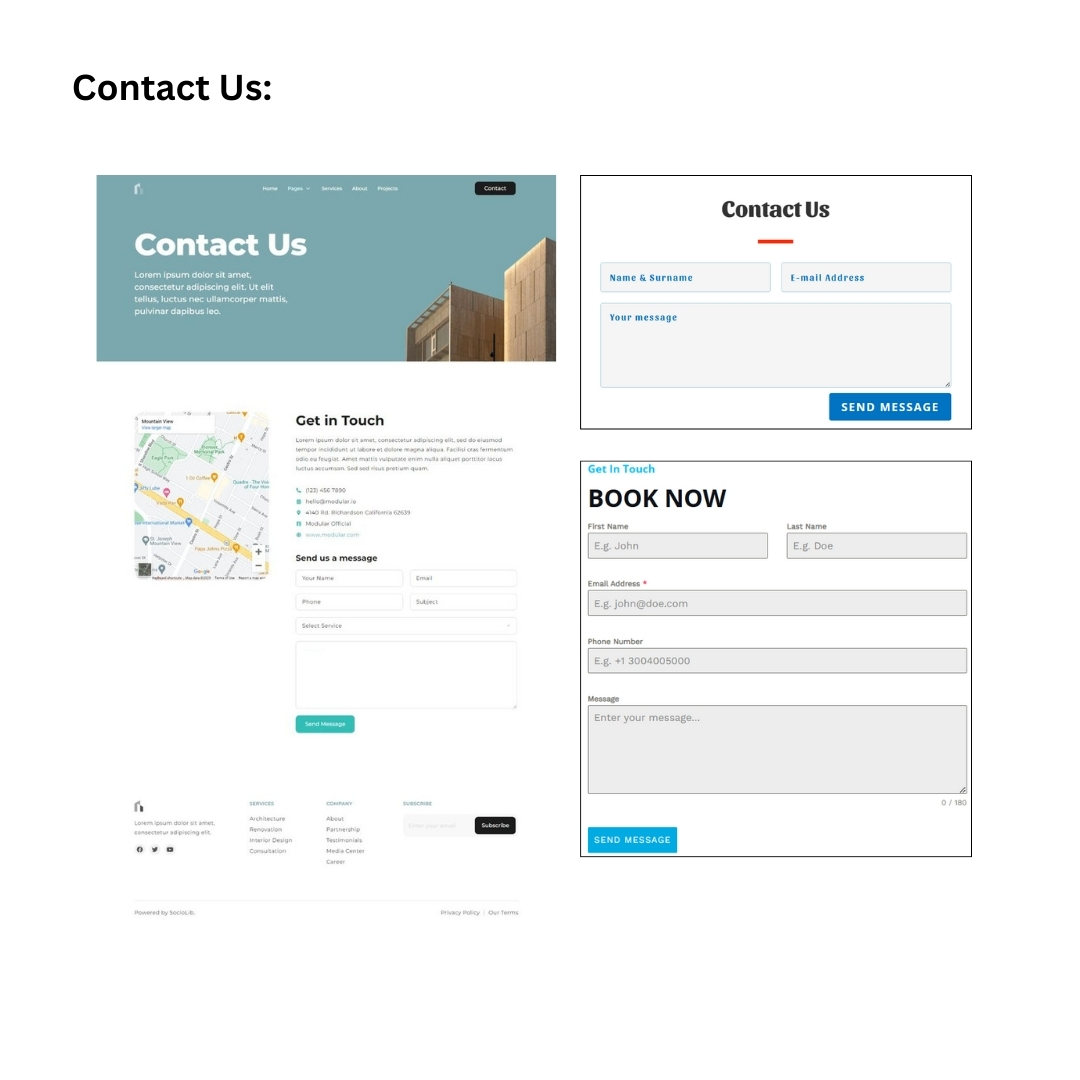
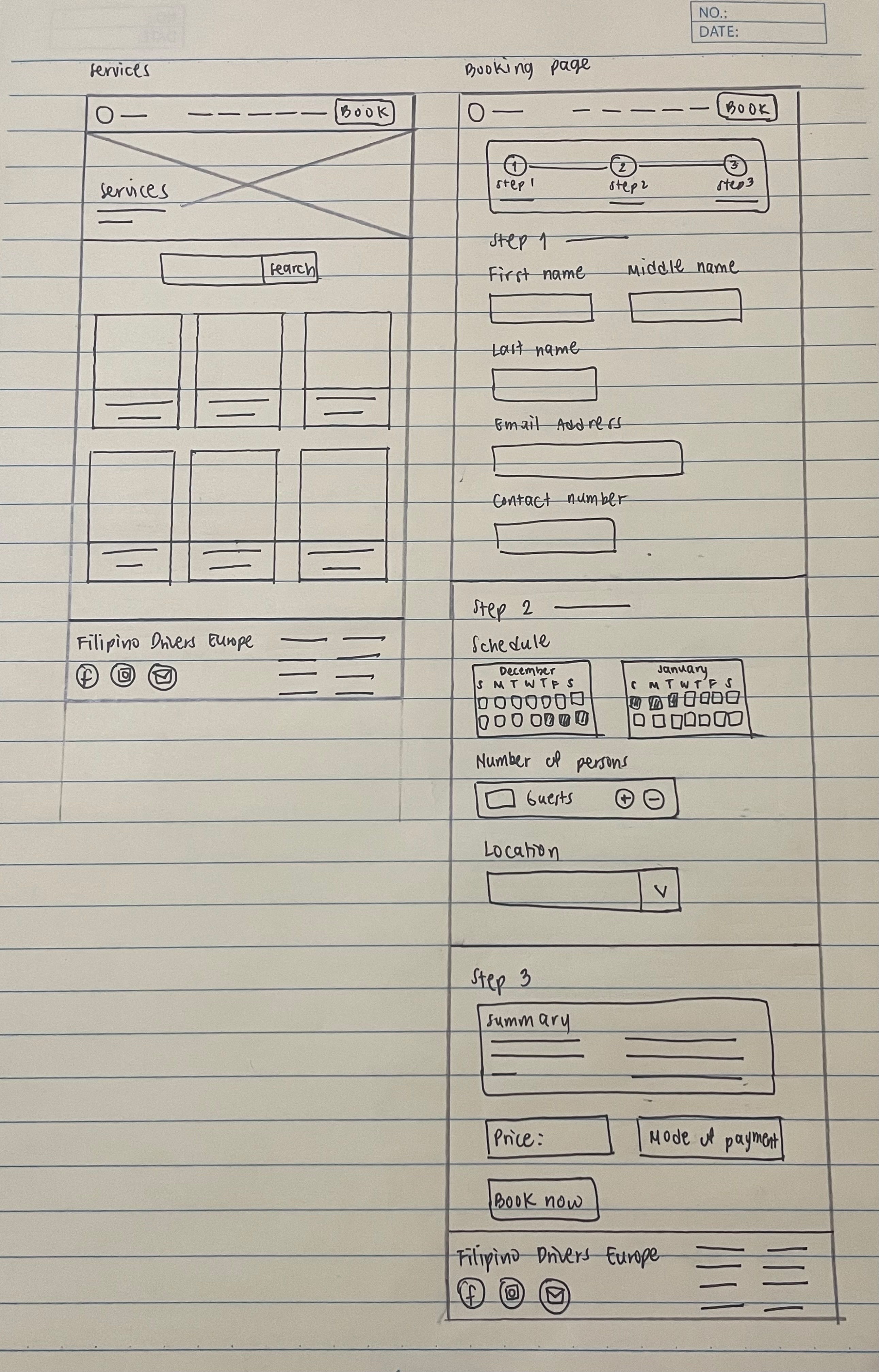
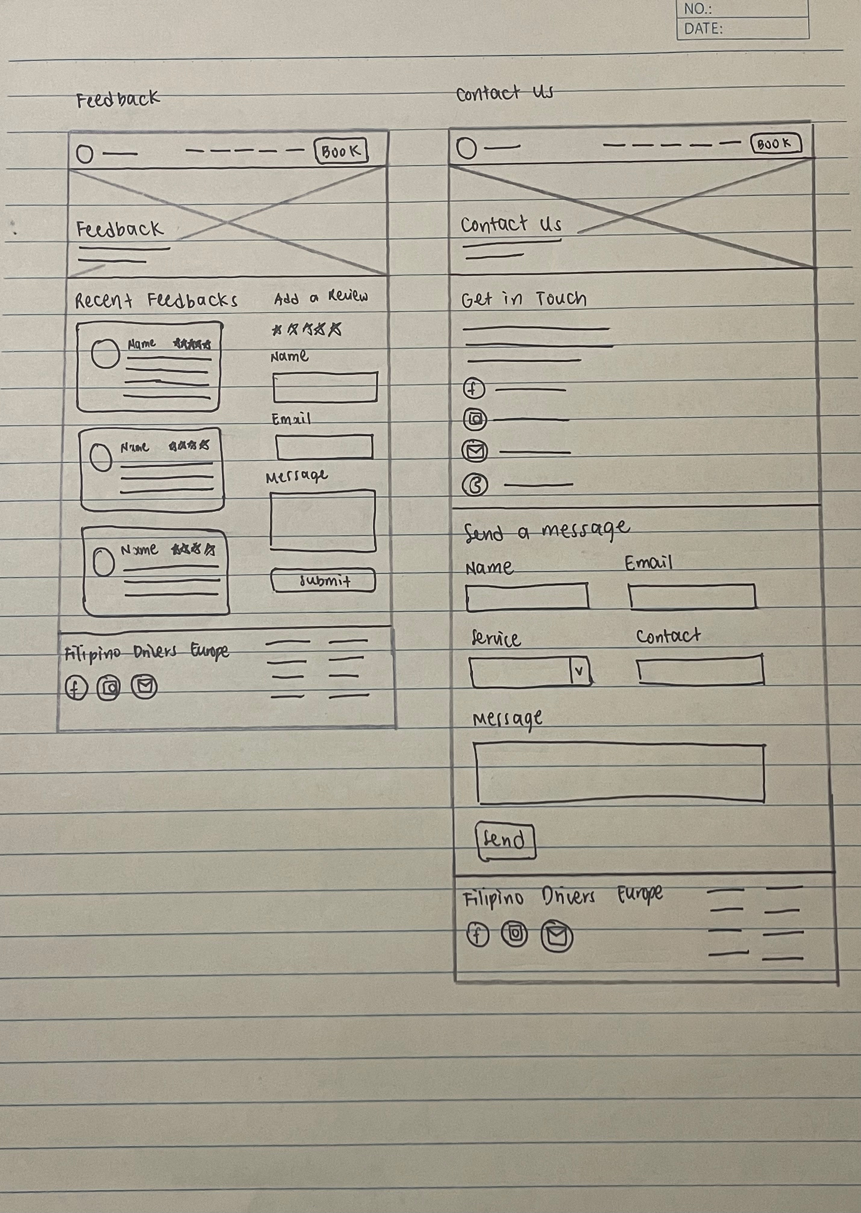
Sketches
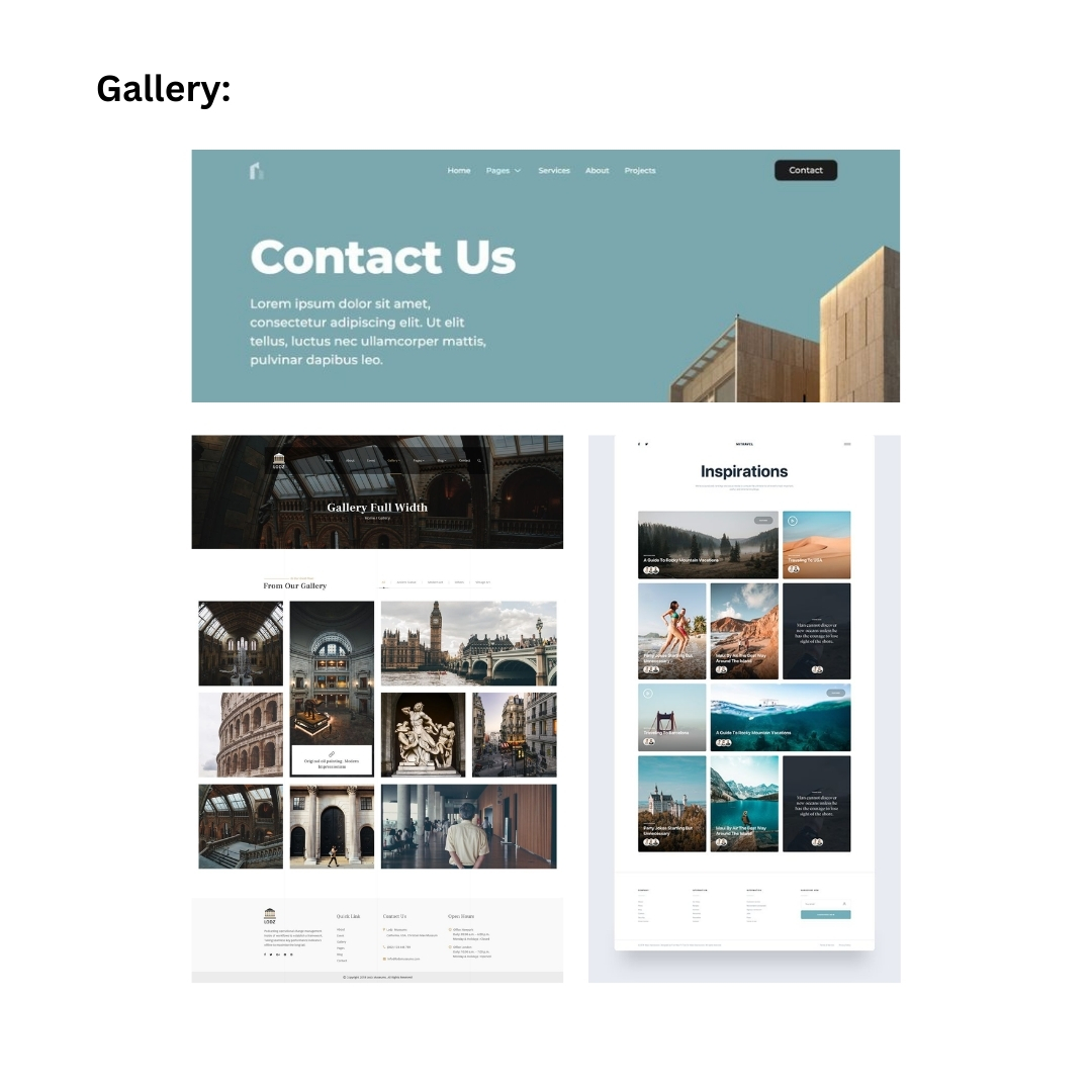
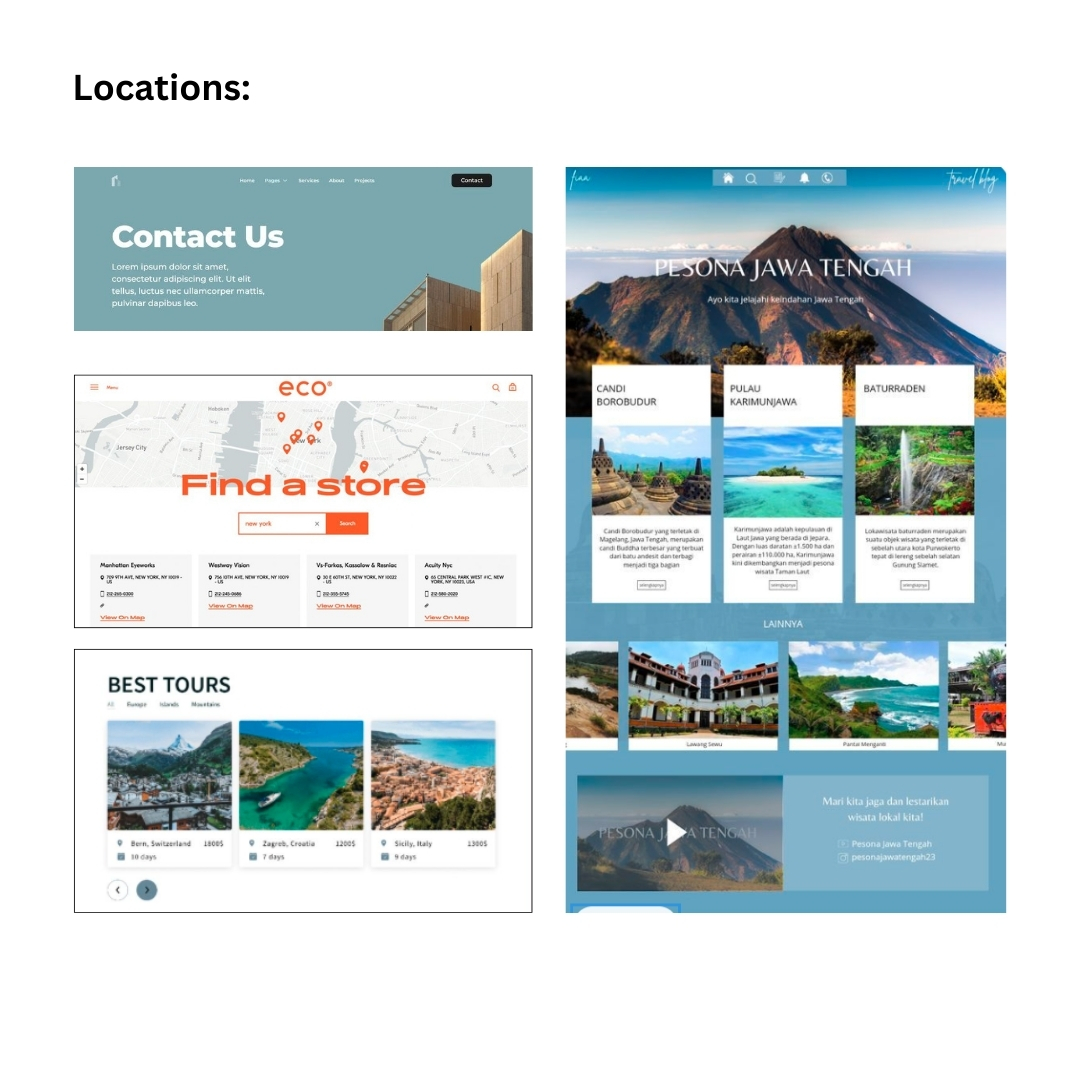
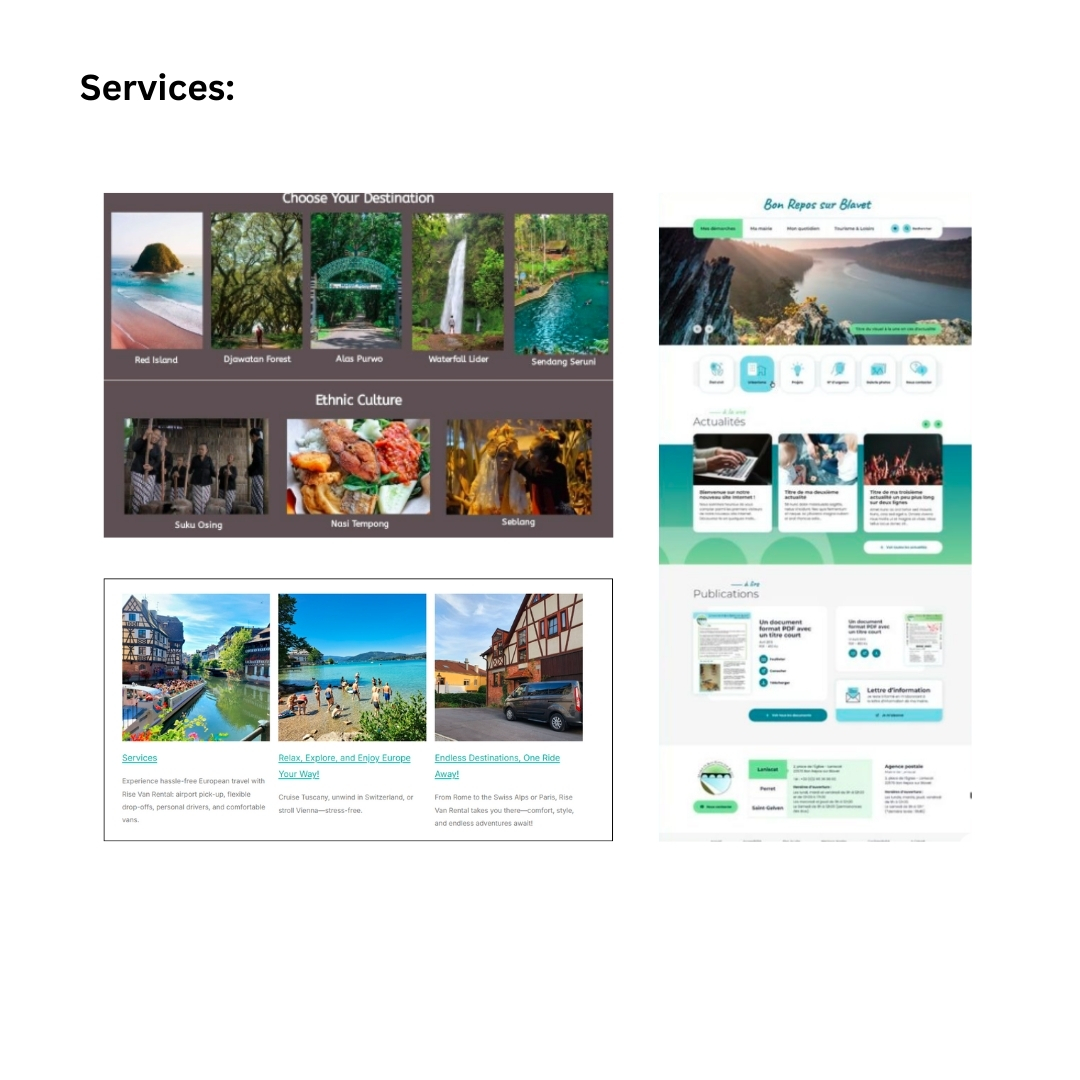
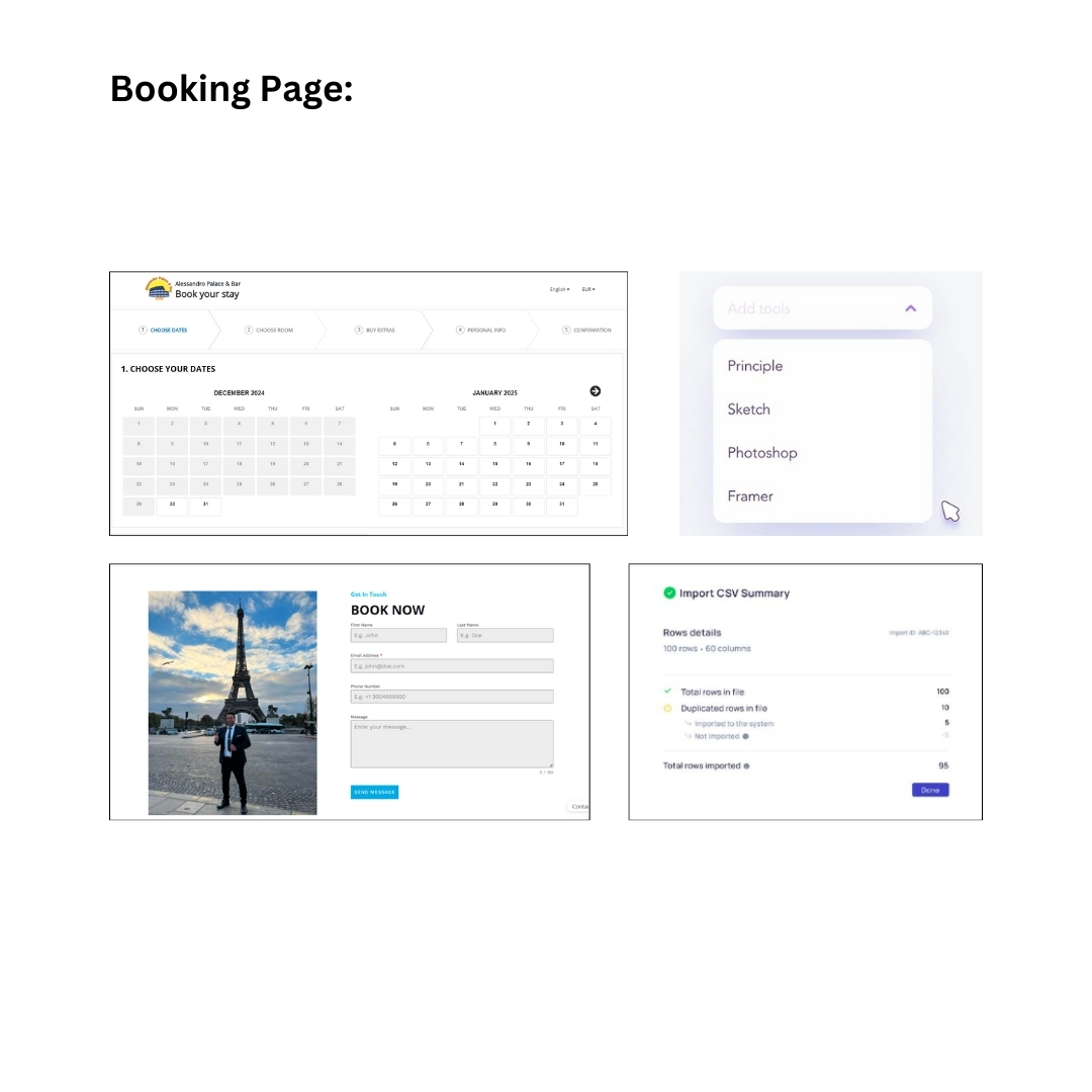
I initially sketched the layout for each page — Home, About Us, Gallery, Locations, Feedback,
Contact Us, Services, and Booking Page. I had the idea of creating additional pages, such as
About Us, Locations, Contact Us, and Services, because competitors have the same pages on
their websites, and other web layouts I have found on Pinterest feature them too. Then, I
proceeded to make it as simple and straightforward as possible to ensure easy navigation for
the stakeholder and audience.
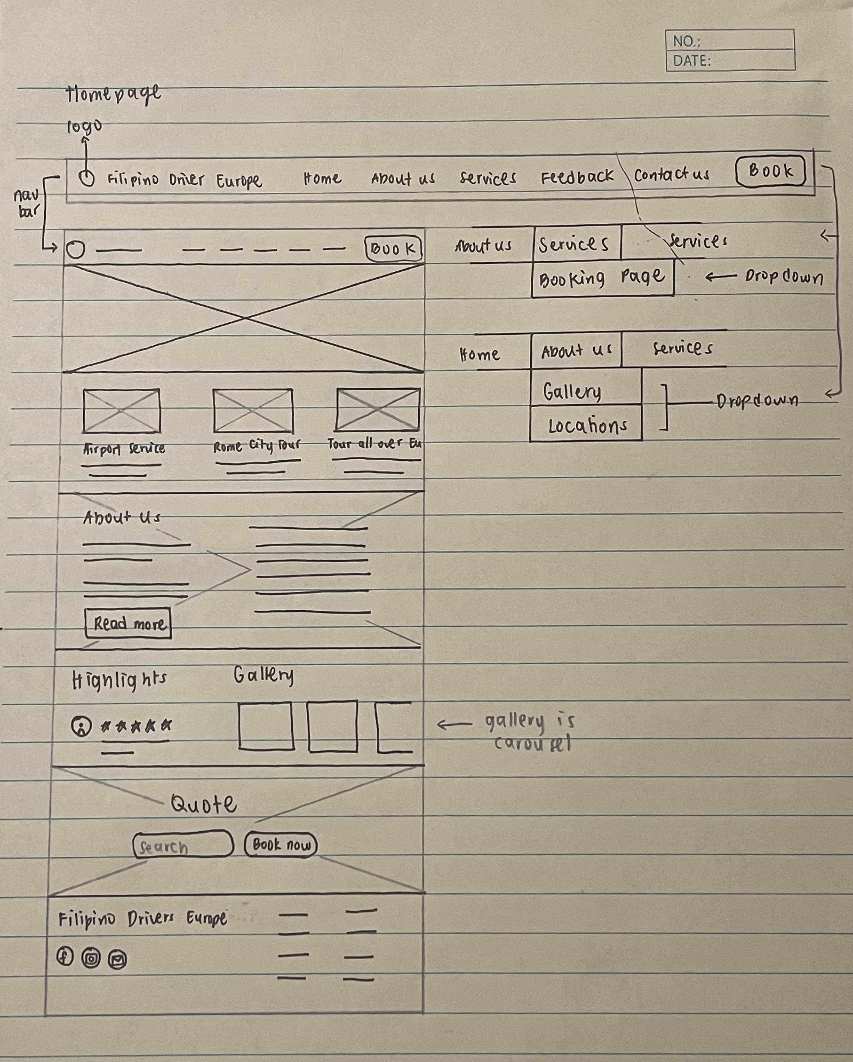
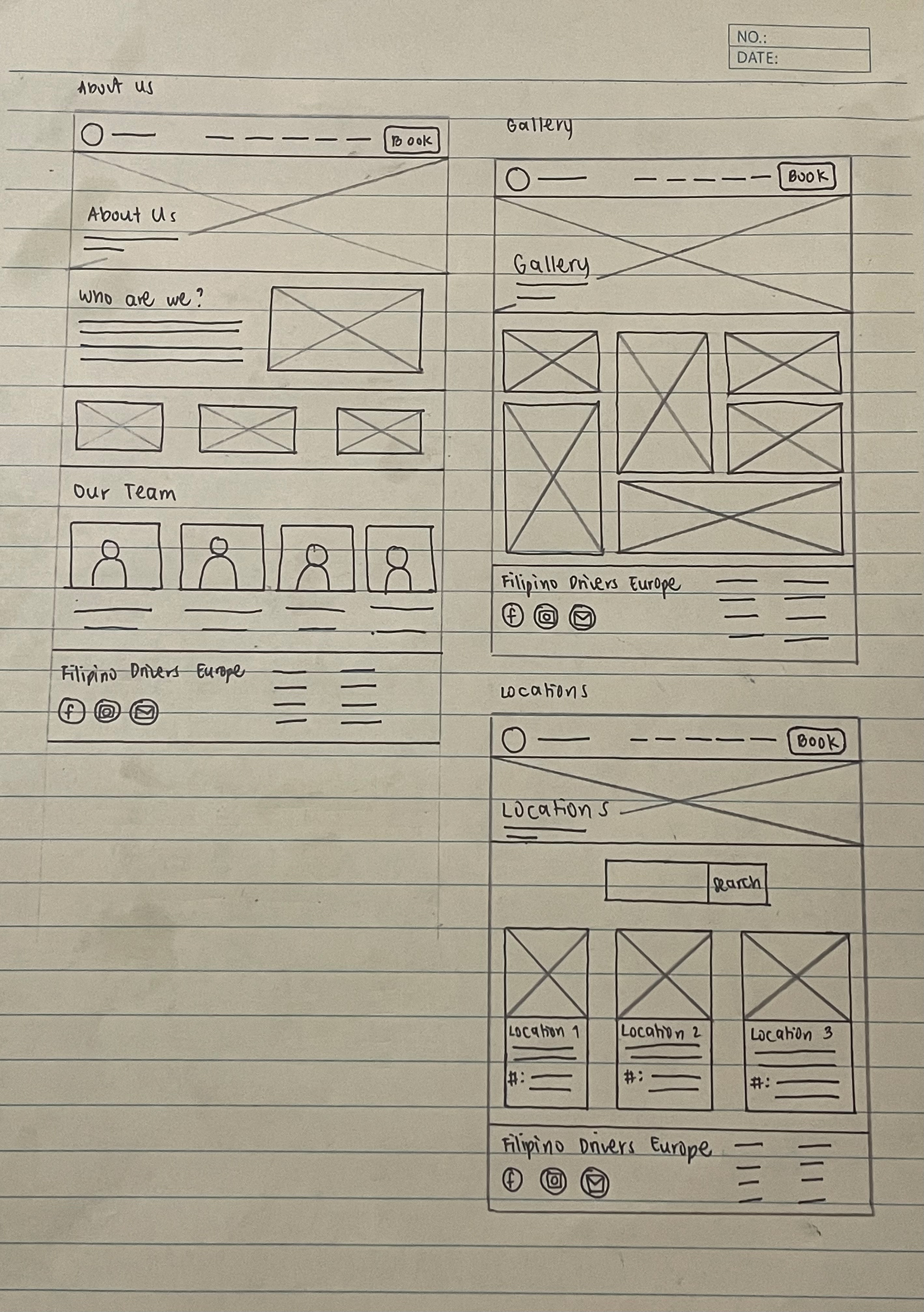
Feedback
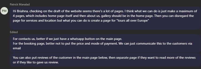
Second Iteration
For the second iteration, I proceeded to create the wireframe, but this time, I applied the
feedback and suggestions from the stakeholder. I compiled all the pages that were removed,
such as the About Us, Contact Us, Services, Gallery, and Location pages, into the Home page
and created sections for each. I then created a ‘Tour All Over Europe’ page to showcase the
cities where the tour takes place and renamed the ‘Feedback’ page to ‘Reviews.’ I also removed
the ‘Price’ and ‘Mode of Payment’ sections. Lastly, I included a WhatsApp button on each page
that opens a chatbox for inquiries.
Feedback
Third Iteration
For the third iteration, I took note of the stakeholder’s feedback in the wireframe and applied
these changes to the Hi-Fi prototype. Before I began, I started compiling the necessary
elements, such as the logo, gallery pictures, and links for the website.
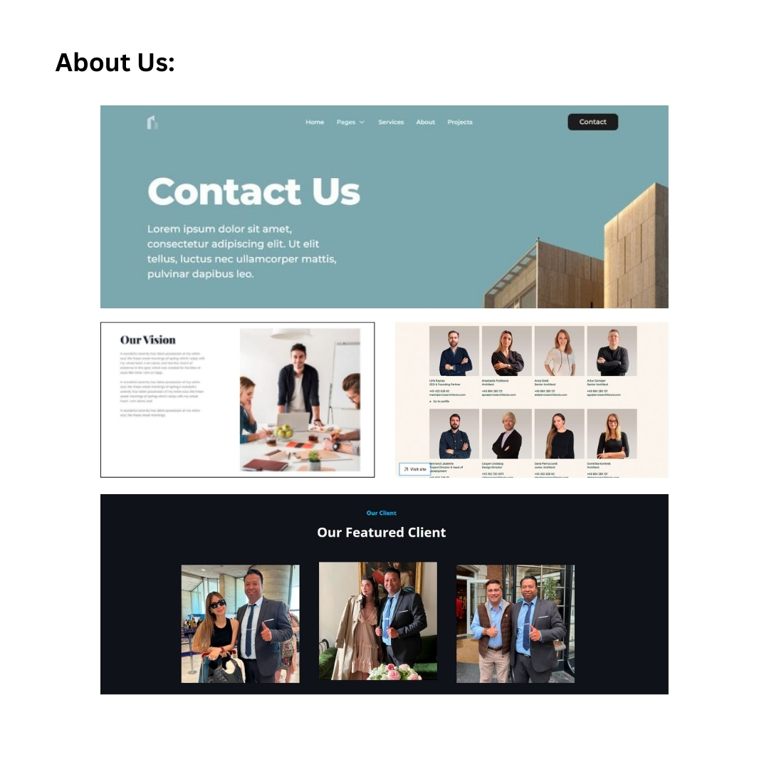
Mood Board
I began the design process by looking for inspirations on Pinterest, and other competitor’s
websites. I also browsed for simple travel and business-related platforms that are a bit bright
and pleasing to the eyes, then I compiled these into a mood board. I took note of how they
established a user-friendly design and layout.
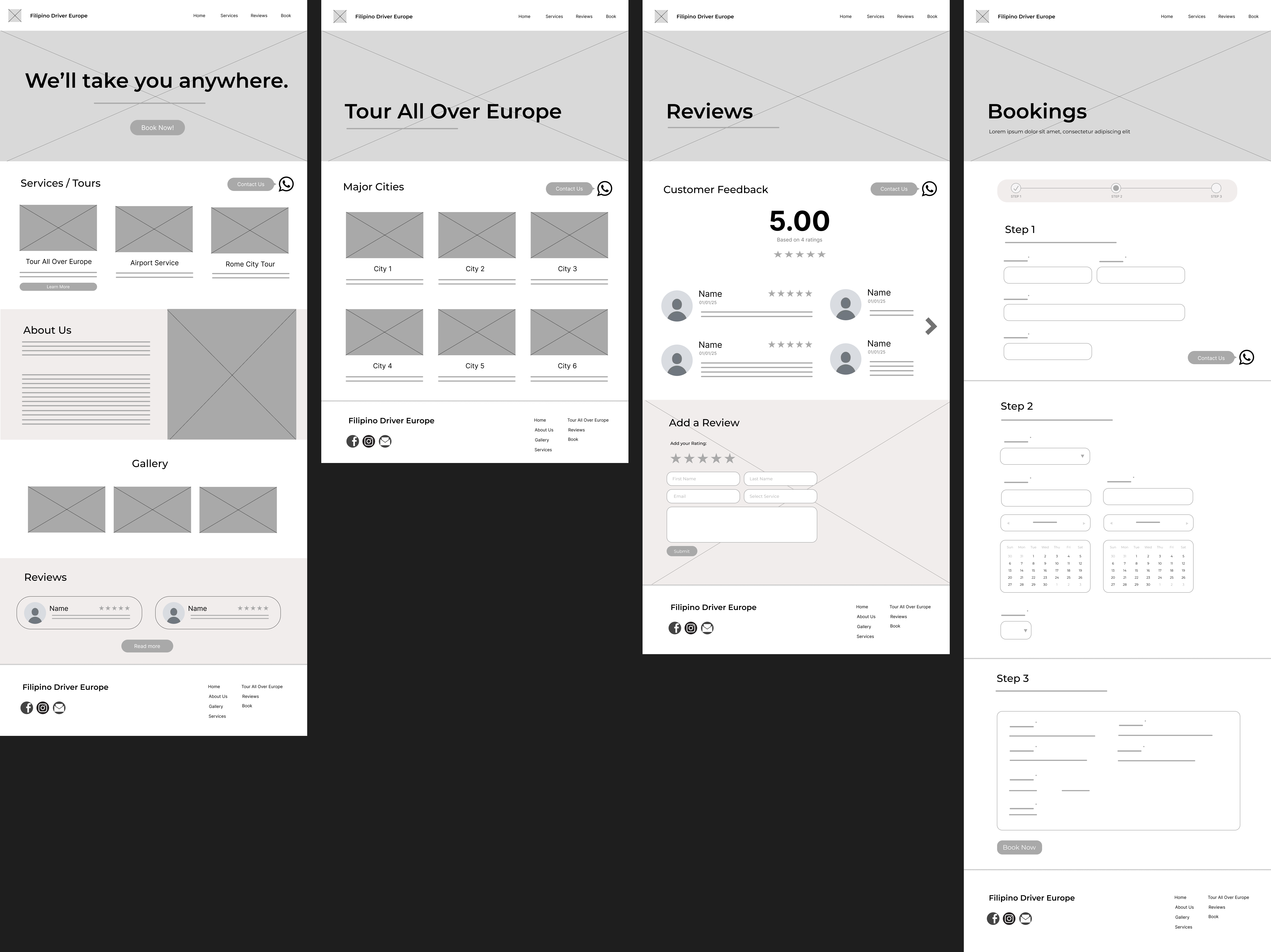
Hi-Fi Prototype
I merged the About Us and Gallery sections into one and added a carousel for the pictures.
Then, I fixed the arrangement of the services and cities on the ‘Tour All Over Europe’ page and
added short descriptions for each. I also removed the carousel on the ‘Reviews’ page for easy
viewing, divided the entire ‘Booking’ page into three separate pages, each for a different step,
instead of creating a single long page, and added a message box in case clients want to type
additional comments about the service they are booking.
I created the design similar to their competitors, featuring a welcoming hero page with a view of
a city, bright colors such as yellow, rounded buttons that complement the overall layout, and
picture overlays in some sections. This design gives a positive vibe when users enter the site.
Feedback
Fourth Iteration
After receiving the feedback, I applied the changes by adjusting the labels of the call-to-action
buttons on the homepage and the navigation bar, rearranging the ‘Booking’ pages according to
the stakeholder’s preferences, and adding a pop up with a confirmation message whenever the
user clicks on the yellow ‘Book Now’ button in the Summary section. I also improved the footer
by removing the social media icons and links, and included a pop up for the Terms and
Conditions, making the footer design more simple.
Feedback
Fifth Iteration
For the fifth iteration, I applied the feedback from my teacher and improved the titles on the
‘Home’ page and ‘Tour All Over Europe’ page to clarify that the cities are not clickable. I also
rearranged the ‘Booking’ pages based on feedback that most people prefer seeing the schedule
before the contact details and added an estimated price in the Summary section so that users
have an idea of how much the service costs. Also, I changed the chatbot icon to provide a more
approachable way for users to make inquiries.
Feedback
Reflection
I enjoy working on my passion project because it will help a lot of Filipinos whenever they want
to tour all over Europe. Also, I wanted to practice my design and coding skills with this project to
make sure that I keep on improving. I had fun conceptualizing the designs, layouts, and finding
inspiration, then coding them. I have a passion for UI/UX design and am eager to pursue this
field in the future. The feedback I received from the stakeholder and my teacher was very
helpful, as it guided me in creating a prototype that they were satisfied with.